Building Digital Trust: An Empathy-Centred UX Framework For Mental Health Apps

Imagine a user opening a mental health app while feeling overwhelmed with anxiety. The very first thing they encounter is a screen with a bright, clashing colour scheme, followed by a notification shaming them for breaking a 5-day “mindfulness streak,” and a paywall blocking the meditation they desperately need at that very moment. This experience isn’t just poor design; it can be actively harmful. It betrays the user’s vulnerability and erodes the very trust the app aims to build.

When designing for mental health, this becomes both a critical challenge and a valuable opportunity. Unlike a utility or entertainment app, the user’s emotional state cannot be treated as a secondary context. It is the environment your product operates in.

With over a billion people living with mental health conditions and persistent gaps in access to care, safe and evidence-aligned digital support is increasingly relevant. The margin for error is negligible. Empathy-Centred UX becomes not a “nice to have” but a fundamental design requirement. It is an approach that moves beyond mere functionality to deeply understand, respect, and design for the user’s intimate emotional and psychological needs.

But how do we translate this principle into practice? How do we build digital products that are not just useful, but truly trustworthy?

Throughout my career as a product designer, I’ve found that trust is built by consistently meeting the user’s emotional needs at every stage of their journey. In this article, I will translate these insights into a hands-on empathy-centred UX framework. We will move beyond theory to dive deeper into applicable tools that help create experiences that are both humane and highly effective.

In this article, I’ll share a practical, repeatable framework built around three pillars:

  1. Onboarding as a supportive first conversation.
  2. Interface design for a brain in distress.
  3. Retention patterns that deepen trust rather than pressure users.

Together, these pillars offer a grounded way to design mental health experiences that prioritise trust, emotional safety, and real user needs at every step.

The Onboarding Conversation: From a Checklist to a Trusted Companion

Onboarding is “a first date” between a user and the app — and the first impression carries immense stakes, determining whether the user decides to continue engaging with the app. In mental health tech, with up to 20,000 mental-health-related apps on the market, product designers face a dilemma of how to integrate onboarding’s primary goals without making the design feel too clinical or dismissive for a user seeking help.

The Empathy Tool

In my experience, I have found it essential to design onboarding as the first supportive conversation. The goal is to help the user feel seen and understood by delivering a small dose of relief quickly, not just overload them with data and the app’s features.

Case Study: A Teenager’s Parenting Journey

At Teeni, an app for parents of teenagers, onboarding requires an approach that solves two problems: (1) acknowledge the emotional load of parenting teens and show how the app can share that load; (2) collect just enough information to make the first feed relevant.

Recognition And Relief

Interviews surfaced a recurring feeling among parents: “I’m a bad parent, I’ve failed at everything.” My design idea was to provide early relief and normalisation through a city-at-night metaphor with lit windows: directly after the welcome page, a user engages with three brief, animated and optional stories based on frequent challenges of teenage parenting, in which they can recognise themselves (e.g., a story of a mother learning to manage her reaction to her teen rolling their eyes). This narrative approach reassures parents that they are not alone in their struggles, normalising and helping them cope with stress and other complex emotions from the very beginning.

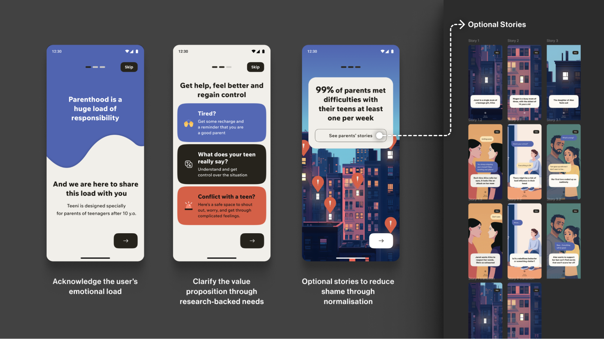
Note: Early usability sessions indicated strong emotional resonance, but post-launch analytics showed that the optionality of the storytelling must be explicit. The goal is to balance the storytelling to avoid overwhelming the distressed parent, directly acknowledging their reality: “Parenting is tough. You’re not alone.”

Progressive Profiling

To tailor guidance to each family, we defined the minimal data needed for personalisation. On the first run, we collect only the essentials for a basic setup (e.g., parent role, number of teens, and each teen’s age). Additional, yet still important, details (specific challenges, wishes, requests) are gathered gradually as users progress through the app, avoiding long forms for those who need support immediately.

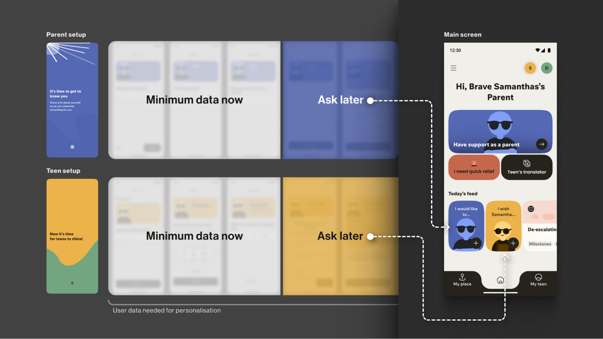
The entire onboarding is centred around a consistently supportive choice of words, turning a typically highly practical, functional process into a way to connect with the vulnerable user on a deeper emotional level, while keeping an explicit fast path.

Your Toolbox

  • Use Validating Language
    Start with “It’s okay to feel this way,” not “Allow notifications.”
  • Understand “Why”, not just “What”
    Collect only what you’ll use now and defer the rest via progressive profiling. Use simple, goal-focused questions to personalise users’ experience.
  • Prioritise Brevity and Respect
    Keep onboarding skimmable, make optionality explicit, and let user testing define the minimum effective length &mdashl the shorter is usually the better.
  • Keep an Eye on Feedback and Iterate
    Track time-to-first-value and step drop-offs; pair these with quick usability sessions, then adjust based on what you learn.

This initial conversation sets the stage for trust. But this trust is fragile. The next step is to ensure the app’s very environment doesn’t break it.

The Emotional Interface: Maintaining Trust In A Safe Environment

A user experiencing anxiety or depression often shows reduced cognitive capacity, which affects their attention span and the speed with which they process information and lowers tolerance for dense layouts and fast, highly stimulating visuals. This means that high-saturation palettes, abrupt contrast changes, flashing, and dense text can feel overwhelming for them.

The Empathy Tool

When designing a user flow for a mental health app, I always apply the Web Content Accessibility Guidelines 2.2 as a foundational baseline. On top of that, I choose a “low-stimulus”, “familiar and safe” visual language to minimise the user’s cognitive load and create a calm, predictable, and personalised environment. Where appropriate, I add subtle, opt-in haptics and gentle micro-interactions for sensory grounding, and offer voice features as an option in high-stress moments (alongside low-effort tap flows) to enhance accessibility.

Imagine you need to guide your users “by the hand”: we want to make sure their experience is as effortless as possible, and they are quickly guided to the support they need, so we avoid complicated forms and long wordings.

Case: Digital Safe Space

For the app focused on instant stress relief, Bear Room, I tested a “cosy room” design. My initial hypothesis was validated through a critical series of user interviews: the prevailing design language of many mental health apps appeared misaligned with the needs of our audience. Participants grappling with conditions such as PTSD and depression repeatedly described competing apps as “too bright, too happy, and too overwhelming,” which only intensified their sense of alienation instead of providing solace. This suggested a mismatch for our segment, which instead sought a sense of safety in the digital environment.

This feedback informed a low-arousal design strategy. Rather than treating “safe space” as a visual theme, we approached it as a holistic sensory experience. The resulting interface is a direct antithesis to digital overload; it gently guides the user through the flow, keeping in mind that they are likely in a state where they lack the capacity to concentrate. The text is divided into smaller parts and is easily scannable and quickly defined. The emotional support tools — such as a pillow — are highlighted on purpose for convenience.

The interface employs a carefully curated, non-neon, earthy palette that feels grounding rather than stimulating, and it rigorously eliminates any sudden animations or jarring bright alerts that could trigger a stress response. This deliberate calmness is not an aesthetic afterthought but the app’s most critical feature, establishing a foundational sense of digital safety.

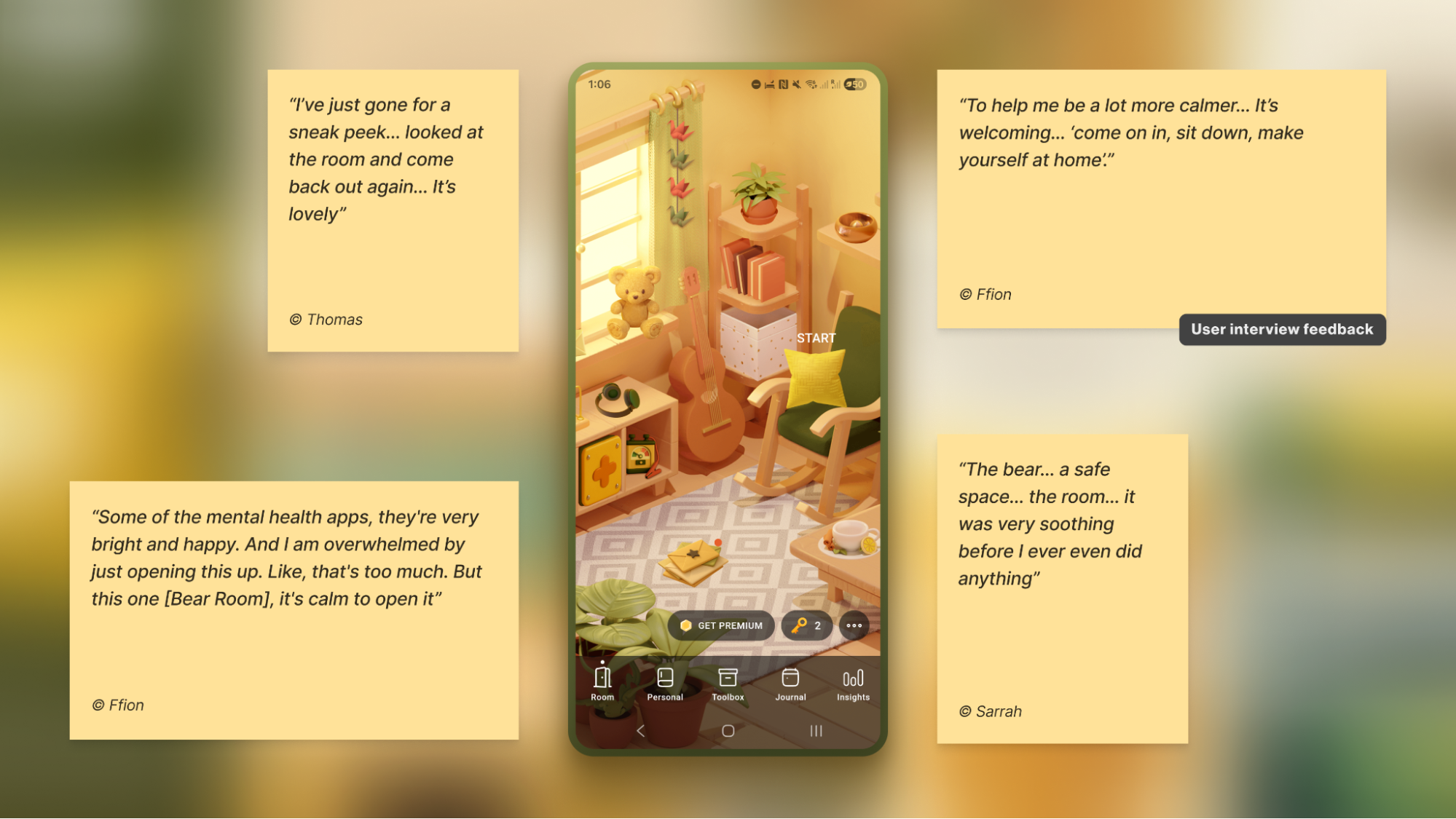
To foster a sense of personal connection and psychological ownership, the room introduces three opt-in “personal objects”: Mirror, Letter, and Frame. Each invites a small, successful act of contribution (e.g., leaving a short message to one’s future self or curating a set of personally meaningful photos), drawing on the IKEA effect (PDF).

For instance, Frame functions as a personal archive of comforting photo albums that users can revisit when they need warmth or reassurance. Because Frame is represented in the digital room as a picture frame on the wall, I designed an optional layer of customisation to deepen this connection: users can replace the placeholder with an image from their collection — a loved one, a pet, or a favourite landscape — displayed in the room each time they open the app. This choice is voluntary, lightweight, and reversible, intended to help the space feel more “mine” and deepen attachment without increasing cognitive load.

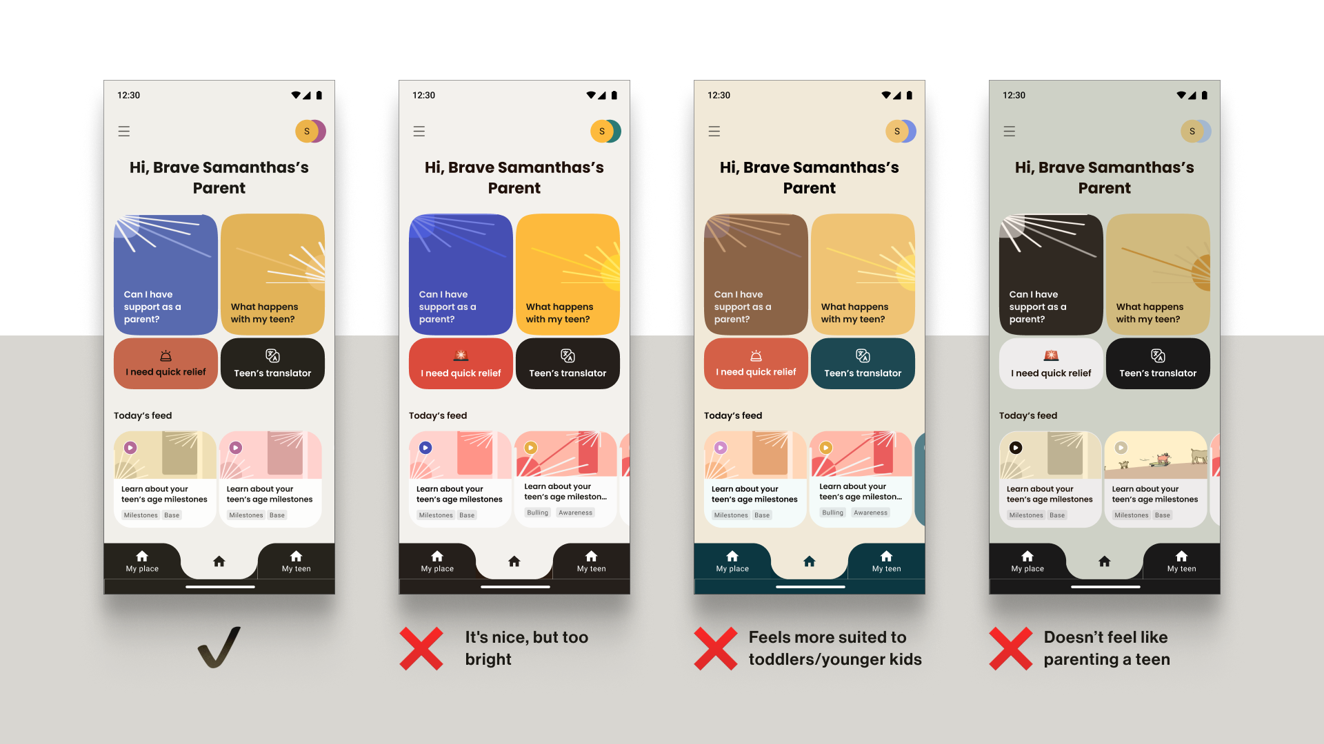
Note: Always adapt to the context. Try to avoid making the colour palette too pastel. It is useful to balance the brightness based on the user research, to protect the right level of the app’s contrast.

Case: Emotional Bubbles

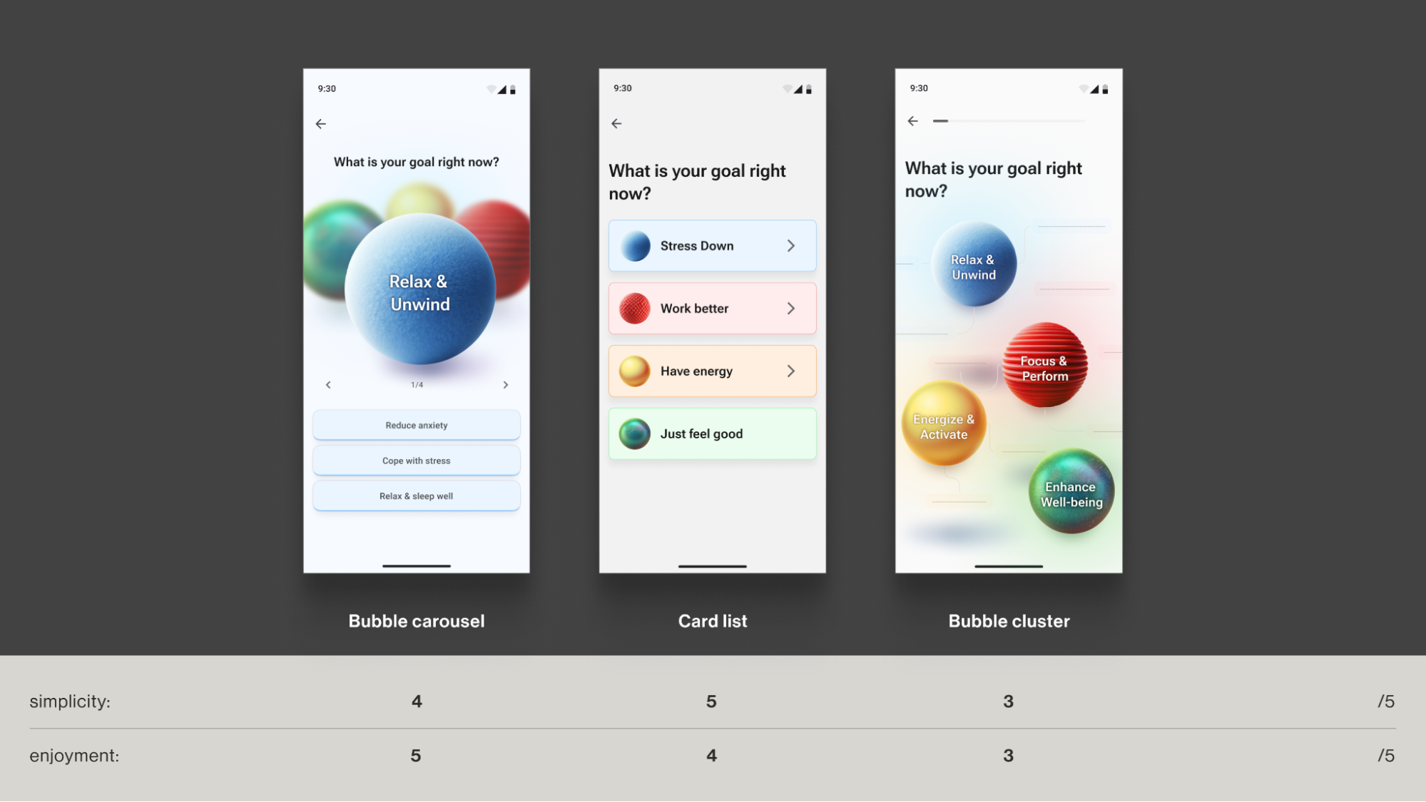
In Food for Mood, I used a visual metaphor: coloured bubbles representing goals and emotional states (e.g., a dense red bubble for “Performance”). This allows users to externalise and visualise complex feelings without the cognitive burden of finding the right words. It’s a UI that speaks the language of emotion directly.

In an informal field test with young professionals (the target audience) in a co-working space, participants tried three interactive prototypes and rated each on simplicity and enjoyment. The standard card layout scored higher on simplicity, but the bubble carousel scored better on engagement and positive affect — and became the preferred option for the first iteration. Given that the simplicity trade-off was minimal (4/5 vs. 5/5) and limited to the first few seconds of use, I prioritised the concept that made the experience feel more emotionally rewarding.

Case: Micro-interactions And Sensory Grounding

Adding a touch of tactile micro-interactions like bubble-wrap popping in Bear Room, may also offer users moments of kinetic relief. Integrating deliberate, tactile micro-interactions, such as the satisfying bubble-wrap popping mechanic, provides a focused act that can help an overwhelmed user feel more grounded. It offers a moment of pure, sensory distraction for a person stuck in a torrent of stressful thoughts. This isn’t about gamification in the traditional, points-driven sense; it’s about offering a controlled, sensory interruption to the cycle of anxiety.

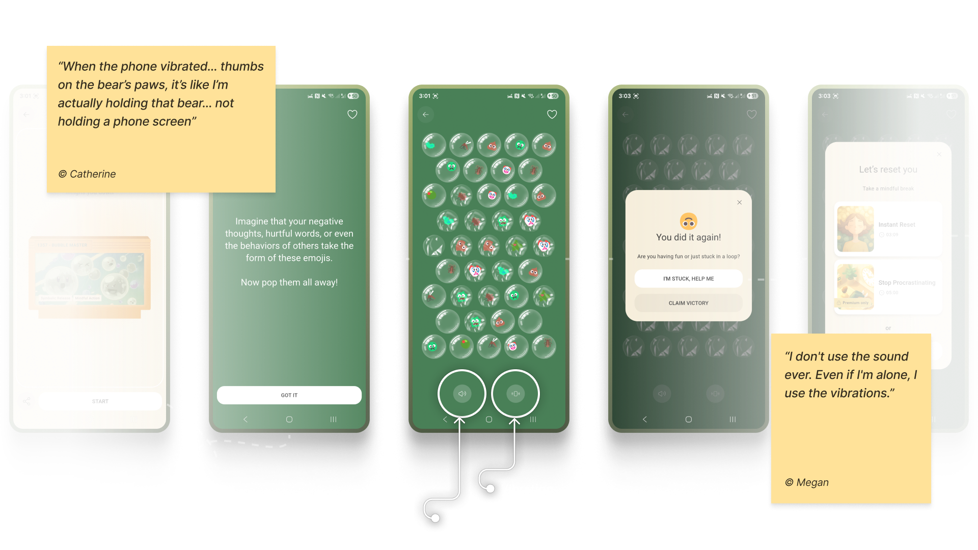
Note: Make tactile effects opt-in and predictable. Unexpected sensory feedback can increase arousal rather than reduce it for some users.

Case: Voice Assistants

When a user is in a state of high anxiety or depression, it can become an extra effort for them to type something in the app or make choices. In moments when attention is impaired, and a simple, low-cognitive choice (e.g., ≤4 clearly labelled options) isn’t enough, voice input can offer a lower-friction way to engage and communicate empathy.

In both Teeni and Bear Room, voice was integrated as a primary path for flows related to fatigue, emotional overwhelm, and acute stress — always alongside a text input alternative. Simply putting feelings into words (affect labelling) has been shown to reduce emotional intensity for some users, and spoken input also provides a richer context for tailoring support.

For Bear Room, we give users a choice to share what’s on their mind via a prominent mic button (with text input available below. The app then analyses their response with AI (does not diagnose) and provides a set of tailored practices to help them cope. This approach gives users a space for the raw, unfiltered expression of emotion when texting feels too heavy.

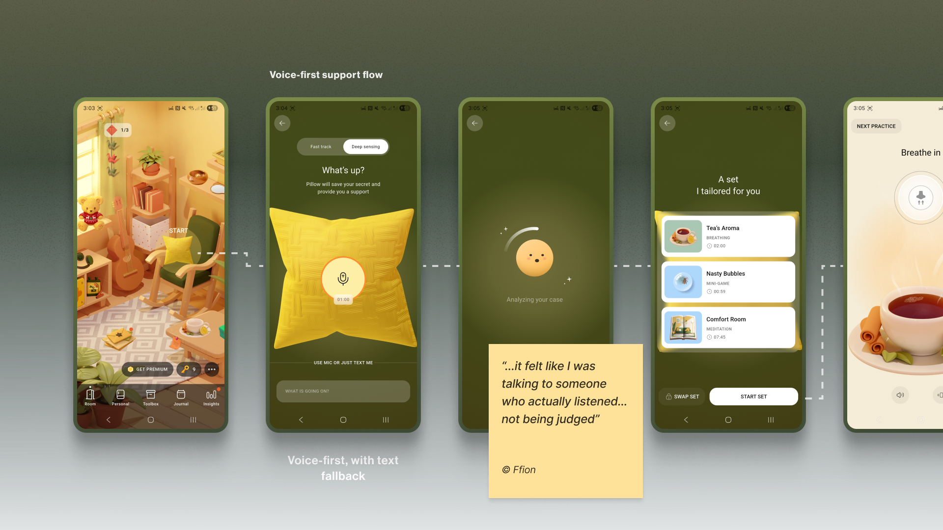
Similarly, Teeni’s “Hot flow” lets parents vent frustration and describe a difficult trigger via voice. Based on the case description, AI gives a one-screen piece of psychoeducational content, and in a few steps, the app suggests an appropriate calming tool, uniting both emotional and relational support.

By meeting the user at their level of low cognitive capacity and accepting their input in the most accessible form, we build a deeper trust and reinforce the app as a truly adaptive, reliable, and non-judgmental space.

Note: Mental-health topics are highly sensitive, and many people feel uncomfortable sharing sensitive data with an app — especially amid frequent news about data breaches and data being sold to third parties. Before recording, show a concise notice that explains how audio is processed, where it’s processed, how long it’s stored, and that it is not sold or shared with third parties. Present this in a clear, consent step (e.g., GDPR-style). For products handling personal data, it’s also best practice to provide an obvious “Delete all data” option.

Your Toolbox

  • Accessibility-Friendly User Flow
    Aim to become your user’s guide. Only use the text that is important, highlight key actions, and provide simple, step-by-step paths.
  • Muted Palettes
    There’s no one-size-fits-all colour rule for mental-health apps. Align palette with purpose and audience; if you use muted palettes, verify WCAG 2.2 contrast thresholds and avoid flashing.
  • Tactile Micro-interactions
    Use subtle, predictable, opt-in haptics and gentle micro-interactions for moments of kinetic relief.
  • Voice-First Design
    Offer voice input as an alternative to typing or single-tap actions in low-energy/high-pressure states
  • Subtle Personalisation
    Integrate small, voluntary customisations (like a personal photo in a digital frame) to foster a stronger emotional bond.
  • Privacy by Default
    Ask for explicit consent to process personal data. State clearly how, where, and for how long data is processed, and that it’s not sold or shared — and honour it.

A safe interface builds trust in the moment. The final pillar is about earning the trust that brings users back, day after day.

The Retention Engine: Deepening Trust Through Genuine Connection

Encouraging consistent use without manipulation often requires innovative solutions in mental health. The app, as a business, faces an ethical dilemma: its mission is to prioritise user wellbeing, which means it cannot indulge users simply to maximise their screen time. Streaks, points, and time limits can also induce anxiety and shame, negatively affecting the user’s mental health. The goal is not to maximise screen time, but to foster a supportive rhythm of use that aligns with the non-linear journey of mental health.

The Empathy Tool

I replace anxiety-inducing gamification with retention engines powered by empathy. This involves designing loops that intrinsically motivate users through three core pillars: granting them agency with customisable tools, connecting them to a supportive community, and ensuring the app itself acts as a consistent source of support, making return visits feel like a choice, not a chore or pressure.

Case: “Key” Economy

In search of reimagining retention mechanics away from punitive streaks and towards a model of compassionate encouragement, the Bear Room team came up with the idea of the so-called “Key” economy. Unlike a streak that shames users for missing a day, users are envisioned to earn “keys” for logging in every third day — a rhythm that acknowledges the non-linear nature of healing and reduces the pressure of daily performance. Keys never gate SOS sets or essential coping practices. Keys only unlock more objects and advanced content; the core toolkit is always free. The app should also preserve users’ progress regardless of their level of engagement.

The system’s most empathetic innovation, however, lies in the ability for users to gift their hard-earned keys to others in the community who may be in greater need (still in the process of making). This intends to transform the act of retention from a self-focused chore into a generous, community-building gesture.

It aims to foster a culture of mutual support, where consistent engagement is not about maintaining a personal score, but about accumulating the capacity to help others.

Why it Works

  • It’s Forgiving.
    Unlike a streak, missing a day doesn’t reset progress; it just delays the next key. This removes shame.
  • It’s Community-driven.
    Users can give their keys to others. This transforms retention from a selfish act into a generous one, reinforcing the app’s core value of community support.

Case: The Letter Exchange

Within Bear Room, users can write and receive supportive letters anonymously to other users around the world. This tool leverages AI-powered anonymity to create a safe space for radical vulnerability. It provides a real human connection while completely protecting user privacy, directly addressing the trust deficit. It shows users they are not alone in their struggles, a powerful retention driver.

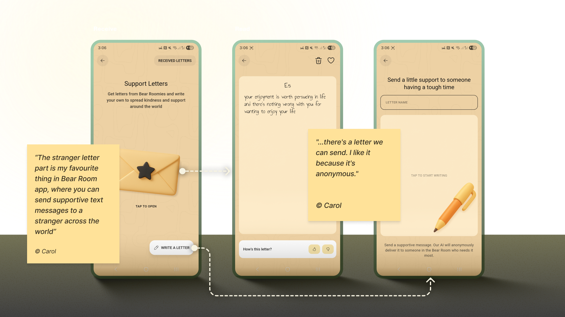
Note: Data privacy is always a priority in product design, but (again) it’s crucial to approach it firsthand in mental health. In the case of the letter exchange, robust anonymity isn’t just a setting; it is the foundational element that creates the safety required for users to be vulnerable and supportive with strangers.

Case: Teenager Translator

The “Teenager Translator” in Teeni became a cornerstone of our retention strategy by directly addressing the moment of crisis where parents were most likely to disengage. When a parent inputs their adolescent’s angry words like “What’s wrong with you? It’s my phone, I will watch what I want, just leave me alone!”, the tool instantly provides an empathetic translation of the emotional subtext, a de-escalation guide, and a practical script for how to respond.

This immediate, actionable support at the peak of frustration transforms the app from a passive resource into an indispensable crisis-management tool. By delivering profound value exactly when and where users need it most, it creates powerful positive reinforcement that builds habit and loyalty, ensuring parents return to the app not just to learn, but to actively navigate their most challenging moments.

Your Toolbox

  • Reframe Metrics
    Change “You broke your 7-day streak!” to “You’ve practiced 5 of the last 10 days. Every bit helps.”
  • Compassion Access Policy
    Never gate crisis or core coping tools behind paywalls or keys.
  • Build Community Safely
    Facilitate anonymous, moderated peer support.
  • Offer Choice
    Let users control the frequency and type of reminders.
  • Keep an Eye on Reviews
    Monitor app-store reviews and social mentions regularly; tag themes (bugs, UX friction, feature requests), quantify trends, and close the loop with quick fixes or clarifying updates.

Your Empathy-First Launchpad: Three Pillars To Trust

Let’s return to the overwhelmed user from the introduction. They open an app that greets them with a tested, audience-aligned visual language, a validating first message, and a retention system that supports rather than punishes.

This is the power of an Empathy-Centred UX Framework. It forces us to move beyond pixels and workflows to the heart of the user experience: emotional safety. But to embed this philosophy in design processes, we need a structured, scalable approach. My designer path led me to the following three core pillars:

  1. The Onboarding Conversation
    Start by transforming the initial setup from a functional checklist into the first supportive, therapy-informed dialogue. This pillar is rooted in using validating language, keeping asking “why” to understand deeper needs, and prioritising brevity and respect to make the user feel seen and understood from their very first interactions.
  2. The Emotional Interface
    Adjust the design to a low-stimulus digital environment for a brain in distress. This pillar focuses on the visual and interactive tools: muted palettes, calming micro-interactions, voice-first features, and personalisation, to make sure a user enters a calm, predictable, and safe digital environment. Certainly, these tools are not limited to the ones I applied throughout my experience, and there is always room for creativity, keeping in mind users’ preferences and scientific research.
  3. The Retention Engine
    Be persistent in upholding genuine connection over manipulative gamification. This pillar focuses on building lasting engagement through forgiving systems (like the “Key” economy), community-driven support (like letter exchanges), and tools that offer profound value in moments of crisis (like the Teenager Translator). When creating such tools, aim for a supportive rhythm of use that aligns with the non-linear journey of mental health.

Trust Is The Success: Balancing Game

While we, as designers, don’t directly define the app’s success metrics, we cannot deny that our work influences the final outcomes. This is where our practical tools in mental health apps may come in partnership with the product owner’s goals. All the tools are designed based on hypotheses, evaluations of whether users need them, further testing, and metric analysis.

I would argue that one of the most critical success components for a mental health app is trust. Although it is not easy to measure, our role as designers lies precisely in creating a UX Framework that respects and listens to its users and makes the app fully accessible and inclusive.

The trick is to achieve a sustainable balance between helping users reach their wellness goals and the gaming effect, so they also benefit from the process and atmosphere. It is a blend of enjoyment from the process and fulfillment from the health benefits, where we want to make a routine meditation exercise something pleasant. Our role as product designers is to always keep in mind that the end goal for the user is to achieve a positive psychological effect, not to remain in a perpetual gaming loop.

Of course, we need to keep in mind that the more responsibility the app takes for its users’ health, the more requirements there arise for its design.

When this balance is struck, the result is more than just better metrics; it’s a profound positive impact on your users’ lives. In the end, empowering a user’s well-being is the highest achievement our craft can aspire to.

Stop Building Laravel Admin Panels From Scratch — Meet Lara Dashboard

Hey there, fellow Laravel developer!

Are you still spending weeks building the same boring admin panel features for every client project? User management, role management, permissions, blog systems, media libraries… the list goes on.

What if I told you there’s a 100% free, open-source solution that gives you all of this — and more — out of the box?

Let me introduce you to https://laradashboard.com — your all-in-one marketplace CMS solution for Laravel.

The Pain We All Know Too Well

Every Laravel project starts the same way:

  • “I need user authentication with role-based access control”
  • “I need a beautiful admin dashboard with charts”
  • “I need content management — posts, pages, categories, tags”
  • “I need a media library for file uploads”
  • “I need email templates and notification management”
  • “I need multi-language support”
  • “I need activity logging for audit trails”
  • “I need REST APIs for mobile apps”
  • “Oh, and I need AI-powered content generation because it’s 2026”

Sound familiar? You’ve probably built these features dozens of times. Each time reinventing the wheel, each time spending precious hours on boilerplate instead of your client’s actual business logic.

What if you could skip all that and focus on what actually matters?

What is Lara Dashboard?

Lara Dashboard is a complete, production-ready Laravel admin panel and CMS that comes with everything you need to kickstart any Laravel project.

Built on the latest tech stack:

  • Laravel 12.x with PHP 8.3/8.4
  • Livewire 3 for reactive components
  • Tailwind CSS 4 for beautiful, responsive UI
  • Alpine.js for lightweight interactivity
  • Laravel Pulse for real-time monitoring
  • Laravel Sanctum for API authentication
  • Pest for modern testing

It’s not just another admin template. It’s a fully functional application with business logic, services, tests, and a modular architecture that lets you extend it infinitely.

Features That’ll Make You Say “Finally!”

User & Access Management

  • Complete user CRUD with profile management
  • Role-based access control (RBAC) using Spatie Permissions
  • Granular permission system with grouped permissions
  • Admin impersonation — log in as any user for debugging
  • Beautiful user detail pages with activity history

Content Management System (CMS)

  • Posts and Pages with visual drag-and-drop builder
  • Categories and Tags with hierarchical structure
  • SEO-friendly URLs and meta management
  • Media library with image optimization
  • Content scheduling and drafts

AI-Powered Content Generation

  • Built-in AI Agent for content creation
  • Support for OpenAI, Anthropic, and other providers
  • Inline AI editor for posts and pages
  • Fine-tuning options for tone and style

Email Management

  • Visual email template builder (drag-and-drop blocks)
  • Multiple email connections (SMTP, Mailgun, etc.)
  • Inbound and outbound email management
  • Notification system with customizable triggers

Translation & Localization

  • 21+ languages supported out of the box
  • Easy translation management UI
  • Add any new language in seconds
  • RTL support ready

Monitoring & Security

  • Activity logging for every action
  • Laravel Pulse integration for real-time metrics
  • Laravel Telescope for debugging
  • reCAPTCHA integration
  • Customizable login page settings

Developer Experience

  • Modular architecture — add/remove features as modules
  • CRUD Generator — scaffold complete CRUD in one command
  • WordPress-like hooks — action/filter system for extensibility
  • REST API with auto-generated Scramble documentation
  • Comprehensive test suite — Pest, PHPStan, Rector, Pint

The Module System — This Changes Everything

Here’s where Lara Dashboard really shines. It uses a modular architecture powered by https://laravelmodules.com/.

This means:

  1. Install only what you need — Don’t need a blog? Don’t enable the module.
  2. Add features via marketplace — Browse and install modules with one click.
  3. Build your own modules — Create custom functionality that plugs right in.
  4. Share or sell your modules — Build once, monetize forever.

CRUD Generator — Your New Best Friend

Need to add a new entity to your project? One command does it all:

# Create migration
php artisan module:make-migration create_products_table Shop

# Run migration
php artisan migrate

# Generate complete CRUD
php artisan module:make-crud Shop –migration=create_products_table

What you get:

  • Model with fillable fields and casts
  • Datatable with sorting, searching, pagination
  • Index, Show, Create, Edit Livewire components
  • Blade views with breadcrumb navigation
  • Routes and sidebar menu item

From zero to fully functional CRUD in under 60 seconds. No joke.

Is It Really Free?

Yes, 100% free and open source.

The core is completely free under the MIT license. You can use it for personal projects, client work, SaaS products — whatever you want.

There are also premium modules available at https://laradashboard.com if you need advanced features like:

  • CRM (Customer Relationship Management)
  • HRM (Human Resource Management)
  • Course Management
  • E-commerce
  • And more coming…

But the core? Completely free. Forever.

Getting Started in 5 Minutes

# Clone the repo
git clone git@github.com:laradashboard/laradashboard.git
cd laradashboard

# Setup environment
cp .env.example .env

# Install dependencies
composer install
npm install

# Generate key and link storage
php artisan key:generate
php artisan storage:link

# Run migrations with seed data
php artisan migrate:fresh –seed

# Start the server
composer run dev

Open http://localhost:8000 and log in:

  • Email: superadmin@example.com
  • Password: 12345678

That’s it. You now have a fully functional admin panel.

Try Before You Clone

Want to see it in action first?

Live Demo: https://laradashboard.com/try-demo

Email: superadmin@example.com
Password: 12345678

Play around. Break things. The demo resets automatically.

Documentation That Actually Helps

We’ve invested heavily in documentation because we know how frustrating bad docs can be.

Full documentation: https://laradashboard.com/docs

Covers everything from:

  • Installation and configuration
  • User and role management
  • Module development
  • CRUD generator usage
  • API integration
  • Deployment guides
  • And much more…

The Tech Stack You’ll Love

| Technology | Version | Purpose |
|——————-|———|————————-|
| Laravel | 12.x | Backend framework |
| PHP | 8.3+ | Server-side language |
| Livewire | 3.x | Reactive components |
| Tailwind CSS | 4.x | Styling |
| Alpine.js | 3.x | Frontend interactivity |
| Laravel Pulse | 1.5 | Real-time monitoring |
| Laravel Sanctum | 4.3 | API authentication |
| Laravel Telescope | 5.17 | Debugging |
| Pest | 4.x | Testing |
| React | 18.x | Page builder components |

All the modern tools. All working together. All tested.

Deployment Made Easy

Lara Dashboard works everywhere:

  • VPS/Dedicated servers — Standard Laravel deployment
  • Shared hosting (cPanel) — Root index.php included, no document root changes needed
  • Docker — Laravel Sail support built-in
  • Cloud platforms — Works with Forge, Vapor, DigitalOcean, AWS, etc.

We even have a distribution package builder that creates production-ready ZIP files with vendor dependencies included — perfect for clients who can’t run Composer.

Join the Community

Lara Dashboard is built by developers, for developers. We’d love to have you:

  • GitHub: https://github.com/laradashboard/laradashboard
  • Facebook Group: https://www.facebook.com/groups/laradashboard
  • LinkedIn: https://www.linkedin.com/groups/14690156
  • YouTube: https://www.youtube.com/@laradashboard (tutorials coming!)

Contributing

Found a bug? Have a feature idea? PRs are always welcome!

The codebase follows strict standards:

  • Pint for code formatting
  • PHPStan/Larastan for static analysis
  • Rector for automated refactoring
  • Pest for testing

Run composer run test and everything is checked automatically.

Why Choose Lara Dashboard?

| Feature | Building from Scratch | Lara Dashboard |
|——————–|———————–|—————-|
| User Management | Hours/Days | Included |
| Role & Permissions | Hours | Included |
| CMS (Posts, Pages) | Days | Included |
| Media Library | Hours | Included |
| Email Management | Hours | Included |
| AI Integration | Days | Included |
| Multi-language | Hours | Included |
| Activity Logging | Hours | Included |
| REST API | Days | Included |
| Monitoring | Hours | Included |
| Beautiful UI | Days | Included |
| Tests | Days | Included |
| Total | Weeks | Minutes |

The math speaks for itself.

Final Thoughts

Stop reinventing the wheel. Stop building the same features over and over. Stop wasting time on boilerplate.

Lara Dashboard gives you a 6-month head start on every Laravel project.

Clone it. Customize it. Ship it.

Your clients will thank you. Your deadline will thank you. Your sanity will thank you.

Ready to try it?

  • Demo: https://laradashboard.com/try-demo
  • GitHub: https://github.com/laradashboard/laradashboard
  • Docs: https://laradashboard.com/docs

Drop a star on GitHub if you find it useful. And let me know in the comments what features you’d love to see next!

Happy coding!

Built with love by the Laravel community. Powered by Lara Dashboard.

Building a Production CLI Tool to Gamify and Enforce Code Documentation with GitHub Copilot CLI

This is a submission for the GitHub Copilot CLI Challenge

What I Built

Cognitive Guard – A CLI tool that analyzes code complexity and blocks commits when complex functions lack documentation. It uses cognitive complexity (not just lines of code) and adds gamification to make documentation less painful.

🔗 GitHub: cognitive-guard

📦 PyPI: pip install cognitive-guard

Core Features

  • Analyzes cognitive complexity using AST parsing
  • Blocks git commits with undocumented complex code
  • Interactive TUI for fixing violations in-terminal
  • Achievement system with progress tracking
  • Multi-language support (Python, JS, TS)

Demo

# Quick demo
cognitive-guard demo

# Interactive setup
cognitive-guard init --interactive

# When you try to commit undocumented code:
git commit -m "Add feature"

🔍 Analyzing staged files...
🚫 COMMIT BLOCKED

Found 2 violations:
  📁 src/utils.py
     ❌ calculate_discount (complexity: 15) - Missing docstring

# Progress tracking
cognitive-guard stats

📊 Your Documentation Journey
   Current:  ████████░░ 80% documented
   Goal:     ██████████ 90% documented
   🎯 Just 5 more function(s) to go!

My Experience with GitHub Copilot CLI

Why I Tried Something Different

I’ve been using Antigravity (Google’s VS Code fork with AI chat) for my daily coding. It’s solid for writing functions and getting inline suggestions. But for this project, I wanted to try GitHub Copilot CLI to see what difference the terminal-based approach makes.

Spoiler: The differences were significant.

The Starting Point (Feb 5, 2026)

I started with a simple prompt:

gh copilot suggest "Build a Python CLI tool that analyzes code complexity 
and enforces documentation. Include git hooks, interactive TUI, and tests."

Over the next 6 hours and multiple follow-up prompts, I had:

  • A working complexity analyzer using Python’s AST module
  • CLI with 7 commands (init, scan, check, tui, stats, hook, update-hook)
  • Interactive TUI using Textual
  • Git hook integration with safe installation
  • 19 tests with pytest
  • Complete documentation

That first day ended with a functional Python package. This would have taken me weeks solo.

Antigravity vs Copilot CLI: What I Noticed

Project-Level vs File-Level Context

Antigravity (chat in IDE):

  • Works great when I’m focused on a single file
  • Chat window helps with function-level questions
  • Needs me to manually provide context about other files
  • Better for “fix this function” or “add this feature to this class”

Copilot CLI:

  • Sees the entire project structure from the start
  • Understands relationships between modules
  • Suggests architecture patterns, not just code
  • Better for “set up CI/CD” or “structure this project”

Example: When I asked Copilot CLI about project structure, it suggested:

cognitive_guard/
├── core/          # Core logic
├── cli/           # CLI interface
├── tui/           # Interactive UI
├── hooks/         # Git integration
└── utils/         # Utilities

With Antigravity, I would’ve had to think through this structure myself, then ask it to help implement each part.

DevOps and Tooling

Antigravity:

  • Struggles with questions about GitHub Actions
  • Limited help with package configuration
  • Not designed for Makefile or Docker questions

Copilot CLI:

  • Generated complete CI/CD workflows
  • Helped with pyproject.toml configuration
  • Suggested pre-commit hooks setup
  • Created Makefile with relevant targets

The CLI is in its natural environment for these tasks. It understands terminal workflows.

Multi-File Refactoring

The CI/CD Disaster:

My GitHub Actions were failing with 73 linting errors across 22 files. Deprecated type hints (Dict → dict), unused imports, formatting issues.

With Antigravity, I would’ve:

  1. Opened each file individually
  2. Asked for fixes per file
  3. Manually ensured consistency
  4. Probably missed some files

With Copilot CLI, I asked:

gh copilot suggest "Fix all Black and Ruff linting errors across the codebase"

It:

  • Scanned all 22 files
  • Applied consistent fixes
  • Explained the changes
  • Updated everything in one pass

73 errors → 0 in one session.

Documentation Generation

Antigravity:

  • Good for docstrings when I’m in a file
  • Helps with comments and inline docs
  • Needs me to create documentation files first

Copilot CLI:

  • Generated README.md structure
  • Created CONTRIBUTING.md, SECURITY.md
  • Suggested what docs I needed
  • Provided examples of each doc type

When I asked “What documentation does this project need?”, Copilot CLI listed: README, QUICKSTART, ARCHITECTURE, CONTRIBUTING, SECURITY, CHANGELOG. Then helped create each one.

What Actually Happened

The Complexity Algorithm

I asked: “I need cognitive complexity analysis counting control flow, nesting, and boolean logic”

Copilot CLI generated an AST-based analyzer. What caught my attention: it didn’t just give me code—it explained the cognitive complexity concept and showed me Python AST patterns I hadn’t used before.

def calculate_complexity(node: ast.AST) -> int:
    complexity = 0
    nesting_level = 0

    for child in ast.walk(node):
        if isinstance(child, (ast.If, ast.While, ast.For)):
            complexity += 1 + nesting_level  # Nested = harder to understand
        elif isinstance(child, ast.BoolOp):
            complexity += len(child.values) - 1

    return complexity

The comment about nested control flow? That was from Copilot CLI explaining why the formula works that way.

The TUI Challenge

I needed an interactive terminal UI. I’d heard of Textual but never used it.

Me: “I want an interactive TUI where users can browse violations and edit docstrings”

Copilot CLI:

  1. Suggested Textual over alternatives (with reasoning)
  2. Generated the complete TUI structure
  3. Added keyboard shortcuts (q, ↑↓ navigation, Enter to edit)
  4. Included error handling for file operations

I learned a new framework while building the feature.

Note: Antigravity would’ve been great once I knew I wanted Textual. But Copilot CLI helped me choose Textual in the first place.

The Git Hook Problem

Safe git hook installation is tricky. Copilot CLI’s solution included:

  • Backing up existing hooks
  • Creating a hook that fails gracefully
  • Providing clear instructions when blocking commits
  • Including a bypass option (–no-verify)

These were edge cases I would have discovered through bug reports, not upfront design.

When Antigravity Would’ve Been Better

To be fair, there were moments where Antigravity’s IDE integration would’ve been smoother:

  1. Function-level debugging: When a specific function had bugs, stepping through in the IDE with AI help is more natural

  2. Code review: Reading generated code with inline suggestions is easier in an editor

  3. Incremental changes: Making small tweaks to existing functions works better with IDE context

But for building a new project from scratch, especially one that involves DevOps, testing, and documentation—Copilot CLI was the better choice.

The Next 8 Days: Iteration and Polish

Days 2-3 (Feb 6-8): GitHub Integration

  • Added CI/CD workflows
  • Created issue templates
  • Set up pre-commit hooks

Days 4-5 (Feb 12): The CI/CD Maze

Copilot CLI fixed all 73 linting errors in one pass. It:

  • Updated type annotations to Python 3.9+ style
  • Removed unused imports consistently
  • Fixed import ordering
  • Explained each change type

More importantly, I learned why modern Python prefers dict over typing.Dict.

Days 6-7 (Feb 12): PyPI Preparation

Copilot CLI helped with:

  • Package metadata in pyproject.toml
  • Build configuration
  • Distribution setup
  • Installation testing

All terminal-based tasks where Antigravity wouldn’t have much to offer.

Days 8-9 (Feb 13-14): Usability Push

I had a working tool but wanted it friendlier. I asked for:

  • A demo command for quick onboarding
  • Interactive setup with questions
  • Better error messages with fix suggestions
  • Visual progress bars in stats

Copilot CLI generated encouraging messages that weren’t cheesy, progress bars using ASCII art, and error messages that guide instead of blame.

The Learning Curve

Some things took adjustment:

Over-Engineering: Initial suggestions were sometimes too comprehensive. I learned to ask for “simple” or “minimal” first, then iterate.

Context Matters: For large changes, breaking requests into smaller prompts worked better. “Refactor this specific module” beats “improve my codebase.”

Test Verification: Generated tests were solid starting points but needed domain-specific adjustments. The structure and patterns were valuable though.

Real Productivity Gains(AI Generated)

Time comparison (estimated vs actual):

Task Without AI With Antigravity With Copilot CLI
Project setup 4 hours 2 hours 30 min
Core algorithm 8 hours 4 hours 2 hours
TUI implementation 12 hours 8 hours 3 hours
Tests 10 hours 6 hours 2 hours
Documentation 8 hours 6 hours 1 hour
CI/CD 6 hours 5 hours 1 hour
Total ~64 hours ~31 hours ~13 hours

Antigravity would’ve saved me time, but Copilot CLI was faster for this type of project.

What Actually Made Copilot CLI Valuable Here

1. It’s a Teacher

Every suggestion came with context. Not just “use this pattern” but “use this pattern because of X, and watch out for Y.”

2. Architecture Guidance

When I asked about project structure, it suggested separation of concerns, proper package organization, and configuration patterns. This shaped the whole project.

3. DevOps Knowledge

The CI/CD workflows included matrix testing, caching, artifact uploading, and coverage reports. I learned GitHub Actions patterns I didn’t know existed.

4. Documentation Generation

The generated README followed best practices with installation, usage, examples, and contribution guidelines. I learned what good documentation looks like.

My New Workflow

After this experience, here’s how I think about using both tools:

Use Antigravity or Copilot Chat when:

  • Writing and refining individual functions
  • Debugging specific code sections
  • Doing code review
  • Making small, focused changes
  • Working within a single file

Use Copilot CLI when:

  • Starting a new project
  • Setting up tooling (CI/CD, pre-commit, etc.)
  • Generating documentation
  • Multi-file refactoring
  • Learning about project structure
  • Anything DevOps-related

They complement each other. Copilot CLI gets the project structured and running. Antigravity helps refine the details.

Tips for Using Copilot CLI

Based on 17+ sessions:

  1. Be specific: “Refactor this function to use async/await” beats “make it better”
  2. Iterate: Start simple, then ask “how can we improve this?”
  3. Learn, don’t copy: Read the generated code, understand the patterns
  4. Provide context: Mention what you’re building and what problem you’re solving
  5. Use it beyond code: Documentation, debugging, DevOps, learning new tools

The Final Numbers

After 9 days:

  • Code: 1,200+ lines across 24 Python files
  • Tests: 19 tests, 40% coverage, all passing
  • Quality: Black and Ruff linters passing
  • Documentation: 15+ markdown files, 15,000+ words
  • Status: Published on PyPI, production-ready

Would I Use It Again?

Yes. For new projects, especially those involving DevOps and documentation, Copilot CLI is now my starting point.

The 5x speed improvement over solo work is real, but the continuous learning is more valuable. Each session taught me something new about Python, tooling, or best practices.

Antigravity remains my go-to for daily coding tasks. But for “build something new from scratch”? Copilot CLI won me over.

Try It

pip install cognitive-guard
cognitive-guard demo
cognitive-guard init --interactive

📦 PyPI: cognitive-guard

🔗 GitHub: cognitive-guard

The question isn’t which AI tool is better. The question is which tool fits the task. For building this project, Copilot CLI was the right choice.

Built in 9 days • 17+ Copilot CLI sessions • 1,200+ lines of code

Your AI coding agent isn’t stupid

After using Cursor and Claude Code daily, I’ve noticed that when an AI coding agent drifts or forgets constraints, we assume it’s a model limitation.

In many cases, it’s context management.

A few observations:

  • Tokens are not just limits. They’re attention competition.
  • Even before hitting the hard window limit, attention dilution happens.
  • Coding tasks degrade faster than chat because of dependency density and multi-representation juggling (diffs, logs, tests).

I started managing context deliberately:

  • Always write a contract
  • Chunk sessions by intent
  • Snapshot state and restart
  • Prefer on-demand CLI instead of preloading large MCP responses

It dramatically improved the stability of the agent.

Curious how others are handling context optimization.

I also wrote a detailed breakdown of:

  • How tokens and context windows actually affect stability
  • Why coding degrades faster
  • A practical context stack model
  • Why on-demand CLI retrieval is often more context-efficient

Full post: https://codeaholicguy.com/2026/02/14/tokens-context-windows-and-why-your-ai-agent-feels-stupid-sometimes/

Cara Setup OpenClaw dengan Custom Provider Sumopod

OpenClaw memungkinkan kita menggunakan berbagai AI provider secara fleksibel. Namun, dalam beberapa kasus kita ingin memakai provider alternatif seperti Sumopod untuk alasan biaya, performa, atau model tertentu.

Pada tutorial ini, kita akan mengkonfigurasi OpenClaw agar berjalan menggunakan custom provider Sumopod.

Checklist:
✅ VPS aktif (Ubuntu 20.04 / 22.04 recommended)
✅ Akses SSH
✅ API Key Sumopod
✅ Basic Linux command

1. Login ke VPS

ssh user@ip_vps

2. Update System

sudo apt update && sudo apt upgrade -y

3. Install openclaw

npm i -g openclaw

lihat quick start di website resminya https://openclaw.ai/

4. Meet your Lobster

jika sudah pernah install openclaw, bisa run openclaw update terlebih dahulu, kemudian run openclaw onboard

openclaw update
openclaw onboard
  • pilih “Yes”
    pilih

  • pilih “QuickStart”
    pilih

  • rekomendasi pilih “Update values”
    rekomendasi pilih

  • pilih Custom Provider
    pilih Custom Provider

  • ubah API Base URL jadi https://ai.sumopod.com/v1
    ubah API Base URL jadi https://ai.sumopod.com/v1

  • masukan API Key Sumopod yang sudah di generate
    masukan API Key Sumopod yang sudah di generate

  • pilih OpenAI-compitable
    pilih  raw `OpenAI-compitable` endraw

  • masukan Model ID yang mau dipakai, disini kita coba pakai deepseek-v3-2-251201, list model lengkap bisa di akses di https://sumopod.com/dashboard/ai/models
    masukan Model ID yang mau dipakai

  • setelah memilih model maka akan muncul message Verification successful, untuk Endpoint ID bisa di biarkan saja custom=ai=sumopod-com
    setelah memilih model maka akan muncul message  raw `Verification successful` endraw , untuk Endpoint ID bisa di biarkan saja  raw `custom=ai=sumopod-com` endraw

  • Model alias optional, bisa langsung Enter saja
    Model alias optional, bisa langsung Enter saja

  • Select channel bisa pilih salah satu, untuk step connect ke whatsapp bisa check video ini https://www.youtube.com/watch?v=StqeJBCHRoM&t=74s
    Select channel bisa pilih salah satu, untuk step connect ke whatsapp bisa check video

  • skills optional, di artikel ini kita skip dulu
    skills optional, di artikel ini kita skip dulu

  • hooks optional, di artikel ini kita skip dulu dengan tekan Spasi
    hooks optional, di artikel ini kita skip dulu dengan tekan Spasi

  • Gateway pilih Restart
    Gateway pilih Restart

  • onboard selesai
    onboard selesai

-pengecekan via whatsapp, model dari sumopod berhasil digunakan
pengecekan via whatsapp

Debug

jika kamu mendapatkan pesan message seperti ini
maka kita perlu config manual via terminal

  • edit file openclaw.json
cd ~/.openclaw/
nano openclaw.json
  • cari bagian seperti berikut ini
"custom-ai-sumopod-com": {
        "baseUrl": "https://ai.sumopod.com/v1",
        "api": "openai-completions",
        "models": [
          {
            "id": "deepseek-v3-2-251201",
            "name": "deepseek-v3-2-251201 (Custom Provider)",
            "contextWindow": 4096,
            "maxTokens": 4096,
            "input": [
              "text"
            ],
            "cost": {
              "input": 0,
              "output": 0,
              "cacheRead": 0,
              "cacheWrite": 0
            },
            "reasoning": false
          }
        ],
        "apiKey": "sk--......"
      }
  • ubah contextWindow jadi 128.000, samakan dengan Context Length yang ada di list sumopod, save kemudian restart gateway
 "contextWindow": 128000,

ubah contextWindow

  • check kembali via whatsapp
    check kembali via whatsapp

Kesimpulan

Menggunakan custom provider di OpenClaw memberikan fleksibilitas tambahan:

  • Pemilihan provider berdasarkan biaya
  • Akses ke model tertentu
  • Kontrol terhadap performa dan token usage

Sumopod dapat menjadi alternatif yang relevan bagi pengguna yang membutuhkan model spesifik atau optimasi biaya inference.

Moving Your Codebase to Go 1.26 With GoLand Syntax Updates

Working on an existing Go project rarely starts with a plan to modernize it. More often, you open a file to make a small change, add a field, or adjust some logic. The code compiles, tests pass, and everything looks fine, but the language has moved forward, and your code hasn’t kept up.

As you bump your project’s Go version, you may start noticing small patterns from older code that stay around for years. A helper variable here. A brittle error check there. You fix them by hand, but as the work spreads across files, you lose context fast.

In GoLand, Go 1.26 syntax updates now show up as focused inspections with quick-fixes. You see the change where you are already working, and you can apply the same change throughout the project when you are ready.

Download GoLand

Applying syntax updates

As soon as you switch the language version of your project to 1.26, GoLand treats that as a signal: It can now look for patterns that suit Go 1.26 better.

The first thing you’ll notice is subtle. A blue underline appears under code that is safe to modernize. The underline uses a dedicated severity level named Syntax updates, with a language updates icon (). It is not an error. It is instead an indication that the code can be updated without changing its behavior.

GoLand adds two Go 1.26 syntax update inspections:

  • Pointer creation with new()
  • Type-safe error unwrapping with errors.AsType

We started with the latest Go 1.26 changes, and we plan to add more inspections for important language and standard library updates from recent years.

Type-safe error unwrapping with errors.AsType

Go 1.26 adds errors.AsType, which gives you a typed result. It avoids the pointer setup that errors.As needs and prevents type-mismatch panics. GoLand suggests the safer form and offers the Replace with errors.AsType quick-fix. You can read more about errors.AsType in the GoLand or official documentation.

Before

After

Pointer creation with new()

Go 1.26 lets new() accept expressions. This removes temporary variables that exist only so you can take their address. GoLand highlights the pattern and offers the Replace with new() quick-fix. You can read more about new()in the GoLand or official documentation.

Before

After

Expanding from one fix to the whole project

Once you apply the first quick-fix, you can move from a single change to a project-wide update. GoLand gives you several entry points, depending on how you work:

  • Right after a quick-fix: Just click Analyze code for other syntax updates.
  • From Search Everywhere: Open Search Everywhere (press Shift twice) and select the Update Syntax action.
  • From go.mod: Open the module file containing the go 1.26 directive and click Analyze code for syntax updates.
  • From the Refactor menu: Click Refactor and select Update Syntax.

GoLand collects the results in a separate tab under the Syntax updates node in the Problems tool window. You can review the updates one by one or apply them in bulk.

GoLand shows a before-and-after diff for each suggested update, so you can review the exact rewrite before you apply it.

What this approach to syntax updates changes in practice

Migration to a new Go version is rarely one big rewrite. It usually happens over the course of dozens of small, safe modernizations mixed into daily work.

GoLand supports this workflow in a few connected steps:

  • It helps you notice update candidates early. When you edit code that can be modernized, GoLand highlights it in the editor.
  • It offers a safe rewrite. You can apply a quick-fix that rewrites the code to the Go 1.26 form without changing its behavior.
  • It scales to the whole project. When you are ready, run Analyze code for other syntax updates on a wider scope and review the suggested updates before you apply them.
  • It lets you apply updates in bulk. From the list of results in the Problems tool window, you can apply fixes one by one or apply a grouped fix to update many occurrences at once.

This combination lets you move your codebase forward without turning the migration into a separate project. You update a line, you see a better form, you apply it, and you keep going.

Happy coding!

The GoLand team

Say Goodbye to “It Works on My Machine”: A Look at TeamCity’s Pretested Commits

This article was brought to you by Adeyinka Adegbenro, draft.dev.

Developers know the frustration well. Code works perfectly on their laptop, then breaks the moment it hits staging or production. It’s easy to overlook slight environmental differences that hide latent bugs like race conditions, platform-specific library loading failures, data inconsistencies (large data sets can expose hidden edge cases like timeouts), network variations, flaky tests, and memory issues.

Even with careful testing, some issues only surface in shared environments. You can’t catch every edge case with local checks alone, and sometimes, pushing unverified changes is unavoidable. That’s why it’s important to catch test failures before code reaches the shared repository. It prevents integration issues and ensures only green commits make it to the shared branch.

In this article, you’ll learn how TeamCity’s pretested commits feature stops broken code from reaching your repository. We’ll explain what pretested (gated) commits are and walk through TeamCity’s workflow using remote runs and IDE integration.

The problem: Broken builds from unverified commits

In software development, unverified commits are common. They speed up individual workflows yet also increase the risk of failed builds.

Typically, developers run local tests, commit their changes, and push to a shared repository before peer review or validation by the continuous integration server. If there’s an error (especially one caused by differences between local and production environments), it can disrupt the entire team’s workflow.

Take database connections. Locally, you might connect one service to your DB and stay well within the database’s max connection limits. But in production, several worker processes connect to the same database, quickly hitting the maximum number of connection limits and triggering timeouts.

When these differences go unnoticed, the result is often a cascading chain of failures. Anyone who pulled that branch as their base now has bad code. Other developers who depend on that branch might also have to spend time debugging the code, especially if the original developer who introduced the bug is not available. This is a massive waste of time and resources, and it could have been avoided by enforcing a pretested commit workflow that uses the validation of a powerful CI server like TeamCity.

Over time, if the main branch is frequently broken, developers become hesitant to pull their latest changes for fear that they could be unstable. This loss of confidence can lead to developers working in isolation and eventually result in multiple merge conflicts, which defeats the whole purpose of using version control as a tool for collaborative development.

What are pretested commits in TeamCity?

TeamCity’s pretested commits, also known as gated or delayed commits, reverse the build-after-commit workflow. Instead of the typical edit, commit, push, and build flow where you hope that the build passes on the continuous integration platform’s server, it’s flipped. You edit the code and then build the change on the TeamCity servers before committing it.

The CI build includes code compilation, tests, linting, and any other predetermined checks defined in your build configuration. If that build fails, the code is not committed, and the developer can fix the issue without affecting the entire team’s process. But if the code build passes the tests, TeamCity or the developer can automatically commit the changes to version control.

The pretested commit workflow

The pretested commit workflow guarantees code quality by running a full build and test cycle before changes hit the main branch. The implementation varies significantly depending on the type of version control system (VCS) being used.

For distributed systems like Git, pretested commits are built around feature branches, so there’s no need to apply patches directly to the main branch. This keeps parallel development safe through local, isolated testing and committing. TeamCity can test against a temporary patch of staged changes you made locally, but stops short of performing the final automatic commit to avoid race conditions. Instead, it uses dedicated validation branches through what is known as the branch remote run.

The workflow described below is built around Git.

Create a project

Once you have a TeamCity instance, you need to create a project either manually or by entering the repository URL (e.g., git@github.com:your-org/your-repo.git) of an existing project. If you select the repository option, you’ll be prompted to log in to the version control host (e.g. GitHub, GitLab, or Bitbucket), and you’ll need to provide the necessary authentication credentials:

Configure the project

Next, you’ll need to enter some preliminary settings: the build name, the default branch name, and the branch specifications. For most Git projects, the default branch is either refs/heads/main or refs/heads/master.

In the branch specification option, make sure you enter at least one branch, with each branch on a new line. This tells TeamCity which branches to monitor for changes. Here’s a sample branch specification:

// Default branch

refs/heads/main

// Regular feature branches

refs/heads/feature/*

Click Proceed to continue to the build step.

Add your build steps

After clicking Proceed, you have to add build steps by clicking the Build Steps tab on your build page. The build steps define the actual sequence of commands required to validate the code. These steps run regardless of the branch type (main or feature/*). A minimal command-line build configuration for a hypothetical Node.js project might look like this:

set -e

npm install # Download and install required packages for the project.

npm run build # Compile source code (e.g., TypeScript, Babel, webpack) into deployable artifacts.

npm run test # Execute all unit and integration tests. The build will fail if any test fails.

npm run lint # run linting checks for files

Don’t forget to save your changes and run the build to make sure it works on the default branch.

Pretest validation

After you’ve added build steps, developers need to work on their isolated feature branch locally, making and committing changes frequently (e.g. a branch named feature/login-flow). To initiate the pretest, the developer pushes their local feature branch to the remote repository remote-run/ prefix. TeamCity automatically watches any branches with the prefix remote-run and will run an automatic build once code is pushed there.

# Pushes feature/login-flow to the remote as remote-run/login-flow

git push origin feature/login-flow:remote-run/login-flow

Integration

Once the remote-run/login-flow build completes, the status dictates the next step. If it fails, the developer reviews the build log, fixes the issues locally on their feature branch, and repeats the push to the temporary remote-run/login-flow branch.

If the build is successful, the developer deletes the temporary remote branch. The feature branch (feature/login-flow) is now proven stable and is ready for the final action:

The developer can now commit and merge with the main branch or create a pull request from their pretested feature branch.

In centralized version control systems like SVN or Perforce, TeamCity’s remote run feature allows developers to validate uncommitted local changes using a patch (a bundle of uncommitted changes). A developer uses an IDE like IntelliJ IDEA and the TeamCity plugin to send a patch to the build server, then TeamCity builds and tests the patch. If that’s successful, TeamCity automatically commits the changes to the main repository, completing the pretested commit.

The benefits of using pretested commits

Pretested commits shift the verification from the developer’s machine to the team’s agreed CI environments. Code only gets added to the main branch after passing the specified checks, so failed builds never disrupt other people’s work.

This keeps integration clean and catches regressions early. Everyone gets a stable base to branch from. You know the latest version actually works, and you won’t have to spend hours chasing errors introduced by someone else’s build.

It also cuts down on frustration. When teams aren’t wasting time fixing someone else’s mistakes, they can focus on their own features. And because you get immediate feedback during pretesting, you catch your own issues before they become someone else’s problem.

These benefits add up. Your commit history stays focused on real progress instead of getting cluttered with commit messages like “fixed typo”, “fixed linting issue”, “added missing dependency that caused build failure”, or “added type checks”. Reviewers can focus on meaningful code changes instead of other noise. Your project history tells the story of how the code evolved, not how often it broke.

Ultimately, pretested commits support continuous delivery goals, especially for agile teams that ship frequently and rely on stable releases. Teams can rest easy knowing that their production code has gone through automated, enforced checks.

VCS and configuration considerations

To get pretested commits running smoothly in TeamCity, there are a few version control and configuration details you should pay attention to:

  • Extensive VCS integrations: TeamCity supports all major version control platforms. Centralized systems such as Subversion, Perforce, and TFVC can use remote run in the IDE, while distributed systems like Git (GitHub, GitLab, Bitbucket, or Azure DevOps) and Mercurial use the branch remote run.
  • IDE plugin setup: Using the pretested commit feature within an IDE (remote run) depends on the installation of the TeamCity IDE plugin. The plugin lets you select local, uncommitted changes and send them directly to the TeamCity server for verification.
  • Branch specifications: Your build configurations in the TeamCity UI need proper branch specifications (e.g. +:refs/heads/*) so that TeamCity knows which branches to monitor and test automatically.
  • Parameters and secrets: Define all build parameters (especially secure secrets) at the project or build configuration level in the TeamCity UI. TeamCity will securely insert them during the personal build. This separation ensures the code remains clean of sensitive configuration details. Parameter settings can be found in the project and build settings, after enabling the Settings mode in the upper-right corner of your dashboard.
  • Matching repository URLs: If you’re using remote run in the IDE, make sure the repository URL configured in IntelliJ IDEA (or your IDE) matches exactly what is defined in the TeamCity server site. Even small differences (e.g. https://github.com/acct/repo.git vs. https://github.com/acct/repo) can prevent TeamCity from recognizing the patch as belonging to the right VCS root.
  • Build triggers: Triggers let you control when your builds run under the specific circumstances/events that you have configured in the settings. For example, you can skip triggering a build if a certain user commits changes or if a phrase is present in a commit message. Configure this in the Triggers tab of your build settings.
  • Build configuration: Make sure you match your build configuration as close as possible to your branch/commit workflow for consistency. This helps make sure that the logic used to test a developer’s changes is similar to that used for the final merge made to the main branch. For example, if your main branch runs database migrations, your personal build should include the same setup.

When to use pretested commits vs. alternatives

Pretested commits are powerful, but they’re not always the right tool for every project. You need to consider project size, branch stability, and how long your tests take to run before incorporating them in your workflow.

Pretested commits work best for teams with a single stable branch where stability is important. They’re also a good fit when you have solid automated tests, and you’re pushing toward continuous integration and delivery.

If your test suites and checks are large, take a long time (i.e. 15 minutes), take up memory, or use production-grade data, running pretested commits remotely frees up developers’ machines and keeps them productive.

But if your team relies heavily on feature branches and long-lived branch workflows, pull requests and merge gates may be a better fit. And if your test suite is incomplete or flaky, pretested commits won’t help much; they’re only as good as the tests backing them up.

Code reviews and staging environments, used along with pretested commits, may be helpful for exploratory testing of the kinks that the flaky test suites cannot cover. Manual commits with quick feedback may be simpler for small teams, solo developers, or teams with tiny codebases.

It’s not always a question of choosing one or the other. Pretested commits can be layered on top of existing workflows. For example, a feature branch might have multiple developers contributing. Each developer uses pretested commits to ensure that only passing commits reach the shared feature branch. Once the feature is complete, the team still opens a PR to merge into main (or master). At that stage, the PR process provides an additional layer of code review and CI checks before the final merge.

Conclusion

Pretested commits give teams a way to guarantee that only tested, working code enters the main branch. This shifts the responsibility of integration checks onto the CI server, allowing developers to focus on writing features and trust that the system enforces quality.

While this workflow isn’t the best fit for every team, it can be transformative for environments where stability and continuous delivery are priorities. Keep in mind that a pretested commit workflow is only as good as its tests and checks. If your tests are unreliable, errors can slip through the cracks and cause problems.

JetBrains TeamCity gives teams everything they need to automatically enforce quality checks, from IDE plugins that let you trigger remote runs directly to flexible branch remote runs. If you’re currently using Jenkins and want to explore how to switch to TeamCity, check out our migration planning kit. For a deeper dive into platform capabilities, JetBrains also has detailed resources you can explore.

Building Modular Monoliths With Kotlin and Spring

This tutorial was written by an external contributor.

Vivek Kumar Maskara

Vivek Kumar Maskara is an Associate Software Engineer at JP Morgan. He loves writing code, developing apps, creating websites, and writing technical blogs about his experiences. His profile and contact information can be found at maskaravivek.com.

Website | Twitter

Over a decade ago, Netflix became one of the early adopters of microservice architecture, showcasing its potential at a large scale. Since then, many companies have jumped on the microservices bandwagon, building their backends this way from day one. While microservices offer isolation and independent scaling, their distributed nature requires managing multiple deployments, monitoring interservice communication, and handling network failures across service boundaries.

As teams have gained real-world experience with this complexity, there’s been a shift back toward monoliths, but not the tightly coupled monoliths of the past. Instead, developers are embracing modular monoliths: an architectural pattern where single deployable applications are organized into well-defined modules based on logical boundaries or business domains. Think of an e-commerce platform where users, products, and orders live in separate modules that interact through clear contracts, such as APIs for synchronous calls and events for async communication. This separation lets teams work in parallel for faster development and better maintainability, while single-unit deployment keeps releases simple and avoids microservice operational complexity.

In this guide, we explore how modular monoliths differ from traditional monoliths, why they’re gaining traction, and how to build them using Spring Modulith and Kotlin.

The Need for Modular Monoliths

The growing modular monolith countertrend makes more sense when viewed against the shortcomings of traditional approaches.

Traditional Monoliths

Traditional monoliths bundle the entire backend into a single codebase with tight coupling between user interfaces, business logic, and data access patterns. In an e-commerce platform, for example, the product catalog, checkout, payments, and order history services are in a single codebase and are deployed together. A monolith uses function calls for internal communication, and often, the call patterns and interdependencies become messy or difficult to maintain.

Microservices

Microservices emerged to solve these maintainability challenges by splitting backends into loosely coupled services, each handling a specific domain. A cab-hailing platform may separate users, drivers, ride matching, payments, and notifications into independent services. However, this introduces distributed system challenges, including complex service discovery, coordinating deployments across dependent services, and debugging interservice communication issues. Without proper expertise, tooling, and observability, this can slow down development.

Benefits of Modular Monoliths

Modular monoliths strike a balance by keeping everything in a single codebase and deploying it as one artifact, while structuring the application into logical modules with well-defined interfaces. This addresses the challenges of distributed systems while maintaining the structural benefits of well-defined interfaces and independent development workflows. Some benefits of a modular monolith include:

  • Simplified deployment: A single deployment artifact simplifies the release process because you don’t need to coordinate multiple service rollouts, manage service meshes, or handle distributed database migrations and rollbacks.
  • Reliable testing: As modules in a monolith communicate in-process rather than over a network, integration tests are faster and more stable. You can use mocks where needed, avoid brittle network dependencies, and run end-to-end (E2E) and performance tests in a controlled environment.
  • Stronger domain modeling: Modular monoliths group related business logic into modules, with clear ownership and communication boundaries between modules. It enforces communication only through well-defined interfaces and enables domain objects to be shared directly without serialization or cross-service APIs. This makes the system easier to maintain and improves development velocity.
  • In-process communication: Since modules communicate through direct method invocations instead of network calls, it reduces latency and points of failure.

Designing a Modular Monolith

When you’re building a modular monolith, you first identify the business domains and split the application into multiple loosely coupled modules with clear boundaries and dependencies. Unlike the tightly interwoven code of a traditional monolith, the modular design ensures that the modules can be developed and maintained independently while still being deployed as a single unit. For example, you can break down an e-commerce platform into separate modules such as users, product catalog, shopping cart, payments, and orders:

Each module encapsulates a specific entity or capability. A product catalog module would manage product details and categories, and an order processing module would handle order and payment entities.

Unlike traditional monoliths, where internal calls often use ad hoc dependencies, in a modular monolith, the interactions with other modules are performed using explicit interfaces and well-defined contracts. This ensures that the intermodule dependencies remain clear and intentional. The communication between the modules uses in-process function calls, so it’s faster and less error-prone compared to network-based interservice calls in microservices.

The modular structure allows logical separation between the modules and enforces fixed boundaries, increasing development speed, improving maintainability, and making testing more reliable. Each module defines its user interface, business logic, and data access layers separately:

These boundaries also lay the groundwork for extracting a particular module as a microservice based on the scaling requirements.

Integrate Spring Modulith

Spring Modulith is a Spring Boot framework that’s based on modular monolith architectural principles. It helps identify, structure, and enforce application modules. It also includes tools for verifying module boundaries and observing their behavior, along with module-level testing capabilities, making Spring Boot applications easier to build and maintain.

Here’s how to integrate Spring Modulith into a Kotlin-based Spring Boot application.

All the code samples are drawn from a fully working Kotlin example, which you can find in this GitHub repository.

Quick Start Kotlin Example

Spring Modulith can be added to any Spring Boot application by including its dependencies in the project’s build.gradle.kts:

// build.gradle.kts
dependencies {
    implementation("org.springframework.boot:spring-boot-starter")
    implementation("org.springframework.modulith:spring-modulith-starter-core:1.4.3")
}

Note: If your project uses Maven, you can add these dependencies to the pom.xml file.

To define the modules, you need to add relevant package directories to the src directory. This code snippet illustrates order and product packages added to the application, each handling its own business logic, data, and services:

SpringModulithExample
└── src/main/java
    ├── example
    │   └── SpringmonolithApplication.kt
    └── example.order
        └── …
    └── example.product
        └── …
    └── example.payment
        └── …

Within each of the modules, you can define the business logic, service, and data access layers based on your application’s requirements. The following code snippet shows a ProductService within the example.product package that returns a static greeting message:

package com.example.springmonolith.product

import org.springframework.stereotype.Service

@Service
class ProductService {

    fun getGreeting(): String {
        return "Hello from Product Module!"
    }
}

Similarly, define an OrderService within the example.order package that invokes ProductService::getGreeting() and returns a combined greeting message:

package com.example.springmonolith.order

import com.example.springmonolith.product.ProductService
import org.springframework.stereotype.Service

@Service
class OrderService(
    private val productService: ProductService
) {

    fun getGreeting(): String {
        return "Hello from Order Module!"
    }
    
    fun getCombinedGreeting(): String {
        return "Hello from Order Module and: ${productService.getGreeting()}"
    }
}

After adding similar business logic for each of the modules (eg ProductService, PaymentService), you also need to add the @Modulithic annotation to the Spring Boot Application class to mark it as modular.

The annotation tells Spring Modulith to automatically detect modules based on package structure and enable the tooling for verification, testing, and observability:

package com.example.springmonolith

import org.springframework.boot.autoconfigure.SpringBootApplication
import org.springframework.boot.runApplication
import org.springframework.modulith.Modulithic

// add this annotation to the application
@Modulithic
@SpringBootApplication
class SpringmonolithApplication

fun main(args: Array<String>) {
    runApplication<SpringmonolithApplication>(*args)
}

Defining allowed module dependencies

Next, you can update the package info file for each of the modules to define the allowed module dependencies. Since the order module depends on the methods defined in the product module, you’ll need to add the following annotation in the order/package-info.java file:

// add this annotation
@org.springframework.modulith.ApplicationModule(allowedDependencies = {"product"})
@org.springframework.lang.NonNullApi
package com.example.springmonolith.order;

Finally, you can update the product/package-info.java file to set an empty dependency list for the product module:

// add this annotation
@org.springframework.modulith.ApplicationModule(allowedDependencies = {})
@org.springframework.lang.NonNullApi
package com.example.springmonolith.product;

The above annotation ensures that if a class or object defined in the product module tries to invoke a method defined outside the module, Spring Modulith verification tests will flag the violation. You will see an example of this scenario in later sections.

Spring Modulith Features

Spring Modulith supports various tools for working with modules, including module verification, documentation, and runtime observability. With @Modulithic, the application automatically recognizes its modules (based on package structure) and enables the modulith tooling. Let’s look at how these work.

Modular Structure Checks

Spring Modulith provides built-in tooling to verify that the module boundaries adhere to the constraints. It checks for cyclic dependencies, validates that modules access other modules only through their public API packages (not internal code), and enforces explicit dependency rules. In your tests, you can use the ApplicationModules.verify() to verify the modular structure:

ApplicationModules.of(Application::class.java).verify()

Refer to the source code on GitHub for a complete example of the ModularityTest. With the above test configured, if the ProductService tries to invoke an order module method, the module verification test will fail. You can test the behavior by extending the ProductService to call getGreeting as shown below:

// add import
import com.example.springmonolith.order.OrderService

@Service
class ProductService(
    private val orderService: OrderService
) {
    
    // add this after getGreeting()
    fun getCombinedGreeting(): String {
        return "Hello from Product Module and: ${orderService.getGreeting()}"
    }
}

Since product module is configured to disallow all intermodule dependencies, when you run unit tests (./gradlew test), you would get a module violation error as shown below:

— TRUNCATED OUTPUT —
ModularityTests > verifiesModularStructure() FAILED
    org.springframework.modulith.core.Violations at ModularityTests.kt:20

You can replace direct intermodule calls with application events that let one module publish a domain event and another module listens to it. This preserves boundaries and avoids compile-time coupling between modules. For example, the order module can publish an event when an order is created, as shown below:

// order module
import org.springframework.context.ApplicationEventPublisher

@Service
class OrderService(private val events: ApplicationEventPublisher) {

    fun completeOrder(orderId: String) {
        events.publishEvent(OrderCompleted(orderId))
    }
}

data class OrderCompleted(val orderId: String)

Notice that the completeOrder method publishes the OrderCompleted event, and other modules (eg, InventoryPolicy) could react to the event using @ApplicationModuleListener, as shown below:

// product module
import org.springframework.modulith.events.ApplicationModuleListener
import org.springframework.stereotype.Component

@Component
class InventoryPolicy {

    @ApplicationModuleListener
    fun on(event: OrderCompleted) {
        println("Updating inventory for order: ${event.orderId}")
    }
}

Notice that the InventoryPolicy component has a listener configured for the OrderCompleted event that prints the order ID when it receives the event. Refer to the refactor branch on GitHub for a complete example on domain events.

Modular Level Testing

Modulith supports writing integration tests scoped to a single module. You can annotate a test class with @ApplicationModuleTests to test the module and its dependencies in isolation. This avoids the need to spin up the entire application, reducing setup overhead and making tests more reliable. For example, this code snippet shows a bare-bones integration test for the product module:

import org.junit.jupiter.api.Test
import org.springframework.modulith.test.ApplicationModuleTests

@ApplicationModuleTests
class ProductModuleTests {

    @Test
    fun testProductServiceGreeting() {
        val greeting = productService.getGreeting()
        assertTrue(greeting.contains("Product Module"))
    }
}

For the OrderService test, since it depends on the product module, you need to set the extraIncludes parameter in the @ApplicationModuleTests annotation to include it as shown below:

package com.example.springmonolith.order

import org.junit.jupiter.api.Test
import org.springframework.beans.factory.annotation.Autowired
import org.springframework.modulith.test.ApplicationModuleTest
import org.springframework.test.context.junit.jupiter.SpringJUnitConfig
import kotlin.test.assertTrue

@ApplicationModuleTest(extraIncludes = ["product"])
@SpringJUnitConfig
class OrderModuleTests {

    @Autowired
    private lateinit var orderService: OrderService

    @Test
    fun testOrderServiceGreeting() {
        val greeting = orderService.getGreeting()
        assertTrue(greeting.contains("Order Module"))
    }
}

Observability into Module Interactions

Spring Modulith helps generate developer documentation using the Documenter abstraction. This tool can generate Unified Modeling Language (UML) component diagrams describing the relationship between modules and can also generate a tabular view of the key elements of a module.

This code snippet generates an application module component diagram using Documenter:

class DocumentationTests {
    private val modules = ApplicationModules.of(SpringmonolithApplication::class.java)

    @Test
    fun writeDocumentationSnippets() {
        Documenter(modules)
            .writeModulesAsPlantUml()
            .writeIndividualModulesAsPlantUml()
    }
}

Spring Modulith also integrates with Micrometer to capture spans for module interactions. These spans can be sent to tracing tools such as Zipkin to generate runtime visualizations, making it easier to inspect which modules depend on each other, see how events flow across modules, and monitor interactions in production.

Deciding When to Use a Modular Monolith

Although a modular monolith can be the ideal balance between simplicity and structure in many cases, it isn’t universally the right choice.

Modular Monolith Use Cases

  • Early-stage development or limited resources: In the early stages of a product or when working with small teams, a modular monolith reduces operational overhead. Developers can focus on delivering features quickly without the complexity of distributed systems. The modular design still enforces boundaries between business capabilities, so if the system grows, you can gradually migrate high-demand modules into separate microservices.
    • Example: A food delivery platform can start with modules for restaurants, menu, and orders inside a single deployable unit, but it can later extract and deploy one of the modules as a microservice.
  • Complex business domains: Applications that involve complex business logic, workflows, or dependencies can benefit from a modular structure. By encapsulating each business capability in its own module, the system becomes easier to develop, test, and maintain.
    • Example: An insurance platform can split policy management, claims processing, and customer support into separate modules to avoid creating interdependencies that can become difficult to maintain.

When Modular Monoliths Aren’t Always the Right Choice

  • Systems with independent scaling needs: Some systems have uneven load patterns where certain components handle millions of requests daily, while others are rarely used. Because modular monoliths deploy as one unit, you can’t scale individual parts independently. A microservice-based approach can more easily scale components that expect a higher load than others.
    • Example: In an e-commerce platform, the product catalog or recommendation services may experience higher request volumes than order or payment services.
  • Systems that use diverse tech stacks: In some organizations, different teams rely on different programming languages, runtimes, or specialized infrastructure for different parts of the system. A modular monolith requires the entire application to use the same stack, which can limit flexibility. In these cases, a microservice-based architecture can provide the isolation needed to mix and match technologies.
    • Example: Machine learning or analytics teams may want to use Python or Go for their services, while client-facing or internal services can be based on Kotlin or Java.

Conclusion

Modular monolith architecture allows you to split the application logic into isolated modules with their own business logic, while still being deployed as a single artifact. It combines the benefits of a modular design while maintaining the development and release-related benefits of a monolithic architecture. Additionally, modern programming languages such as Kotlin provide tools that can help you achieve monolith stability without giving up the productivity that draws people to microservices.

Spring Modulith and Kotlin provide the tools to design and enforce clear module boundaries, test modules independently, and monitor their interactions. Try out Spring Modulith to build modular Kotlin applications, while keeping the flexibility to evolve into microservices if your scaling needs change.