Before WP-CLI, WordPress maintenance meant: browser open, log in to each site, click Update All, check if anything broke, log out, repeat. With 8 clients that was a half-day of clicking.
Now it’s one command per site, or one command for all sites. Here’s exactly how.
What WP-CLI actually is
WP-CLI is the command-line interface for WordPress. Everything you can do in the WordPress dashboard, you can do faster from the terminal — plus things the dashboard can’t do at all.
Run this script once. Every client gets backed up and updated. Any site that stops responding after the update triggers a warning.
Security checks in one command
# Check for the common security issues
wp --path=/var/www/client --allow-root user list --role=administrator --fields=ID,user_login,user_email
wp --path=/var/www/client --allow-root core verify-checksums
wp --path=/var/www/client --allow-root doctor check --all# Check file permissionsstat-c"%a %n" /var/www/client/wp-config.php
find /var/www/client -name"*.php"-perm /o+w 2>/dev/null | head-10
The doctor check --all command requires the WP CLI doctor package:
wp package install wp-cli/doctor-command
It checks PHP errors, inactive plugins, option table bloat, cron job health, and more. One command gives you a full site health report.
Database maintenance
# Check autoloaded data size (should be under 1MB)
wp --path=/var/www/client --allow-root db query
"SELECT SUM(LENGTH(option_value))/1024/1024 as mb FROM wp_options WHERE autoload = 'yes';"# Count post revisions
wp --path=/var/www/client --allow-root db query
"SELECT COUNT(*) FROM wp_posts WHERE post_type = 'revision';"# Optimize database tables
wp --path=/var/www/client --allow-root db optimize
On sites with 2+ years of content, cleaning up revisions and transients can reclaim hundreds of MB and noticeably speed up the admin dashboard.
Cache management
# Flush all caches
wp --path=/var/www/client --allow-root cache flush
wp --path=/var/www/client --allow-root rewrite flush

# LiteSpeed Cache specific
wp --path=/var/www/client --allow-root litespeed-purge all

# W3 Total Cache
wp --path=/var/www/client --allow-root w3-total-cache flush all
Always flush caches after updates. A cached version of a broken page is harder to diagnose than a broken page.
Generating the client report from WP-CLI output
I pipe WP-CLI output to a log file, then format it into an HTML report:
#!/bin/bashLOG_FILE="/reports/client1_$(date +%Y%m%d).log"{echo"=== WordPress Maintenance Report: $(date) ==="echo""echo"--- PLUGIN UPDATES ---"
wp --path=/var/www/client1 --allow-root plugin update --allecho""echo"--- CORE VERSION ---"
wp --path=/var/www/client1 --allow-root core version
echo""echo"--- ADMIN USERS ---"
wp --path=/var/www/client1 --allow-root user list --role=administrator --fields=user_login,user_email
echo""echo"--- BACKUP STATUS ---"ls-lh /backups/client1_*.sql | tail-3}>"$LOG_FILE" 2>&1
echo"Report saved: $LOG_FILE"
The log file gets converted to a formatted HTML email and sent to the client automatically. They see professional documentation of everything that happened. You spent 20 minutes running scripts; they received a polished report.
WP-CLI on Windows (PowerShell)
For Windows servers or if you’re running maintenance scripts from Windows:
# WP-CLI works via SSH from PowerShell$session=New-SSHSession-ComputerName"clientserver.com"-Credential$credInvoke-SSHCommand-SessionId$session.SessionId-Command"wp --path=/var/www/client --allow-root plugin update --all"
Or use the PowerShell equivalent script that SSH’s into each client server and runs the maintenance commands remotely.
The time comparison
Manual (browser-based):
Log in to each WP dashboard: 2 min/site
Check for updates: 1 min/site
Run updates: 3-5 min/site (waiting for each plugin)
Verify site still works: 2 min/site
Write update notes: 3 min/site
Total: ~11 min/site x 8 sites = ~90 minutes
WP-CLI automated:
Start the script: 1 min
Wait for it to run: 15-20 min (unattended)
Review the output log: 3 min
Total: ~20-25 minutes for all 8 sites
The script runs while you do other work. You review the output when it’s done.
The full script bundle (Bash for Linux, PowerShell for Windows, clients.json template, HTML report generator):
WordPress Agency Automation Bundle — skip the 12 hours of building it yourself.
Related articles
I automated WP maintenance across 8 client sites
WordPress plugin conflicts: diagnose and fix
WordPress staging environments: the 15-min setup
WordPress security: 10-minute monthly checklist
MainWP vs ManageWP vs custom scripts
WordPress client onboarding: the exact process
WordPress speed optimization: 6 fixes that actually work
All paid tools: devautomation.gumroad.com
What’s your most-used WP-CLI command? Drop it in the comments.
The fantasy was that programmatic SEO would let me skip the part where you write 200 individual articles and trick Google into ranking them. I had a structured dataset (US ZIP codes, cities, states) and a templated page generator. So I shipped 33,620 pages overnight. Then I sat back and waited for the long-tail traffic to roll in.
That’s not what happened.
A few months later, I have a more nuanced view. Here are the five lessons I would have paid actual money for at the start.
The numbers, so we’re working from data
Out of 33,620 templated pages on my site:
~6,200 are indexed
~18,000 are in “Crawled, currently not indexed” (CCNI)
~8,500 are “Discovered, currently not indexed”
~700 are flagged as soft 404
The rest are recently submitted and still in queue
That’s an indexation rate of about 18%. Sounds low. It kind of is. But here’s the catch: the 6,200 indexed pages drive the vast majority of organic traffic. The CCNI pile is mostly low-traffic ZIPs in low-population areas. Google has decided those aren’t worth indexing, and honestly they’re probably right.
If you came into programmatic SEO expecting “ship N pages, get N pages of traffic,” recalibrate. The real math is closer to “ship N pages, get 15-25% indexed, and the indexed pile drives 95% of your traffic.”
Lesson 1: Templating gives you the structure, not the content
This is the biggest one and the one most programmatic SEO tutorials skip.
My page generator spit out pages with this rough structure:
Hero (city, state, ZIP)
Search box
List of nearby gas stations
State average price comparison
“How to save on gas in {city}” section
Footer
Sounds reasonable. The problem: when I put two pages side by side (one for ZIPs in California, one for ZIPs in Maine), they were 95% identical text. The hero changed. The station list was different. Everything else was the same paragraph with one word swapped.
Google’s templated-content detection is real and it’s specifically looking for this. There’s a metric (referenced in their public ranking patents as “boilerplate ratio”) that measures what fraction of a page is shared with other pages on the same site. High boilerplate ratio plus thin unique content equals a soft 404 verdict.
The fix was to make the templated content actually vary. I built a state-context module with hand-written paragraphs for the 15 highest-traffic states. Each is 80 to 120 words covering the state’s gas tax, refinery capacity, regulatory regime, and seasonal pricing patterns. The other 35 states got a parameterized template with state-specific variables (avg price, neighboring states, gas tax rate). After this shipped, indexation rates climbed about 15% over six weeks.
The 80/20 here: hand-writing the top 15 of 50 states covered about 75% of my traffic. The other 35 got the templated treatment, which is fine because they’re not driving meaningful traffic anyway.
If I’d known this at the start, I would have spent the first weekend writing 15 paragraphs by hand and the second weekend generating the rest. Instead I spent four weekends generating everything and then went back to hand-write the top tier. Same end state, slower path.
Lesson 2: Internal URL types compete with each other
I had two URL types covering the same entity. A programmatic city page (/houston-tx) and a blog post about Houston gas prices (/blog/cheapest-gas-houston). Different formats, different content, both about Houston gas.
Google saw these as competitors. It picked one to index (the blog post) and put the other in CCNI. Then it picked the other for some sister cities (city page won, blog post in CCNI). The pattern was inconsistent and frustrating.
My first instinct was wrong. I tried to “fix” this by submitting the CCNI page for re-validation, hoping Google would just index both. That’s not how this works. Google has a per-site indexation budget and a canonical-decision system that picks one URL per topic per intent. When you ask it to re-evaluate, it just makes the same decision again.
The actual fix was to differentiate the intent of each URL type:
Blog post: opinionated guide, current events, “why are gas prices high in Houston this month”
City page: factual reference, station list, ZIP grid, state context, “where to find cheap gas in Houston”
Once the content categories were clearly different, Google’s canonical decisions became consistent. Blog posts started ranking for query-with-intent searches (“why are gas prices high in Houston”). City pages ranked for quantity-intent searches (“cheap gas Houston”). They stopped competing for the same impressions.
If you have two URL types covering similar entities, they’re probably competing whether you intended it or not. Audit your URLs and make sure each type has a clear, different job.
Lesson 3: Word count is a proxy, not a target
I spent some time obsessing over word counts. I’d seen “1,500 word minimum for ranking” quoted in SEO guides. So I padded pages with filler to hit the number.
Google did not care. The pages that broke through to indexed weren’t the ones with 1,500 words. They were the ones with 800 words of actually useful, page-specific content.
Word count is a proxy for depth. If you can get to 800 words by writing things that are genuinely useful and page-specific, you’re done. If you’re padding to hit a target, Google can tell, and the padding doesn’t help. The detection isn’t a single signal, it’s a combination: sentence-level perplexity, semantic distinctness from other pages on your site, contextual relevance to the query intent. Modern ranking models are sophisticated enough to recognize stuffing.
I went from a 640-word baseline to an 810-word “after” state by adding things that were genuinely useful: the per-state context, an SSR-rendered nearby ZIP grid, a top-stations summary. None of it was filler. The +170 words mattered because of what was in them, not because of the count.
Lesson 4: GSC verdicts have memory
If a page gets flagged as soft 404, fixing the page doesn’t immediately clear the verdict. The recovery flow is:
Fix the page
Submit a re-validation request in GSC
Wait 1 to 4 weeks for the re-crawl
Accept that some URLs won’t come back even after you fix them
GSC’s verdict is sticky. It’s not because Google is malicious. It’s because the indexation queue is finite and pages with prior negative verdicts get deprioritized. If a page has been “soft 404” for three months and you fix it, Google doesn’t drop everything to re-evaluate. It works through the queue, and your fixed page joins the back.
The implication: when planning a programmatic SEO site, get the page quality right before you submit URLs to GSC. Submitting a thin page early creates a verdict you’ll fight for months. Better to wait, polish, and submit clean.
I did the opposite. I submitted everything immediately because I was excited. About 700 pages got soft-404’d, and clearing those verdicts took about 8 weeks of patient post-mortem work even after the underlying content was fixed.
Lesson 5: Branded search beats backlinks for indexation
This one surprised me.
Pages that started getting branded search impressions (users typing “gas price check Houston” into Google) got indexed faster than pages that had inbound backlinks from other domains. The branded queries didn’t even have to convert. Just the impressions seemed to register.
Google’s signal here seems to be: “people are looking for this specific page on this site, by name.” That signal is hard to fake (it requires real users typing branded queries) so Google trusts it heavily. A backlink can be paid for or manufactured. Branded search volume cannot.
The implication: if you want to accelerate indexation on a specific page, drive direct traffic to it from anywhere. Social posts, email, bio links, even paid ads briefly. The traffic sends a “this page is real and people want it” signal that Google’s ranking model picks up.
I tested this informally. I posted a link to one of my CCNI city pages on Reddit. Got about 80 visits in a day. Within two weeks the page moved from CCNI to indexed, with a top-50 ranking on its target query. I didn’t change the page at all. Just sent traffic.
I’m not claiming this works every time. But the pattern was strong enough that I now bias toward “drive traffic to anything stuck in CCNI” over “build more backlinks to anything stuck in CCNI.”
What I’d do differently
If I were starting over:
Start with 50 hand-written pages, not 50,000 templated ones. Get those indexed and ranking before generating the long tail. The long tail benefits from established authority.
Differentiate URL types from day one. Decide what each URL type is for and don’t blur the line.
Pre-compute everything. If you’re going to template at scale, all unique-per-page content (geocoding, internal links, neighbor lists) should be resolved at build time, not runtime. Runtime fetches show up as “loading…” placeholders in the SSR HTML, and Google reads those as thin content.
Check GSC weekly, not monthly. Soft 404 verdicts compound silently. By the time you have 700 of them, recovery is a multi-month project.
Save the URL submissions for last. Polish first. Submit when the page is actually good. Once a verdict lands, it’s sticky.
The bottom line
Programmatic SEO works. But the math isn’t “ship 33,620 pages, get 33,620 pages of traffic.” It’s closer to “ship 33,620 pages, get 6,200 indexed, get traffic on the top 2,000 of those, and the rest are infrastructure.” The work isn’t generating the pages. The work is earning the right to keep them indexed.
If you’ve shipped a programmatic site at scale, what’s your indexation rate? I’d love to hear what others are seeing. My hypothesis is that 15-25% indexation is typical for first-year programmatic sites, and the rate climbs over time as the site builds authority. But I have a sample size of one, so I’d love more data points.
Every WordPress emergency I’ve seen in the last five years had the same root cause: someone tested an update on production.
A staging environment eliminates this. If it breaks on staging, you fix it on staging. Nothing reaches the client’s live site until it’s verified. Here’s how I set one up in 15 minutes.
Why staging isn’t optional for client sites
“It worked on my machine” is a joke. “It worked on the live site yesterday” is a client emergency.
The risks of updating production directly:
Plugin update breaks the theme — client’s site is down during business hours
PHP version bump reveals a deprecated function — white screen on every page
Theme update wipes custom CSS — site looks wrong until you remember what you changed
A staging environment catches all of these before they matter.
Option 1: Staging via hosting panel (easiest)
Most quality hosts (SiteGround, Kinsta, WP Engine, Cloudways) have one-click staging built in.
SiteGround: Site Tools -> WordPress -> Staging -> Create Staging Copy Kinsta: MyKinsta -> Site -> Environments -> Add Environment WP Engine: User Portal -> Sites -> Staging -> Copy to Staging
What this does: creates a full copy of the site (files + database) at a subdomain (usually staging.clientdomain.com or clientdomain.wpengine.com). Changes stay isolated until you push to live.
After testing updates:
Test on staging: update plugins, verify site works
Push to live: one-click merge from staging to production
Verify on production: check key pages, checkout, contact forms
Time for the whole flow: 20-30 minutes. Time for a manual plugin update without staging: 5 minutes. Time to fix a broken production site without staging: 2-6 hours.
Option 2: Local by Flywheel (free, for local testing)
Local (getlocal.io) runs a full WordPress environment on your machine. Free, works offline, fast.
1. Download Local from localwp.com
2. Create new site -> WordPress
3. Click "Pull from host" (connects to WP Engine, Kinsta, etc.)
   Or use WP-CLI to import manually
For clients on shared hosting without staging: this is the fallback. Pull the site locally, test, push changes manually.
Limitation: you can’t test live payment processing locally. Use Option 1 for WooCommerce sites.
Option 3: WP-CLI staging on a VPS (most control)
If you have a VPS or the client’s server has enough space:
#!/bin/bashLIVE_PATH="/var/www/html/production"STAGING_PATH="/var/www/html/staging"STAGING_DOMAIN="staging.clientdomain.com"# Copy filescp-r$LIVE_PATH$STAGING_PATH# Export live database
wp --path=$LIVE_PATH--allow-root db export /tmp/live_backup.sql
# Import to staging database (must create DB first)
mysql -u root -p staging_db < /tmp/live_backup.sql
# Update staging URLs in database
wp --path=$STAGING_PATH--allow-root search-replace "clientdomain.com""$STAGING_DOMAIN"# Update wp-config.php for staging databasesed-i"s/production_db/staging_db/"$STAGING_PATH/wp-config.php
Then set up the staging subdomain in nginx/Apache. The staging site is fully isolated.
The staging workflow for monthly maintenance
This is how I handle updates for every client:
1. Create/refresh staging copy (hosting panel, 2 min)
2. Run all updates on staging (WP-CLI or dashboard)
3. Quick verification: homepage, key pages, checkout, contact form
4. If all good: merge to production (1 click)
5. Post-production check: same 4-5 pages
With this workflow, the “update broke the site” emergency essentially doesn’t happen. I’ve been doing this for 3 years across 15+ client sites.
[ ] Contact form submits (check that email arrives)
[ ] Login/logout works
[ ] For WooCommerce: add to cart, checkout, payment gateway (test mode)
[ ] Admin dashboard accessible
[ ] No PHP errors or warnings visible (check debug.log)
This takes 5-10 minutes. It’s the difference between a routine update and an emergency call.
Client communication about staging
I include staging in my service agreements. Clients sometimes push for “just update it live, it’ll be fine” — especially for minor updates.
My response: “Updates on production cost me nothing extra to do safely. If something breaks, it costs both of us time to fix. Staging takes 10 minutes; cleanup takes hours. I always test first.”
Some clients explicitly want to see the staging site before changes go live. I send them the staging URL and a list of what to check. It turns a potential complaint (“why did the button color change?”) into a pre-approved change.
Automating the staging refresh
For sites I update monthly, I automate the staging refresh with a script that runs before the update window:
#!/bin/bash# Run before monthly maintenance windowLIVE="clientdomain.com"STAGING="staging.clientdomain.com"# Refresh staging (Kinsta API - other hosts have similar)
curl -X POST "https://api.kinsta.com/v2/sites/$SITE_ID/environments/$STAGING_ENV_ID/clone-from/$LIVE_ENV_ID"-H"Authorization: Bearer $KINSTA_TOKEN"echo"Staging refreshed. Ready for updates."
This ensures staging always reflects the current production state, not a 3-month-old copy.
Why most freelancers skip staging (and why that’s the wrong call)
“It takes too long.” — 15 minutes to set up. 5 minutes per update cycle after that.
“The client is on shared hosting with no staging.” — Use Local by Flywheel or ask the client to upgrade to a plan with staging (and explain why).
“It’s just a minor update.” — Plugin conflicts and WooCommerce breaking changes have happened on “minor” updates. The risk profile doesn’t match your definition of minor.
The real cost of skipping staging isn’t the 10 minutes you saved. It’s the 6 hours you spend on an emergency fix, the client relationship damage, and the stress.
The monthly maintenance automation bundle includes pre-update backup scripts that work as a lightweight staging safety net:
WordPress Agency Automation Bundle
Service agreement template that includes staging workflow documentation:
WordPress Agency Starter Kit
Related articles
I automated WP maintenance across 8 client sites
WordPress plugin conflicts: diagnose and fix
WordPress backups: the strategy that actually protects client sites
WooCommerce maintenance: 8 checks
How to price WordPress maintenance retainers
WordPress client onboarding: the exact process
WordPress speed optimization: 6 fixes that actually work
All paid tools: devautomation.gumroad.com
What staging setup do you use for client sites — hosting-provided, Local, or something else?
Everyone keeps saying it. Half the people saying it can’t define it. I spent three weeks finding out whether the thing they’re describing actually holds up when you’re building something real.
Let me define vibe coding properly, because the term has been stretched to the point where it means almost anything involving AI and code.
Vibe coding is a development workflow where you describe what you want in natural language, often imprecisely, often iteratively and let an AI tool generate, modify, or explain code based on your intent rather than your specification. The “vibe” is the feeling of directing rather than writing, of being a composer who sketches melodies and lets the AI fill in the notation.
The term was popularised by Andrej Karpathy in early 2025 and it resonated because it named something a lot of developers were already experiencing. You’re not doing traditional programming. You’re not doing no-code. You’re doing something in between, guiding an AI through a problem using natural language plus occasional code review, trusting the tool to handle the implementation details while you stay at the problem level.
The debate is whether this is a legitimate development methodology or a fast path to unmaintainable code that works until it doesn’t.
I tested it on real tasks to find out.
The Testing Methodology
Three task types that cover the range of what developers actually do:
Task 1: Build a React dashboard : A monitoring dashboard with real-time data, filtering and a chart component. Not a toy example, the kind of component you’d actually ship.
Task 2: Debug a Python API : A FastAPI endpoint with a subtle async bug causing intermittent 500 errors under load. The kind of bug that takes a human developer 2-3 hours to find.
Task 3: Refactor legacy code : A 300-line Python function handling multiple concerns simultaneously. The task: split it sensibly without changing behaviour.
Four evaluation dimensions:
Code quality : would a senior engineer approve this in a code review?
Speed : time to a working solution
Vibe : how natural did the flow feel? Did I feel like I was driving or fighting?
Production readiness : edge cases handled, error states covered, tests included?
The 10 Tools
Cursor, Windsurf, Claude (claude.ai), GitHub Copilot (agent mode), Bolt.new, v0 by Vercel, Replit Agent, Devin, Aider and Codeium.
Cursor is the benchmark that everything else gets compared against and the comparison is usually unfair to everything else.
The React dashboard task: I described what I wanted in the chat sidebar. Cursor read the existing file structure, understood the component patterns I was using and produced a dashboard that matched my codebase conventions without me specifying them. The chart component needed one round of iteration, the initial output used a library I didn’t have installed, but the correction was a single message.
The debug task is where Cursor genuinely impressed me. I pasted the error logs and described the symptom. Cursor identified the async context manager issue in the database connection handling without me pointing it out. It explained why the bug caused intermittent failures specifically under load, not in isolation. That explanation was accurate and it’s the kind of contextual reasoning that makes the debugging session feel like pairing with a capable engineer rather than using a tool.
The refactoring task: clean extraction of concerns, appropriate abstractions, preserved behaviour. The one gap was that tests weren’t generated automatically, I had to ask for them separately.
The vibe is consistently good. The tab completion alone changes how fast you work. The chat integration with the file context feels natural. If you’re not using Cursor and you’re writing code daily, you’re leaving velocity on the table.
Windsurf’s Cascade mode is the closest competitor to Cursor and in some tasks it’s genuinely better. The multi-file coordination, when a change in one file should propagate to related files, is handled more proactively than Cursor in my testing.
For the React dashboard, Windsurf’s output was slightly more boilerplate-heavy than Cursor’s. The structure was correct but the styling choices felt generic in a way that would need cleanup before shipping. Not wrong, just not as convention-aware.
The debugging task showed the gap: Windsurf identified the right area of the code but its explanation of why the bug manifested under load was less precise than Cursor’s. The fix was correct. The understanding behind it felt shallower.
The vibe is good, particularly in Cascade mode. Where Cursor feels like a co-pilot who reads your intent, Windsurf feels like a capable pair programmer who needs slightly more explicit direction. The distinction matters on complex tasks and disappears on simple ones.
Claude’s code quality is consistently the highest of any tool I tested. The React dashboard output was clean, well-commented, accessible and included error boundary handling I hadn’t asked for. The refactoring was architecturally thoughtful in a way that reflected genuine understanding of why the original code was problematic.
The debugging task: Claude caught the async issue, explained it with more depth than any other tool and provided a test case that would reproduce the bug reliably, something I hadn’t asked for.
The vibe score reflects the interface constraint. Claude in the browser is a chat interface, not an IDE. The code quality is excellent but the workflow of copy-paste between the chat and my editor breaks the flow that Cursor and Windsurf maintain natively. When Claude gets API access to your IDE (this is coming), the vibe score changes.
For code review and architectural reasoning, Claude is the best tool here. For the integrated vibe coding flow, the interface is the limitation.
Tool 4: GitHub Copilot (Agent Mode)
Code quality: 7/10 | Speed: Very fast | Vibe: 8/10 | Prod ready: 6/10
Copilot’s agent mode is fast. Tab completion that anticipates your next line before you’ve finished the current one is genuinely addictive. For boilerplate-heavy tasks, setting up a new component structure, writing standard CRUD operations, nothing is faster.
The gaps appear on complex tasks. The React dashboard output was functional but shallow, no error handling, no loading states, no edge case coverage. The structure was correct; the completeness wasn’t there.
The debugging task was the weakest performance of any tool I’d consider recommending. Copilot identified the general area of the problem but missed the specific async context issue, suggesting a fix that would have helped in some cases but not addressed the root cause.
If you’re primarily writing code and want faster typing, Copilot is excellent. If you’re solving complex problems and want to understand them, it underperforms the tools with more reasoning depth.
Tool 5: Bolt.new
Code quality: 7/10 | Speed: Very fast | Vibe: 8/10 | Prod ready: 5/10
Bolt.new exists in a different category from the IDE-integrated tools. It’s for generating full applications from descriptions, not for coding workflows within existing projects.
For the React dashboard, built from scratch, not integrated into an existing codebase, Bolt.new produced something visually impressive and functionally limited within about four minutes. The demo looks great. The code quality underneath is the kind that works until you need to change something.
For the debugging and refactoring tasks: Bolt.new isn’t designed for this use case and it showed. These tasks require context about an existing codebase that Bolt.new’s interface doesn’t support well.
The vibe for greenfield work is genuinely good, describing a product and watching it appear is still impressive even if you’ve seen it a hundred times. The production readiness of the output is not there for anything beyond prototyping.
Tools 6–10: The Quick Summary
v0 by Vercel : Excellent for React UI components specifically, poor outside that domain. Design sensibility is the best of any tool here. If you’re building Next.js frontends, v0 is a genuine productivity multiplier for component generation.
Replit Agent : Best if you need cloud deployment built into the workflow. The code quality is adequate, the integrated deployment is the differentiator.
Devin : The most autonomous of any tool. Genuinely impressive on multi-step tasks. The latency is real, it thinks before acting and the thinking takes time. For complex, long-horizon tasks where you want to describe an outcome and walk away, Devin is the tool. For interactive vibe coding where you want fast iteration, it’s too slow.
Aider : The power user’s choice. Terminal-native, works with any model, extremely configurable. The vibe is terminal-flavoured, excellent for developers who live in the command line, alienating for everyone else. Code quality is high when you configure it well.
Codeium : Strong autocomplete, adequate chat. The free tier is genuinely competitive with Copilot for basic completion. Less impressive on complex reasoning tasks.
The Honest Answer to “Does It Work for Production?”
Yes, with the right tools and the right mindset.
The vibe coding workflow produces production-quality code on well-defined tasks with tools like Cursor and Claude. The catch is that “well-defined” is doing work in that sentence. Vibe coding amplifies your ability to execute on a problem you understand, it doesn’t replace the need to understand the problem.
The failure mode I saw consistently: developers who described what they wanted without understanding the constraints or edge cases, accepted the first output without critical review and discovered the gaps when the code ran in a real environment.
The success mode: developers who used vibe coding to accelerate the implementation of problems they’d already thought through, treated AI output as a first draft rather than a final answer and maintained the ability to read and understand the code that was generated.
The tools that produce the best production code are the ones with the deepest reasoning capability, Cursor, Claude, Aider, not the ones with the fastest output. Speed is a feature. Understanding the problem is still your job.
For the full ranked comparison with screenshots, prompting strategies and code sample comparisons across all ten tools, Dextra Labs tested all 10 vibe coding tools head-to-head with the detail that a single Dev.to article can’t cover.
The full explainer on what vibe coding is, including the workflow patterns that work in production versus the ones that produce demo-quality code, covers the methodology in more depth.
Published by Dextra Labs | AI Consulting & Enterprise Development
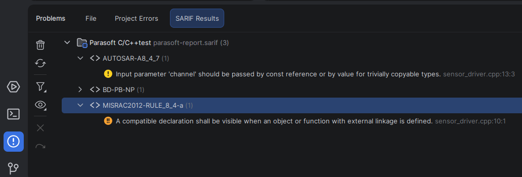
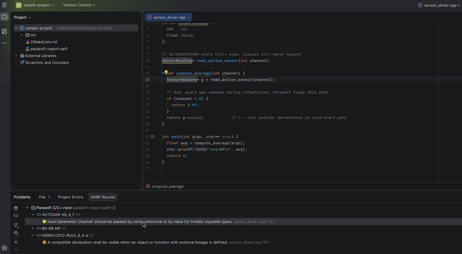
Starting with v2026.1.2, CLion includes the SARIFThe Static Analysis Results Interchange Format. Viewer, available out of the box. This is especially useful for embedded and automotive teams, for whom external static analysis is often part of the compliance toolchain. If you use tools that produce SARIF reports – such as Parasoft C/C++test, Clang Static Analyzer, or in-house checkers – you can now review their findings directly in the IDE, navigate to the relevant source code, and keep the triage process within your development workflow.
What is SARIF?
SARIF provides a common format for analyzing issues, rules, severities, code locations, and execution flows. That matters when a project relies on multiple tools at once, such as C/C++ analysis, compiler checks, and internal quality gates.
DOWNLOAD CLION
Why the SARIF Viewer matters for automotive teams
MISRA, AUTOSAR, CERT C/C++, and ISO 26262 reports no longer need to live only in a CI artifact, a web dashboard, or a vendor-specific tool. You can open them in CLion next to the code you’re working on.
How it works
Select Use Code | Import SARIF Results… and then select your .sarif or .sarif.json file. You can also drag the report into the IDE’s Project tool window. CLion will validate the report, add a SARIF Results tab to the Problems tool window, and group findings by tool and rule.
Double-click a result to open the corresponding location in the editor.
Imported reports are stored per project, so the triage state is restored when you reopen the project. You can also clear, re-import, filter, and group results from the SARIF Results toolbar.
Disabling the plugin
If your project doesn’t use SARIF reports, you can disable the plugin from Settings | Plugins | Installed | SARIF Viewer.
Try it in CLion 2026.1.2
The SARIF Viewer is available in CLion 2026.1.2 out of the box. Try it with your own reports or any other SARIF 2.1.0-compatible output, and let us know what would make the workflow better for you.
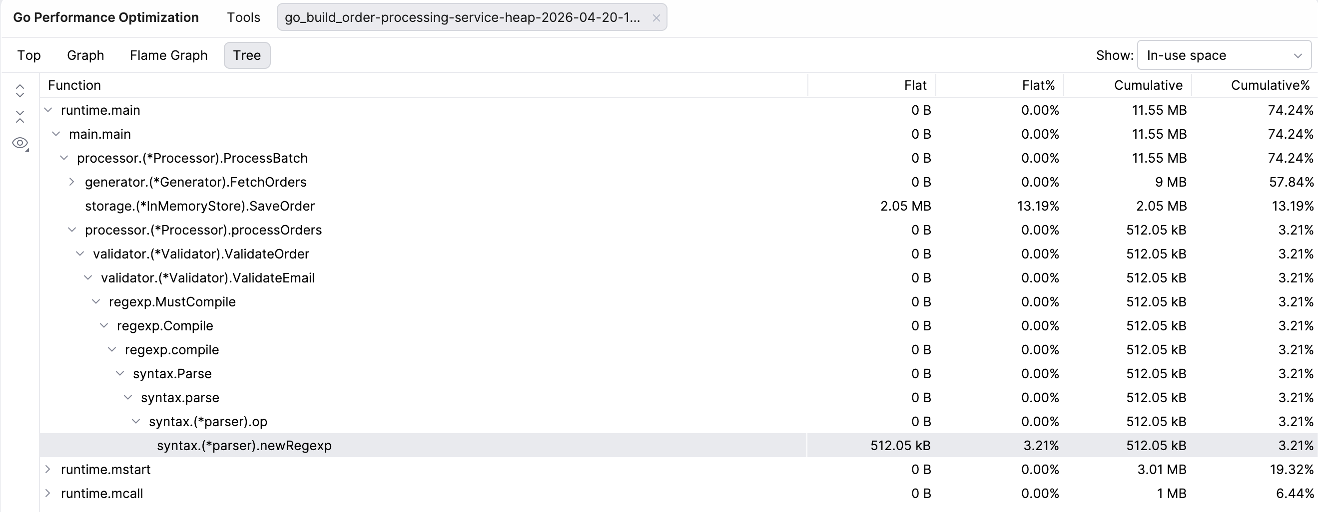
As is often the case with Go, the standard library comes with a great tool for profiling your programs – pprof. It samples your call stack, allowing you to later generate reports that help you analyze and visualize your software’s performance without installing any plugins. Everything you need is in the Go development kit.
The problem? It’s a bit of a hassle. In our discussions with Go developers, we’ve heard that some actually avoid it if they can. There could be a few reasons for this. For many developers, typical Go services perform well enough without optimizations, so when they do need to use profiling, it becomes a complex “rescue mission” tool they aren’t really experienced with. For some, the issue isn’t profiling in itself, but rather what to do with the results. Since pprof just shows developers a lot of low-level profiling data, it’s on them to make sense of it and find the root of the issue. On the other end of the spectrum, there are those who practice continuous profiling and use dedicated tools for it.
This article serves as a practical guide for those developers who would rather avoid dealing with Go’s confusing profiling tools. Profiling is incredibly useful – it helps you identify CPU bottlenecks, memory issues, and concurrency problems, all of which affect both your and your users’ experience with your product. So to help you make the best use of it, we will explain some of the main profiling types in Go (CPU, heap, allocs, mutex, block, and goroutine), as well as how to run and interpret them. And because you’re on the JetBrains blog, we’ll also show you how GoLand makes profiling as easy as pressing a single button. But first…
How does profiling work in Go?
Go profilers track program performance by sampling the call stack and additional data at either regular time intervals or upon specific runtime events, depending on the profile. They generate profile files that can then be analyzed using tools like the pprof CLI or its web interface, so you can see where your program spends time and memory. This helps you find functions that use unnecessary resources and slow down the program, without having to guess. For example, Go’s diagnostic documentation recommends profiling to identify expensive or frequently called code paths.
Types of profiles in Go
As mentioned in the intro, Go comes pre-equipped with a profiling tool called pprof, so you don’t need any external libraries. There are different things you can analyze with it, depending on your needs. The most popular profiles that we’ll be discussing in this article are:
CPU: Samples the call stack and tracks where CPU time was spent.
Memory(allocs / heap): Tracks allocations (total / currently in use) to show you where memory is being used.
Block: Tracks blocking events, showing you where goroutines were blocked.
Mutex: Captures which goroutines blocked other goroutines, revealing lock contention.
Goroutine: Takes snapshots of stack traces of goroutines to show you how many there are at the moment, and what they’re doing.
It’s perhaps worth mentioning here that Go also has the runtime/trace package – an execution tracer that records specific runtime events, capturing the timeline rather than snapshots. runtime/trace will not be covered in this article.
CPU
CPU profiling is often the first step when diagnosing performance issues in Go programs. It records where your program spends CPU time by periodically sampling the stack of the goroutines that are being executed.
It’s good for things like finding hot paths in CPU-bound code (e.g. expensive parsing, serialization, hashing, or tight loops), understanding why a benchmark is slower than expected under realistic load, investigating the root cause of a Grafana alert, or generating input for profile-guided optimization.
What this profile does not tell you is where your program spends time waiting on locks or the network. Since CPU profiling samples active execution, blocking and contention need other profiles, like the block and mutex ones described below. This means the actual running time of a goroutine will not match its execution time on the CPU.
Memory profiles – heap and allocs
The memory profiles – heap and allocs – are perhaps the most confusing, even for seasoned Go developers. To clarify: heap and allocs are both types of memory profiling that give you insights into memory consumption, allocation patterns, and garbage collection (GC). Under the hood, both store the same data. The only difference is which sample type they present as the default.
The sampling types available in both profiles are:
inuse_space: The amount of memory (in bytes) that’s currently allocated and has not yet been garbage collected.
inuse_objects: The total number of individual objects currently on the heap.
alloc_space: The cumulative amount of memory (in bytes) allocated since the program started (including memory that has already been freed).
alloc_objects: The cumulative count of objects allocated since the program started (including those that have already been collected).
The heap profile shows inuse_space as the default view, and the allocs profile shows alloc_space. You can, however, switch between all four sampling types freely.
An important point about memory profiles is that they are sampled, not exact. Go’s A Guide to the Go Garbage Collector explains that, by default, these profiles only sample a subset of heap objects that’s good enough to find hotspots.
Another thing to remember is that memory profiles don’t actually cover all memory, as Go can allocate some values to the stack and outside the heap that’s managed by GC, depending on the outcome of escape analysis.
Block profile
The block profile shows you where goroutines are blocked waiting for synchronization primitives such as sync.Mutex, sync.RWMutex, sync.WaitGroup, sync.Cond, and channel send/receive/select. A block profile tracks blocking events, measures how long they last, and then aggregates them by stack trace once they are completed. It tells you where your program spent time waiting instead of doing useful work and helps you optimize inefficient synchronization patterns.
The block profile tracks two sample types:
Contentions: This shows the number of times a block event occurred (i.e. multiple goroutines attempted to access a shared resource simultaneously and only one could proceed).
Delay (latency): This shows the total time spent being blocked (i.e. the actual amount of time a goroutine spent in a blocked state before it could resume execution).
This is an important distinction because you can have low contention with high delay (and vice versa); for example, when only one goroutine waits for a lock, but it takes 10 seconds because the holder is performing a slow network call.
Block profiling is disabled by default in the Go runtime, as it introduces overhead. In production, you should enable block profiling only for very short periods and at a very long sampling interval to investigate known issues.
Mutex profile
In contrast to the block profile, the mutex profile captures goroutines that block other goroutines and focuses specifically on sync.Mutex and sync.RwMutex contention. You could say that, while the block profile tells you what is waiting, the mutex profile tells you what is causing the wait. Another significant difference is that mutex profiling uses event-based sampling rather than time-based sampling.
On the other hand, the mutex profile behaves similarly to the block profile in that it only records completed events and is also disabled by default. It also tracks two sample types – contentions and delay.
You should reach for a mutex profile when you think your application throughput or latency is being limited by lock contention. The Go diagnostic docs explicitly recommend using it when the CPU is not fully utilized because of mutex contention.
Goroutine profile
As the name would suggest, goroutine profiling helps you inspect how many goroutines exist in your program and what they’re doing at the moment by taking a snapshot of their stack traces. The goroutine profile helps you debug concurrency issues by identifying goroutine leaks or deadlocks as they are happening
In the context of block and mutex profiles, it’s critical to remember that the goroutine profile deals with current goroutines. Every entry in the profile shows the current function call stack, whether the goroutine is running, waiting, or blocked, and where it’s stuck (channel, mutex, I/O, etc.). The profile is exposed in net/http/pprof by default, which makes it the go-to choice for troubleshooting your program when it’s hanging or experiencing a pile-up.
That said, when you’re investigating problems with your program, it’s best to look at all three profiles – goroutine, block, and mutex – to get the full picture. For example, if you see a pile-up in the goroutine profile that shows multiple goroutines parked in sync.Mutex.Lock, the block profile will tell you which callers spent time blocked there, and the mutex profile will tell you which section made the wait expensive.
How to collect Go profiles
Now that we know what the main profiles in Go are, let’s see how you can collect and interpret them to actually improve your software.
There are different ways to collect the profiles – with runtime/pprof, net/http/pprof, and… GoLand. They all produce pprof-compatible profiles that you can then visualize with either go tool pprof or GoLand.
While the “traditional” ways are somewhat tedious, if you know how to run one profile, you know how to run the others – for the most part. We’ll go through the general steps and point out differences and exceptions where necessary.
And for those of you who have GoLand version 2026.1.2 or higher, we’ll show you how to run and inspect the profiles without having to remember any commands or a single line of code.
runtime/pprof
For explicit, code-controlled profiling, runtime/pprof is the way to go. For most applications, this is the most direct API:
import (
	"os"
	"runtime"
	"runtime/pprof"
)

func captureCPU() error {
	f, err := os.Create("cpu.pb.gz")
	if err != nil {
		return err
	}
	defer f.Close()

	if err := pprof.StartCPUProfile(f); err != nil {
		return err
	}
	defer pprof.StopCPUProfile()

	runLoad()
	return nil
}

func captureHeap() error {
	runtime.GC() // run GC first to capture only the most current objects
	f, err := os.Create("heap.pb.gz")
	if err != nil {
		return err
	}
	defer f.Close()
	return pprof.Lookup("heap").WriteTo(f, 0)
}

func captureAllocs() error {
	f, err := os.Create("allocs.pb.gz")
	if err != nil {
		return err
	}
	defer f.Close()
	return pprof.Lookup("allocs").WriteTo(f, 0)
}

func dumpGoroutines() error {
	return pprof.Lookup("goroutine").WriteTo(os.Stdout, 2)
}
As you can see, the CPU profile uses StartCPUProfile / StopCPUProfile. It has its own start/stop API because it streams during a time window – you turn it on, run the workload, and then stop it when it’s finished.
The heap profile captures data since the last GC, so you should call runtime.GC() before writing a profile. Forcing the GC will give you the most up-to-date stats, but there are some scenarios where you might want to avoid that.
For goroutine profile, text output is usually better than pprof graphs when you’re debugging a leak or a deadlock, hence pprof.Lookup("goroutine").WriteTo(os.Stdout, 2).
net/http/pprof
The standard choice for long-running services is net/http/pprof. You start by importing the package:
# CPU: 30-second profile
go tool pprof http://localhost:6060/debug/pprof/profile?seconds=30

# Live heap, forcing a GC first
go tool pprof http://localhost:6060/debug/pprof/heap?gc=1

# Total allocations since process start
go tool pprof http://localhost:6060/debug/pprof/allocs

# Block profile (only useful if SetBlockProfileRate was configured)
go tool pprof http://localhost:6060/debug/pprof/block

# Mutex profile (only useful if SetMutexProfileFraction was configured)
go tool pprof http://localhost:6060/debug/pprof/mutex

# Human-readable goroutine dump
curl http://localhost:6060/debug/pprof/goroutine?debug=2
For CPU, seconds=N means “record the CPU profile for N seconds”. The HTTP handler for CPU defaults to 30 seconds if you omit the parameter.
For heap, heap?gc=1 will run the GC, while heap and heap?gc=0 will not.
debug=1 switches the profile to text (with the exception of the CPU profile).
If you want a quick and easy way to take a look at the profiles, head straight to http://localhost:6060/debug/pprof – you’ll find an HTML index listing all the available profiles there.
Capturing profiles with GoLand
If you don’t work with profiles regularly, collecting them the traditional way usually requires you to look up the documentation or tutorials to first remember what, where, and when. That’s why, in GoLand 2026.1.2, we implemented a new profiler tool that makes it easier for you to both collect and inspect profiles – all from the comfort of your IDE.
The tool currently allows you to capture CPU, heap, allocs, goroutine, block, and mutex profiles, as well as view their imports.
Opening the profiler
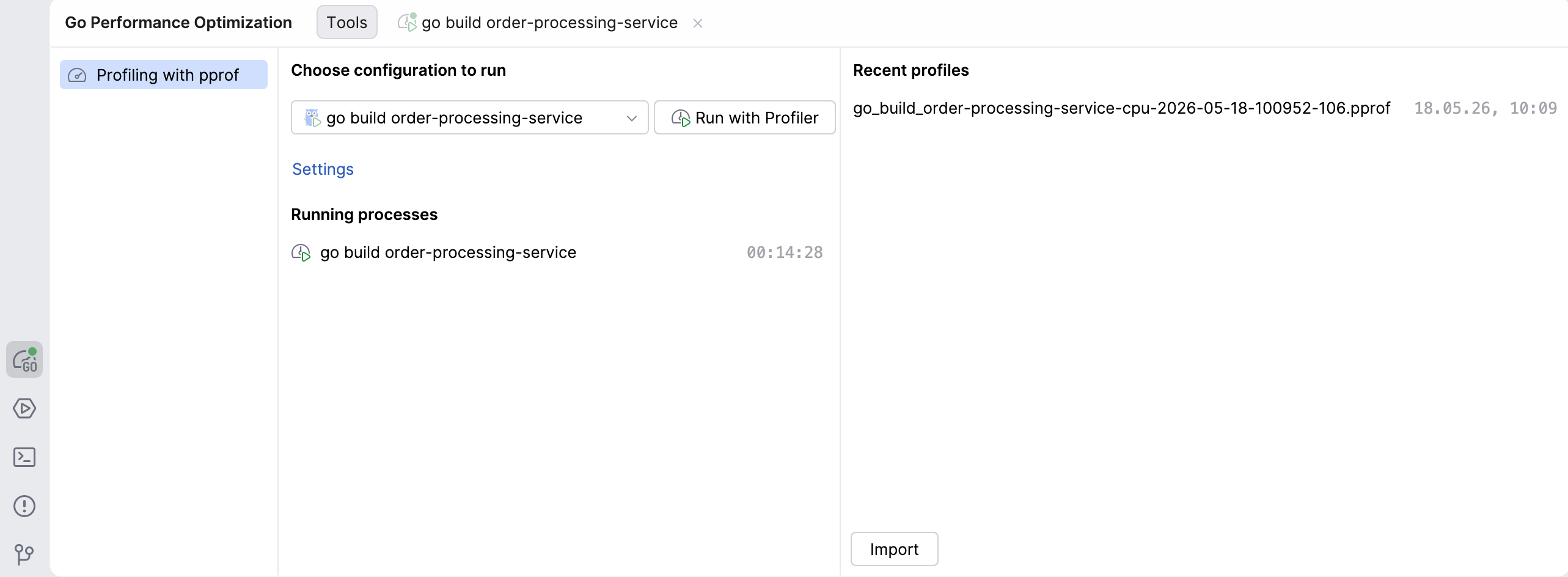
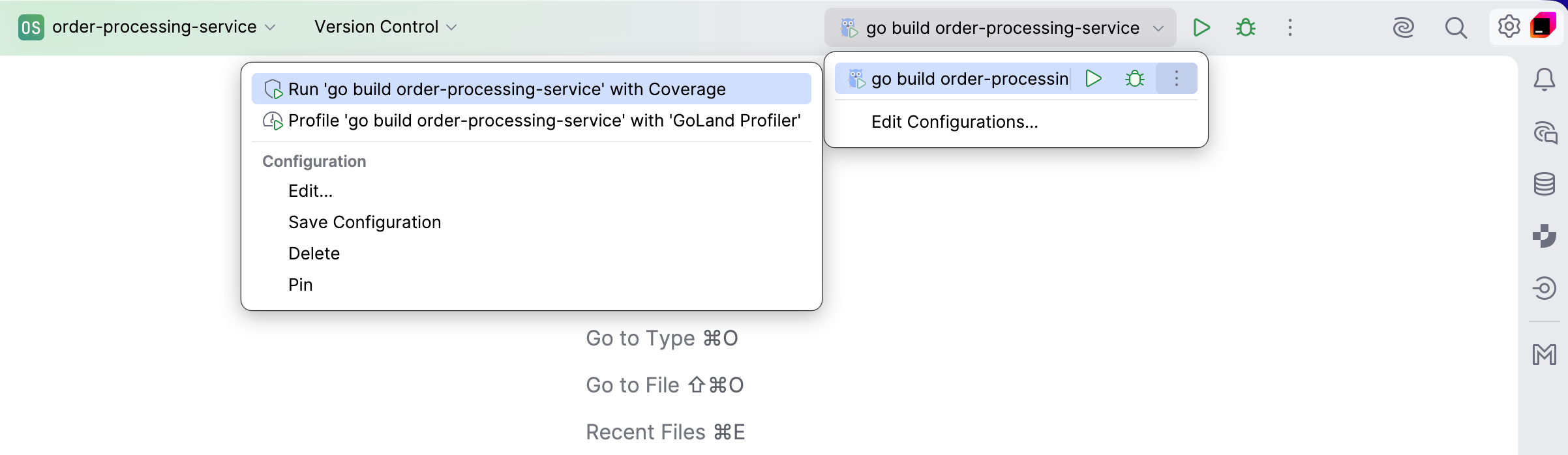
There are multiple ways to start the profiler tool.
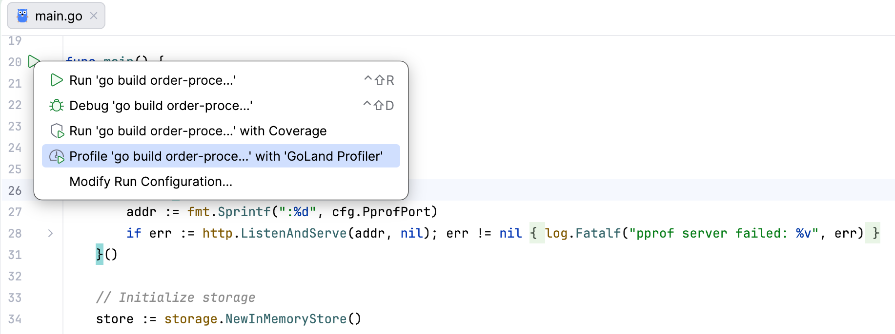
Go Performance Optimization tool window: In the tool window bar, you will see a new icon for the Go Performance Optimization tool, which is where profiling actions can be performed. From there, you can choose which configuration to run, view profiles you already captured, or import profiles captured by someone else.
Run widget: Now, in addition to running and debugging, this widget also includes an option to profile your program, available under the More Actions icon. Clicking on the Profile with… option will set up the process and open the Go Performance Optimization tool window.
Gutter icon: Wherever you see the run icon in the gutter, you can launch the profilertool from the dropdown that appears when you click on it.
Capturing profiles
Capturing profiles is pretty straightforward. To launch your program in profiling mode, click the Run with Profiler button – GoLand will set up the entire process for you. To capture the profile you’re interested in, simply click on the corresponding button.
An important caveat is that when profiling is initiated, GoLand modifies the executable during compilation to expose the required profiling API. Your code and your program will not be affected, but for that reason, the profiler can’t be attached to a program that’s currently running.
Capturing a CPU profile
Since a CPU profile is not collected continuously or by default, it works a little differently from the other profiles. In order to run it, you have to click Start CPU recording, let the profiler run for the desired amount of time, and then stop the recording to inspect the results.
Capturing a heap profile
GoLand allows you to capture a heap profile with or without forcing garbage collection first. Normally, the advice is to run the GC before collecting a heap profile since it reports memory stats as of the most recently completed GC cycle and skips more recent allocations to avoid skewing the profile toward short-lived garbage. Therefore, if you want to see the heap objects that are currently live, you should force GC first.
There are, however, scenarios where you don’t want that, and then it makes sense for you to collect the heap profile without GC:
You want to see the process in its natural state. Forcing GC changes the heap, GC pacing, and short-term memory behavior. If you want to see what the service looks like under normal load, avoid it.
You’re looking into allocation pressure or memory spikes. When you want to investigate how much work the GC has to actually do, forcing a cleanup will hide the “mess” that you’re trying to investigate.
You’re comparing the states before and after forced GC. If memory disappears after garbage collection, it was probably garbage that was waiting for collection or GC pacing. If it remains, you have retained objects.
Note that if you capture the heap profile with GC first, GoLand will actually force garbage collection, so capturing a heap profile without GC right after will likely not provide meaningful insights.
Importing and exporting profiles
The Profiler tool also allows you to open and view profiles captured by others (not necessarily using GoLand), as long as they’re in a pprof-compatible format. Simply drag and drop the file, or click the Import button in the Go Performance Optimization tool window and select the file from there.
Profiles captured with GoLand are pprof-compatible and stored in a designated directory. If you want to share a profile you captured in GoLand, go to Recent profiles and right-click on the one you want to share to reveal its location.
How to inspect profiles
Once you have a Go profile, inspection is mostly the same, no matter how it was collected, since go tool pprof can read either a saved file or a live HTTP URL.
In the terminal
If you have a saved profile file collected with runtime/pprof, you can access it in the terminal:
go tool pprof ./your-binary cpu.pb.gz
This will start pprof’s interactive shell in the terminal. The main text reports are top, list, tree, peek, and traces.
If you want a one-shot terminal report instead of an interactive shell, add a format flag:
go tool pprof -text ./your-binary cpu.pb.gz
go tool pprof -tree ./your-binary mutex.pb.gz
go tool pprof -peek='mypkg.(*Cache).Get' ./your-binary cpu.pb.gz
go tool pprof -list='mypkg.(*Cache).Get' ./your-binary cpu.pb.gz
This will print the report and exit the profile.
From the web interface
This is the easiest way if you want to see graphs and flame graphs, and move between top, peek, and source views.
# saved local profile
go tool pprof -http=localhost:8081 ./server cpu.pb.gz

# live profile from a running service, with the local binary for symbols/source
go tool pprof -http=localhost:8081 ./server
  'http://localhost:6060/debug/pprof/profile?seconds=30'
With -http=host:port, pprof starts a local web server and opens a browser. The web UI provides multiple views of the same profile:
Graph: Visualizes the call graph.
Flame Graph: Provides an interactive flame graph (the larger the node and the thicker the edge, the higher the resource consumption is).
Top: Lists the functions consuming the most resources in a table format.
Source: Displays source code annotated with resource consumption.
Peek: Provides a statistical peek at function samples.
Inspecting profiles with GoLand
Navigating between your code and different endpoints, as is the case with go tool pprof, can be quite distracting. The profiling tool in GoLand lets you see and manage everything related to profiling in one place – your IDE.
Once you collect or import your profiles, you will have access to views that you probably recognize from the web interface – (call) graph, flame graph, and top – as well as a tree view. You can access these views for all the profiles (CPU, heap, allocs, goroutine, block, and mutex) and select different sample types:
The CPU profile can show you either CPU time or samples.
The heap profile, by default, shows you in-use space, but it can also show in-use objects, allocated space, or allocated objects.
The allocs profile, by default, shows allocated space, but it can also show you everything that the heap profile does. That’s because these two are both representations of the same memory profile, which we discussed earlier.
Mutex and block both can show either contentions or delay.
The goroutine profile only has one sample type – number of goroutines – so there is no selector for that profile.
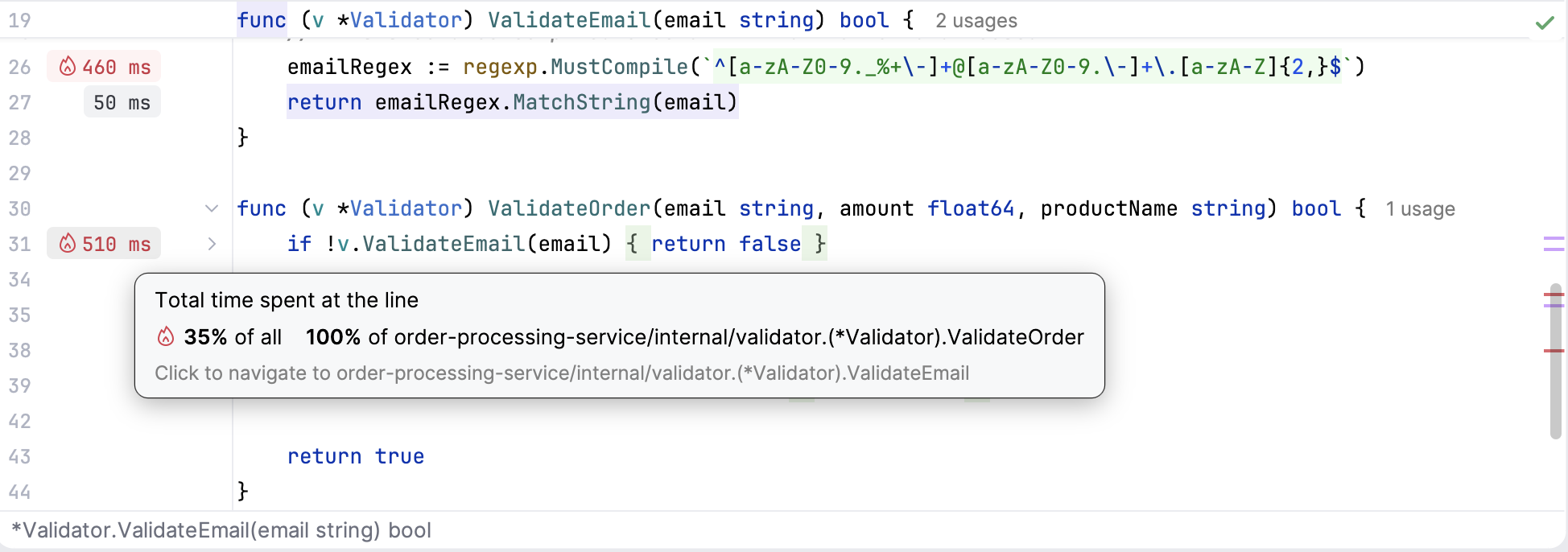
You can easily navigate directly to the relevant line of code from any of the views, simply by clicking on the relevant function. The tool will also highlight any hotspots in your code with a fire icon in the editor’s gutter.
Now that you know what profiles you can visualize, let’s discuss in more detail what the different views show and how to use them.
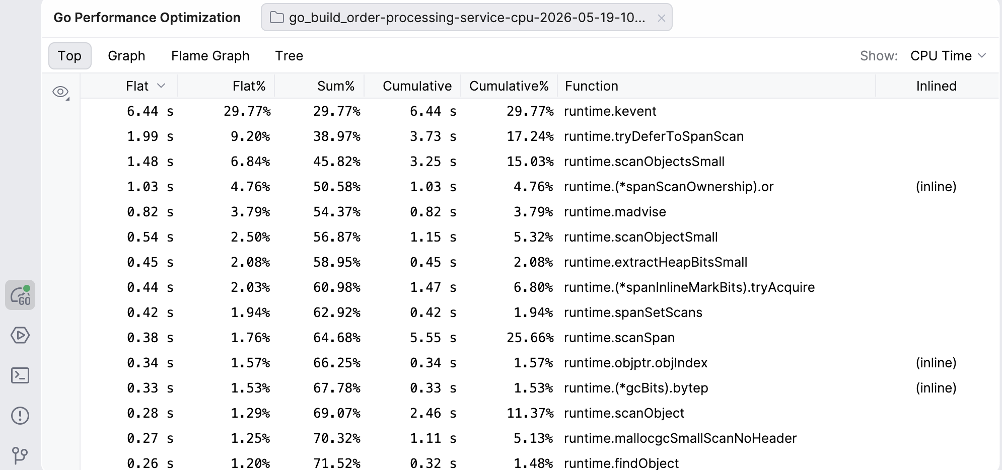
Top
The Top view shows you an ordered table of the top functions in the profile. The values in this view represent different units, depending on the profile (e.g. CPU time, memory bytes, or goroutine counts).
Flat and Flat%: The amount of the resource consumed directly by that function, excluding callees. Flat values tell you if the function itself is expensive.
Sum%: Running sum of Flat%.
Cumulative and Cumulative%: The total amount of the resource consumed by this function and everything it calls. This tells you if the function creates a lot of work overall.
By default, the functions in this view are ordered from the highest to lowest Flat. However, you can reorder the view however you like – clicking on any other header will make it the default for ordering, and clicking on the same header again will reverse the order.
Clicking on a function’s row will also take you to the relevant line of code in the editor.
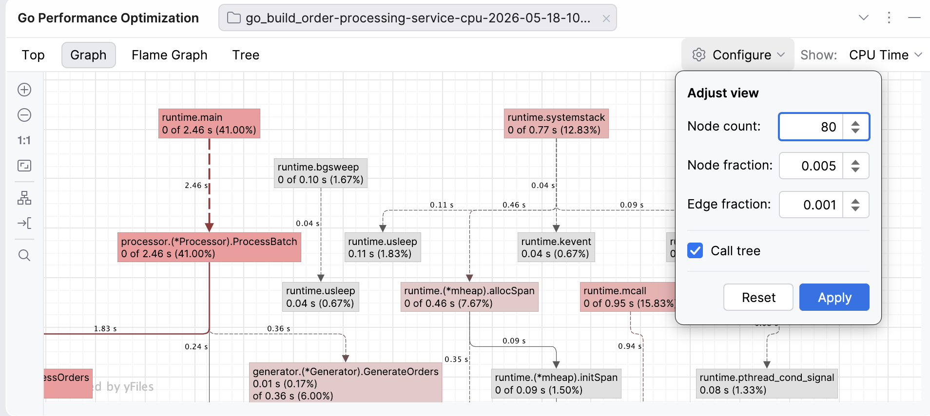
Graph
In the web interface, a call graph is the default way of visualizing the data as a network. We’ve taken efforts to make the Graph view more visually inviting and interactive.
The nodes of the graph are functions – the redder the box, the more resource-intensive the function. The edges are function calls labeled with how much data (e.g. CPU time or memory) flows in that call – the bolder and redder the arrow, the more resources the call consumes. The dashed lines represent paths through nodes that have been removed from view because of the graph settings (such as node count). You can move both the edges and the nodes to improve visibility if the graph looks too dense.
The Graph view in GoLand allows you to adjust the view to your needs by modifying the node and edge fractions:
Node count: Limits the number of nodes shown on the graph to the top N nodes. For example, if you set your node count to N=80, the graph will only show 80 nodes (regardless of the remaining settings). Visible nodes are determined by a special entropy-based algorithm from the pprof tool (for example, the algorithm favors nodes with high cumulative or flat values and diverse call patterns, while deprioritizing simple passthrough nodes).
Node fraction: Controls which nodes will be shown, based on how much of the total sample value a node accounts for. For example, if you set the node fraction to 0.01, the graph will only show functions responsible for 1% or more of the total samples. The smaller the value, the more detail you will see, but this may also lead to more clutter that will make it harder for you to notice hotspots.
Edge fraction: This setting works similarly to the node fraction, but controls which edges (the call paths between functions) are shown. For example, if you set it to 0.005, the graph will only show call edges that contribute 0.5% of the total samples.
Call tree: This toggle changes how the data is presented by showing the actual paths, which means the same function can appear multiple times in different contexts. By default, instead of a call tree, the graph shows a call graph, where functions are merged so there’s only one node per function.
If you look at the default graph and find it overwhelming, try increasing the fractions to see fewer nodes or edges, or reduce the node count. If you feel like important paths are missing, decrease the node or edge fractions.
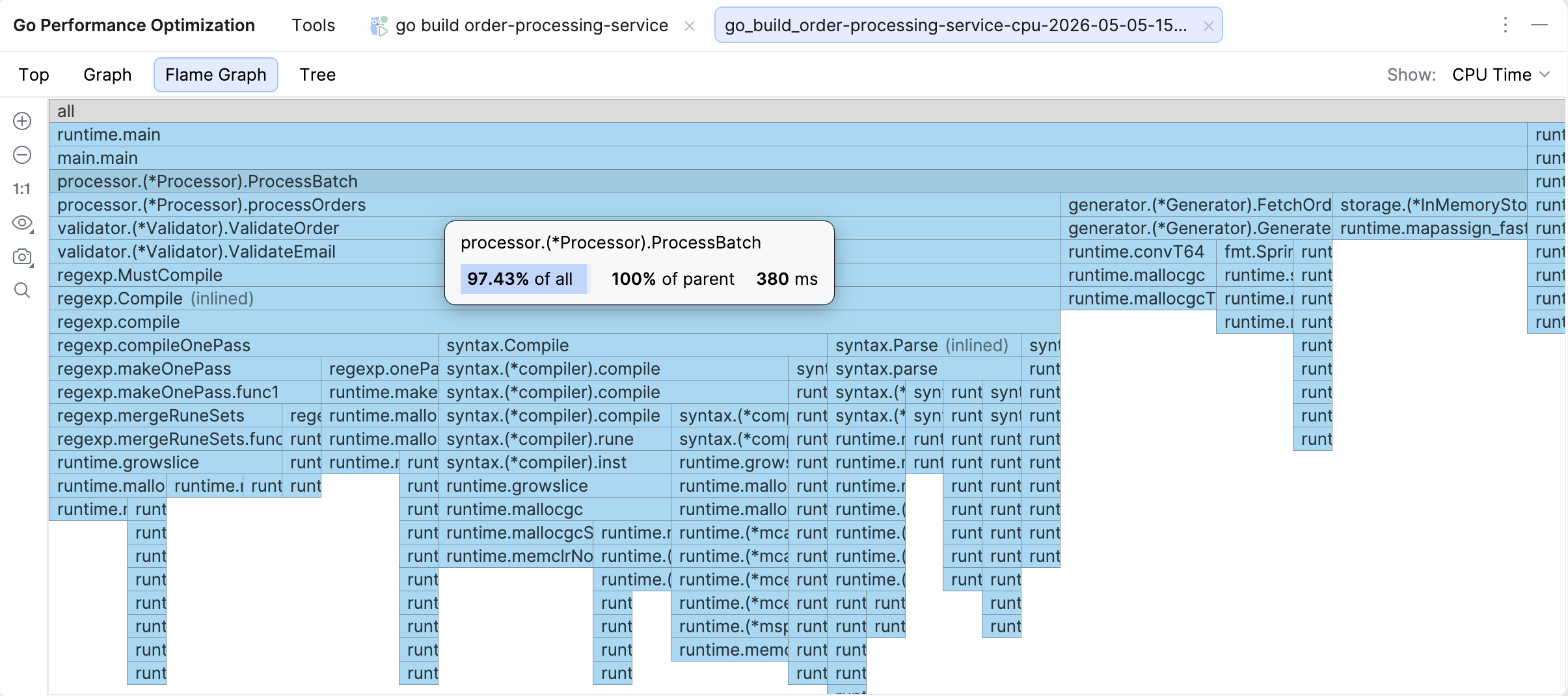
Flame graph
The Flame graph is the default view when you open a profile, as our research has established that this is the view developers access the most often.
A flame graph is a visualization of the call stack where cost is presented as width, i.e. the longer the bar, the more resources the function and its children are using. The height only signifies the depth of the call chain, so a tall but skinny tower will not be your culprit when it comes to resource consumption.
If you hover over a function, you will see the cumulative percentage (% of all), the share relative to the parent (% of parent), and cumulative value – the same data you can also see in Top and Tree views. Clicking on a function’s bar will take you to the relevant line of code, and if that function is hot, there will be a flame icon in the gutter.
Some other interesting functions in this view are:
Icicle graph: The flame graph by default is presented in an icicle view, i.e. main is at the top. You can uncheck that option to turn the view upside down.
Capture image: You can take a snapshot of the graph and save it or copy it to the clipboard.
Search: You can search for the function you’re interested in.
You can also try out the New Flame Graph view option for a more modern look and feel.
Tree
You can also see the Tree view. This view presents the same data as the Top view, but organizes all functions under their parent function, regardless of how resource-intensive they are.
Line profiler
The line profiler is an alternative to the -list command in pprof.
Once you run your program with the profiler tool, GoLand will add runtime hints near the corresponding lines of code right in the editor. Lines that took a significant amount of time to execute will have grey labels, while the most resource-intensive ones will be marked with red labels with a fire icon.
The connection works the other way round as well. You can navigate directly to a specific line of code in the editor from any of the profiling views, simply by clicking on the relevant function.
Why try GoLand’s profiler?
The profiler tool in GoLand makes profiling your software as easy as clicking a button. You no longer need to remember commands or additional steps. The entire process stays in your IDE, so you don’t have to jump between the editor and the browser, and you can easily check the problematic lines of code. We hope that both the new tool and this guide will take the guesswork out of profiling and help more developers make this code optimization technique a part of your daily work.
Years of productivity-focused design are now visible in the data.
Pragmatism has been central to Kotlin’s design from day one. The language prioritizes the developer’s convenience and productivity over academic purity or feature ambition.
Developers describe working in Kotlin in a fairly consistent way: more time spent on what you’re trying to build, less time on ceremony. There are fewer rituals to satisfy the compiler, and less boilerplate to write before getting to the part that matters. For years, the interesting question was whether that effect would also be visible at scale.
Now there is data. A recent JetBrains Research study measured the wall-clock cycle from first edit to push across roughly 28 million examples. On comparable work, Kotlin developers spent about 15%–20% less time than developers working in Java.
That gap matters even more right now, as more code is written by AI agents and developers spend more of their time reading, reviewing, and verifying code. We’ll come back to this at the end.
Productivity by design: A short history
Pragmatism becomes concrete when you look at the features it produces. Here are five examples from more than a decade of language and ecosystem design decisions.
Data classes
Some patterns repeat in every codebase. Value objects, DTOs, message envelopes, and configuration records – Kotlin captures these shapes in a single declaration.
data class User(val id: Long, val name: String, val email: String)
There’s one line, value-like behavior, and minimal boilerplate. You get equality, hashing, structural destructuring, toString(), and a copy() constructor automatically. Adding a field doesn’t mean rewriting six methods by hand.
Null safety
Kotlin’s type system tracks whether a value can be absent, and the compiler refuses to let you ignore the question. A whole category of runtime failures becomes compile-time feedback.
val length: Int = user?.profile?.email?.length ?: 0
A nullable chain is expressed in one line, and the compiler verifies every step. Missing values surface at compile time, not later in production.
The small wins
A handful of features quietly remove friction at every call site. Smart casts eliminate redundant typing once a type check has already happened. Named arguments with defaults make configuration readable without builder ceremony. Trailing lambdas turn block-based APIs into something that reads like ordinary control flow.
Each one is small. Together, they shape what a typical function looks like:
fun createUser(
    name: String,
    role: Role = Role.MEMBER,
    email: String? = null,
) = transaction {                       // trailing lambda
    val user = Users.insert(name, role, email)
    if (email != null) {                // smart cast: email is now String
        sendWelcome(email.lowercase())
    }
    user
}

createUser(name = "Anton", role = Role.ADMIN)   // named args + default
Three features compound into one short, readable function.
Coroutines and structured concurrency
Async work in Kotlin reads like ordinary code. suspend functions look sequential but execute concurrently, and structured concurrency ties every async operation to the scope that started it – so nothing escapes and runs in the background unnoticed.
DSLs as a first-class idiom
Productivity didn’t stop at the language. The same syntactic decisions – trailing lambdas, extension functions, type-safe builders – also enable a culture of IDE-aware DSLs across the ecosystem: Gradle build scripts, Compose UI, Ktor routing, Exposed SQL, and HTML and JSON builders. Each is a configuration surface the compiler understands as native code, not a separate format to memorize.
None of these is an isolated win. Each is the product of the same commitment to pragmatism. The rest of this post examines what that commitment looks like in aggregate.
The question stories couldn’t answer
Developers have described Kotlin this way for years: less ceremony and more time on the actual work. But description is not measurement. Whether the same effect would also show up in numbers, at a scale where one team’s opinion doesn’t dominate, is a different question.
Stories don’t scale, and self-reporting has known biases, including the obvious one: People who choose Kotlin want that choice to be justified. A quieter bias is that developers who tried Kotlin briefly and then went back may never be sampled. That’s the gap a study can close.
What the study found
In a recent study, the JetBrains Research team analyzed telemetry from IntelliJ IDEA Ultimate over a 20-month window, from November 2023 to June 2025, covering roughly 320,000 developers and 28 million development cycles. A cycle in this study is the wall-clock time from the first edit of a source file after a push to the next push on that file.
For small tasks (about ten minutes of editing), Kotlin cycles were on average about 15.7% shorter than Java cycles. For medium tasks (around half an hour), they were about 20.3% shorter. For large tasks (one and a half to two hours), they were about 15.1% shorter. In absolute terms, that’s a minute or two off a short fix, five to seven minutes off a medium one, and 15–20 minutes off a long one – repeated many times across a workday and a quarter. The same pattern held across task sizes and throughout the 20-month window.
The obvious questions are fair. Aren’t Kotlin and Java projects different sizes? Aren’t the developers at different experience levels? Aren’t some Kotlin teams just newer or better resourced than the Java ones they’re being compared to?
Significant effort went into ruling these factors out. The study compared the same developers before and after their migration from Java to Kotlin, against developers who stayed on Java over the same period – a longitudinal design that isolates the language change from team or project differences. Work was bucketed by task size, so the comparison did not pit a one-line tweak against a feature build. JDK version was used as a proxy for engineering culture, with the comparison run both with and without that control. The pattern held.
The full methodology – the longitudinal design, the controls, the validity checks, and the boundaries of what the study can and can’t claim – is in the JetBrains Research post. Everything from here on is how we, on the Kotlin side, read those results.
The bigger finding: Kotlin projects don’t slow down
A 15%–20% gap on individual tasks is real, but it isn’t the headline. The larger finding is in the trajectory. Looking at how the same kind of work changes shape over the lifetime of a project, the data tells a different story than the point-in-time numbers do.
In the study sample, Java projects slowed down over the 20-month window. Cycles became 9%–17% longer as codebases grew – across small, medium, and large tasks. The same pattern shows up in independent slices of the data: The longer a Java project ages, the more time the same kind of work takes. Kotlin projects barely showed that slowdown. Some Kotlin migrants even improved over the same period, working faster on comparable tasks at the end of the window than at the start.
This lines up with what we have heard for years from the maintainability side of the conversation: Kotlin code is easier to maintain. You can come back six months later and still understand what you wrote.
Until now, those reports lived alongside the productivity reports as separate observations. They increasingly look like the same finding from two angles.
Here is our reading of why this happens – explicitly ours, not a conclusion the study set out to prove. Kotlin code expresses intent more clearly than the equivalent Java code does. Types carry more information. Idioms are more uniform across teams and over time. Less of the work is encoded in patterns that the next reader has to reconstruct.
If that’s the right interpretation, the trajectory result makes sense. A codebase that stays readable doesn’t accumulate the kind of friction that slowly turns a 10-minute change into a 15-minute one. The difference may not be noticeable on day one. But at scale, the compounding effect is undeniable!
What this means in the age of AI
As AI-assisted authoring and agentic workflows become more common, developers are spending more time reviewing, integrating, rejecting, and adjusting code than writing it themselves. Even on teams that haven’t adopted agents wholesale, this shift is changing the distribution of daily activities. More of the developer’s job is deciding whether that code belongs.
Two well-established facts sit side by side. First, developers spend most of their time reading code rather than writing it. The 80/20 estimate is industry folklore for a reason – it shows up in studies, in retrospectives, in any honest accounting of how a workday is spent. Second, on comparable work, Kotlin developers move through their cycles meaningfully faster than Java developers do.
The reasonable interpretation is that the time saved is reading time. Reading is where most of the time goes, and Kotlin appears to make that faster.
In agentic workflows, this is more important. Code review of an AI-generated change is reading. Verifying that a proposed implementation does what it claims is reading. Integrating it into an existing system is reading. Rejecting a bad suggestion starts with reading. The proportion of a developer’s week spent typing has been falling for two decades, and it’s plummeting now. Time spent reading and understanding is doing the opposite.
Languages that let you read faster – and trust what you read – are far more compelling for modern software development.
Kotlin also carries more static guarantees out of the box. Non-nullability is enforced at the type level. Type narrowing happens automatically once you’ve checked a type. Sealed hierarchies plus exhaustive when expressions can answer “Did the agent miss a case?” questions at compile time. The same features that make Kotlin code faster to read also make it faster to verify mechanically, by the compiler before review, and by the human reviewer thereafter.
That kind of safety really pays off when you didn’t write the code yourself.
The productivity edge in the data was real before AI, and how software development is changing could make that edge more important than ever. The day-one gap, the trajectory advantage, and the agentic workflow case all point in the same direction.
Takeaway
For developers: The team conversation that’s been running on intuition for years now has numbers behind it. The next time the question comes up about whether Kotlin actually pays off for a Java team, you can ground your answer in concrete data.
For technical leaders: The quantitative case for a new JVM service is now visible. The smaller day-one effect and the larger trajectory effect both work in your favor. The second matters most for anything you expect to maintain beyond a year.
Pragmatism produced a language whose payoff compounds with time – and matters more, not less, as the developer’s role evolves.
Links:
JetBrains Research post – full methodology and caveats
Kotlin for backend – frameworks, deployment, and migration paths
At JetBrains, we believe that top talent knows no borders. Exceptional people can come from anywhere, and we are committed to building the best possible team by looking beyond geography.
That’s why we invest in international employee relocation support and help colleagues move across borders to join our global teams.
Last year, over 90 colleagues (plus their families and pets) relocated with the help of JetBrains. Most of whom rated their experience as smooth or very smooth, a testament to the care, adaptability, and commitment of our global team.
Relocating to a new country is both exciting and overwhelming, a moment filled with possibility, questions, and more than a few forms to fill out. We understand that moving your life across borders takes courage, trust, and support. We’re committed to making the experience as smooth as possible for every colleague who chooses to build their next chapter with us.
This guide explains how relocation with JetBrains works, what support we provide, and what international hires can expect during the process.
*Disclaimer: Every relocation journey is unique. The exact process varies depending on the person’s nationality, family situation, and both the departure and destination countries. What follows is a general overview of the JetBrains relocation process, not a strict template.
What relocation support does JetBrains provide?
Starting a new role is already a big step. Doing it while navigating a new country can feel like an even bigger one. That’s why we approach your relocation as a shared journey, not just another task.
Our relocation specialists and HR teams work closely with every newcomer to help remove friction wherever possible. They coordinate the logistics, explain the process, and stay connected long after the move is complete. Our onboarding team steps in next, offering office tours, welcome events, and an onboarding buddy system that helps new colleagues start building community from day one.
As one relocation specialist explained:
“We want people to focus on their new role, not bureaucracy. If we can make someone’s first weeks calmer and easier, that’s already a success.”
The JetBrains relocation process step by step
1. After the offer: getting oriented
Once a candidate accepts an offer, a relocation specialist reaches out to introduce the process, share guides and timelines, and schedule an initial call. We also provide access to the relocation onboarding landing page, which helps newcomers navigate the first steps.
Depending on the destination country and nationality, we typically start with the immigration process:
Work permit applications
Visa applications
Residence permit support
Document collection and verification
Translations and apostilles
These early phases can take the most time, and patience is often part of the journey.
2. Preparing for the move
As the relocation date approaches, we help coordinate practical logistics based on the relocation package offered in each location.
Household goods shipment (usually happens one month before relocation)
Booking temporary accommodation for your first month in your new location
Booking flight tickets and airport transfers
3. Arrival: bureaucracy, basics, and settling in
The first days after arrival are often about practicalities:
Registering at the municipality
Visiting authorities to finalize residence permits
Opening a bank account
Signing up for insurance or obtaining local tax IDs
This part can be intimidating, especially in a new language, but our specialists guide colleagues through what to expect and how to prepare.
4. Finding a home and starting your new life
Once the essentials are in place, newcomers begin looking for permanent housing, receiving their shipped belongings, and setting up utilities.
For families, this phase can also include searching for daycares or schools.
And through it all, whether the question is:
“How do I exchange my driver’s license?” or “What does this letter from the municipality mean?”
our team stays available to assist you.
Who guides you through the process?
Depending on the destination, relocation is coordinated by:
Local relocation specialists
Local HR Team
External relocation agencies (in countries without a dedicated specialist)
In every case, someone remains your main point of contact, making sure you never feel alone in the process.
How long does relocation take?
It varies widely. For most people, the entire journey takes 2–4 months, depending on immigration requirements and the time required to collect documents.
Support you can count on
A warm welcome from the relocation specialist
Onboarding events and office tours
A buddy system for informal support
Local communities and colleague networks
Language classes in some locations
A dedicated Slack channel for all your questions as you settle into a new country
Unexpected positives that newcomers often mention
Feeling more independent than expected
Discovering how international and helpful local JetBrains teams are
Realizing how quickly a new place can start to feel like home
Advice for future relocators
If you’re preparing to move for the first time, these insights can help:
1. Set the right expectations Learn about net salary, cost of living, and the housing market early. Understanding the practical realities makes everything easier.
2. Talk to others who’ve done it Colleagues who already live in your future country can share honest, everyday insights.
3. Ask questions, lots of them Relocation specialists are here to help you understand processes, requirements, and local norms.
4. Give yourself emotional space Relocation is exciting, but also exhausting. It’s normal to need time to adjust.
Why our Relocation team does this work
When you ask our Relocation team what they love most about their roles, the answer is always personal.
“Being able to make an impact in someone’s life and well-being, that’s the most rewarding part. Relocation can be overwhelming at the start. Knowing you helped make it a little easier means everything.”
Final thoughts
Relocating isn’t only about packing boxes. It’s about beginning something new, in a different culture, with new opportunities, rhythms, and communities.
At JetBrains, we’re proud to support employees through every stage of that transition. Our goal is to make relocation with JetBrains feel as manageable, transparent, and human as possible.
Interested in relocating with JetBrains? Explore our open roles, global office locations, and international relocation opportunities to learn more about joining our teams around the world.