Support open source this Giving Tuesday: Help sustain the technologies you use every day

Support open source this Giving Tuesday: Help sustain the technologies you use every day

For more than a decade, Giving Tuesday has been a global day of generosity, a day when people come together to give, collaborate, and this year, the Eclipse Foundation is proud to participate by highlighting widely used open source software that powers your digital life.

Open source technologies, from developer tools to infrastructure powering global industries, form the backbone of modern innovation. Yet, this vital ecosystem doesn’t sustain itself. It requires continuous investment in services, security, compliance, and community development

This Giving Tuesday (2 December), we are inviting everyone who benefits from open source, developers, enterprises, startups, students, researchers, and tech enthusiasts, to give back to the tools that have supported your work all year  

Your 1€ makes a difference: Here is why.

Imagine this: The most-used Eclipse Foundation projects receive millions of downloads every single day. If we could get just €1 per download this Giving Tuesday, we could secure and sustain these essential technologies for years to come.


Your contribution is direct and meaningful: 

Your gift helps ensure the securityinnovation, and longevity of widely used open source projects. This Giving Tuesday, you can directly support the tools that have supported your work all year.

Don’t wait. Become a sponsor today: Support open source now!

Join a global movement

When you become a sponsor, you’re joining a worldwide network of people committed to keeping open source secure, innovative, and accessible. Your support helps maintain the tools and technologies that developers rely on year-round.

Flexible Giving, Real Impact: 

  • No minimum commitment:  Every contribution, big or small, has a real and lasting impact.
  • Global access with multicurrency options: With flexible giving options in multiple currencies, contributors from around the world can easily support the projects they depend on.

Whether you choose a one-time gift or set up recurring support, your sponsorship directly helps maintain the technologies that keep the digital ecosystem moving forward.

 Three Ways to Give Back This Giving Tuesday

  1. Become a sponsor today Make a one-time or recurring donation to directly support our infrastructure and services.
  2. Learn more about our sponsorship programUnderstand the full scope of our work and where your support goes.
  3. Share the Message: Help us spread the word on social media and tag the Eclipse Foundation.

Thank you for helping keep open source strong, secure, and thriving for everyone.

Carmen Delgado


Hashtag Jakarta EE #309

Hashtag Jakarta EE #309

Welcome to issue number three hundred and nine of Hashtag Jakarta EE!

I am currently in Ottawa with Tanja and Shabnam preparing JakartaOne Livestream 2025. This is the seventh edition of JakartaOne Livestream, so you would assume we know what to do at this point. Which I guess we do.

As previous years, I will be in Studio Jakarta EE with Shabnam and Tanja between the talks as hosts of the show. Check it out and make sure to register for the event so you have it in your calendar. And I hope to see as many as possible of you on Tuesday.

The last week, there was a ballot in the Jakarta EE Specification committee for a resolution about allowing the use of other namespaces, such as org.eclipse.microprofile, for Jakarta EE specifications. The resolution was voted down with 7 negative and only 3 positive votes. This was also the situation for the non-binding community votes which ended with 4 negative and only 1 positive vote. This result shows that the Jakarta EE Working group members and the community values the consistency of the Jakarta EE brand.

Ivar Grimstad


State, Logic, And Native Power: CSS Wrapped 2025

If I were to divide CSS evolutions into categories, we have moved far beyond the days when we simply asked for border-radius to feel like we were living in the future. We are currently living in a moment where the platform is handing us tools that don’t just tweak the visual layer, but fundamentally redefine how we architect interfaces. I thought the number of features announced in 2024 couldn’t be topped. I’ve never been so happily wrong.

The Chrome team’s “CSS Wrapped 2025” is not just a list of features; it is a manifesto for a dynamic, native web. As someone who has spent a couple of years documenting these evolutions — from defining “CSS5” eras to the intricacies of modern layout utilities — I find myself looking at this year’s wrap-up with a huge sense of excitement. We are seeing a shift towards “Optimized Ergonomics” and “Next-gen interactions” that allow us to stop fighting the code and start sculpting interfaces in their natural state.

In this article, you can find a comprehensive look at the standout features from Chrome’s report, viewed through the lens of my recent experiments and hopes for the future of the platform.

The Component Revolution: Finally, A Native Customizable Select

For years, we have relied on heavy JavaScript libraries to style dropdowns, a “decades-old problem” that the platform has finally solved. As I detailed in my deep dive into the history of the customizable select (and related articles), this has been a long road involving Open UI, bikeshedding names like <selectmenu> and <selectlist>, and finally landing on a solution that re-uses the existing <select> element.

The introduction of appearance: base-select is a strong foundation. It allows us to fully customize the <select> element — including the button and the dropdown list (via ::picker(select)) — using standard CSS. Crucially, this is built with progressive enhancement in mind. By wrapping our styles in a feature query, we ensure a seamless experience across all browsers.

We can opt in to this new behavior without breaking older browsers:

select {
  /* Opt-in for the new customizable select */
  @supports (appearance: base-select) {
    &, &::picker(select) {
      appearance: base-select;
    }
  }
}

The fantastic addition to allow rich content inside options, such as images or flags, is a lot of fun. We can create all sorts of selects nowadays:

  • Demo: I created a Poké-adventure demo showing how the new <selectedcontent> element can clone rich content (like a Pokéball icon) from an option directly into the button.

See the Pen A customizable select with images inside of the options and the selectedcontent [forked] by utilitybend.

See the Pen A customizable select with only pseudo-elements [forked] by utilitybend.

See the Pen An actual Select Menu with optgroups [forked] by utilitybend.

This feature alone signals a massive shift in how we will build forms, reducing dependencies and technical debt.

Scroll Markers And The Death Of The JavaScript Carousel

Creating carousels has historically been a friction point between developers and clients. Clients love them, developers dread the JavaScript required to make them accessible and performant. The arrival of ::scroll-marker and ::scroll-button() pseudo-elements changes this dynamic entirely.

These features allow us to create navigation dots and scroll buttons purely with CSS, linked natively to the scroll container. As I wrote on my blog, this was Love at first slide. The ability to create a fully functional, accessible slider without a single line of JavaScript is not just convenient; it is a triumph for performance. There were some accessibility concerns around this feature, and even though these were really valid, I’m sure it’s up to us developers to make it work. The good thing is, all these UI changes are making it a lot easier than custom DOM manipulation and dragging around aria tags, but I digress…

We can now group markers automatically using scroll-marker-group and style the buttons using anchor positioning to place them exactly where we want.

.carousel {
  overflow-x: auto;
  scroll-marker-group: after; /* Creates the container for dots */

  /* Create the buttons */
  &::scroll-button(inline-end),
  &::scroll-button(inline-start) {
    content: " ";
    position: absolute;
    /* Use anchor positioning to center them */
    position-anchor: --carousel;
    top: anchor(center);
  }

  /* Create the markers on the children */
  div {
    &::scroll-marker {
      content: " ";
      width: 24px;
      border-radius: 50%;
      cursor: pointer;
    }
    /* Highlight the active marker */
    &::scroll-marker:target-current {
      background: white;
    }
  }
}

See the Pen Carousel Pure HTML and CSS [forked] by utilitybend.

See the Pen Webshop slick slider remake in CSS [forked] by utilitybend.

State Queries: Sticky Thing Stuck? Snappy Thing Snapped?

For a long time, we have lacked the ability to know if a “sticky thing is stuck” or if a “snappy item is snapped” without relying on IntersectionObserver hacks. Chrome 133 introduced scroll-state queries, allowing us to query these states declaratively.

By setting container-type: scroll-state, we can now style children based on whether they are stuck, snapped, or overflowing. This is a massive “quality of life” improvement that I have been eagerly waiting for since CSS Day 2023. It has even evolved a lot since we can also see the direction of the scroll, lovely!

For a simple example: we can finally apply a shadow to a header only when it is actually sticking to the top of the viewport:

.header-container {
  container-type: scroll-state;
  position: sticky;
  top: 0;

  header {
    transition: box-shadow 0.5s ease-out;
    /* The query checks the state of the container */
    @container scroll-state(stuck: top) {
      box-shadow: rgba(0, 0, 0, 0.6) 0px 12px 28px 0px;
    }
  }
}
  • Demo: A sticky header that only applies a shadow when it is actually stuck.

See the Pen Sticky headers with scroll-state query, checking if the sticky element is stuck [forked] by utilitybend.

  • Demo: A Pokémon-themed list that uses scroll-state queries combined with anchor positioning to move a frame over the currently snapped character.

See the Pen Scroll-state query to check which item is snapped with CSS, Pokemon version [forked] by utilitybend.

Optimized Ergonomics: Logic In CSS

The “Optimized Ergonomics” section of CSS Wrapped highlights features that make our workflows more intuitive. Three features stand out as transformative for how we write logic:

  1. if() Statements
    We are finally getting conditionals in CSS. The if() function acts like a ternary operator for stylesheets, allowing us to apply values based on media, support, or style queries inline. This reduces the need for verbose @media blocks for single property changes.
  2. @function functions
    We can finally move some logic to a different place, resulting in some cleaner files, a real quality of life feature.
  3. sibling-index() and sibling-count()
    These tree-counting functions solve the issue of staggering animations or styling items based on list size. As I explored in Styling siblings with CSS has never been easier, this eliminates the need to hard-code custom properties (like --index: 1) in our HTML.

Example: Calculating Layouts

We can now write concise mathematical formulas. For example, staggering an animation for cards entering the screen becomes trivial:

.card-container > * {
  animation: reveal 0.6s ease-out forwards;
  /* No more manual --index variables! */
  animation-delay: calc(sibling-index() * 0.1s);
}

I even experimented with using these functions along with trigonometry to place items in a perfect circle without any JavaScript.

See the Pen Stagger cards using sibling-index() [forked] by utilitybend.

  • Demo: Placing items in a perfect circle using sibling-index, sibling-count, and the new CSS @function feature.

See the Pen The circle using sibling-index, sibling-count and functions [forked] by utilitybend.

My CSS To-Do List: Features I Can’t Wait To Try

While I have been busy sculpting selects and transitions, the “CSS Wrapped 2025” report is packed with other goodies that I haven’t had the chance to fire up in CodePen yet. These are high on my list for my next experiments:

Anchored Container Queries

I used CSS Anchor Positioning for the buttons in my carousel demo, but “CSS Wrapped” highlights an evolution of this: Anchored Container Queries. This solves a problem we’ve all had with tooltips: if the browser flips the tooltip from top to bottom because of space constraints, the “arrow” often stays pointing the wrong way. With anchored container queries (@container anchored(fallback: flip-block)), we can style the element based on which fallback position the browser actually chose.

Nested View Transition Groups

View Transitions have been a revolution, but they came with a specific trade-off: they flattened the element tree, which often broke 3D transforms or overflow: clip. I always had a feeling that it was missing something, and this might just be the answer. By using view-transition-group: nearest, we can finally nest transition groups within each other.

This allows us to maintain clipping effects or 3D rotations during a transition — something that was previously impossible because the elements were hoisted up to the top level.

.card img {
  view-transition-name: photo;
  view-transition-group: nearest; /* Keep it nested! */
}

Typography and Shapes

Finally, the ergonomist in me is itching to try Text Box Trim, which promises to remove that annoying extra whitespace above and below text content (the leading) to finally achieve perfect vertical alignment. And for the creative side, corner-shape and the shape() function are opening up non-rectangular layouts, allowing for “squaricles” and complex paths that respond to CSS variables. That being said, I can’t wait to have a design full of squircles!

A Hopeful Future

We are witnessing a world where CSS is becoming capable of handling logic, state, and complex interactions that previously belonged to JavaScript. Features like moveBefore (preserving DOM state for iframes/videos) and attr() (using types beyond strings for colors and grids) further cement this reality.

While some of these features are currently experimental or specific to Chrome, the momentum is undeniable. We must hope for continued support across all browsers through initiatives like Interop to ensure these capabilities become the baseline. That being said, having browser engines is just as important as having all these awesome features in “Chrome first”. These new features need to be discussed, tinkered with, and tested before ever landing in browsers.

It is a fantastic moment to get into CSS. We are no longer just styling documents; we are crafting dynamic, ergonomic, and robust applications with a native toolkit that is more powerful than ever.

Let’s get going with this new era and spread the word.

This is CSS Wrapped!

How UX Professionals Can Lead AI Strategy

Your senior management is excited about AI. They’ve read the articles, attended the webinars, and seen the demos. They’re convinced that AI will transform your organization, boost productivity, and give you a competitive edge.

Meanwhile, you’re sitting in your UX role wondering what this means for your team, your workflow, and your users. You might even be worried about your job security.

The problem is that the conversation about how AI gets implemented is happening right now, and if you’re not part of it, someone else will decide how it affects your work. That someone probably doesn’t understand user experience, research practices, or the subtle ways poor implementation can damage the very outcomes management hopes to achieve.

You have a choice. You can wait for directives to come down from above, or you can take control of the conversation and lead the AI strategy for your practice.

Why UX Professionals Must Own the AI Conversation

Management sees AI as efficiency gains, cost savings, competitive advantage, and innovation all wrapped up in one buzzword-friendly package. They’re not wrong to be excited. The technology is genuinely impressive and can deliver real value.

But without UX input, AI implementations often fail users in predictable ways:

  • They automate tasks without understanding the judgment calls those tasks require.
  • They optimize for speed while destroying the quality that made your work valuable.

Your expertise positions you perfectly to guide implementation. You understand users, workflows, quality standards, and the gap between what looks impressive in a demo and what actually works in practice.

Use AI Momentum to Advance Your Priorities

Management’s enthusiasm for AI creates an opportunity to advance priorities you’ve been fighting for unsuccessfully. When management is willing to invest in AI, you can connect those long-standing needs to the AI initiative. Position user research as essential for training AI systems on real user needs. Frame usability testing as the validation method that ensures AI-generated solutions actually work.

How AI gets implemented will shape your team’s roles, your users’ experiences, and your organization’s capability to deliver quality digital products.

Your Role Isn’t Disappearing (It’s Evolving)

Yes, AI will automate some of the tasks you currently do. But someone needs to decide which tasks get automated, how they get automated, what guardrails to put in place, and how automated processes fit around real humans doing complex work.

That someone should be you.

Think about what you already do. When you conduct user research, AI might help you transcribe interviews or identify themes. But you’re the one who knows which participant hesitated before answering, which feedback contradicts what you observed in their behavior, and which insights matter most for your specific product and users.

When you design interfaces, AI might generate layout variations or suggest components from your design system. But you’re the one who understands the constraints of your technical platform, the political realities of getting designs approved, and the edge cases that will break a clever solution.

Your future value comes from the work you’re already doing:

  • Seeing the full picture.
    You understand how this feature connects to that workflow, how this user segment differs from that one, and why the technically correct solution won’t work in your organization’s reality.
  • Making judgment calls.
    You decide when to follow the design system and when to break it, when user feedback reflects a real problem versus a feature request from one vocal user, and when to push back on stakeholders versus find a compromise.
  • Connecting the dots.
    You translate between technical constraints and user needs, between business goals and design principles, between what stakeholders ask for and what will actually solve their problem.

AI will keep getting better at individual tasks. But you’re the person who decides which solution actually works for your specific context. The people who will struggle are those doing simple, repeatable work without understanding why. Your value is in understanding context, making judgment calls, and connecting solutions to real problems.

Step 1: Understand Management’s AI Motivations

Before you can lead the conversation, you need to understand what’s driving it. Management is responding to real pressures: cost reduction, competitive pressure, productivity gains, and board expectations.

Speak their language. When you talk to management about AI, frame everything in terms of ROI, risk mitigation, and competitive advantage. “This approach will protect our quality standards” is less compelling than “This approach reduces the risk of damaging our conversion rate while we test AI capabilities.”

Separate hype from reality. Take time to research what AI capabilities actually exist versus what’s hype. Read case studies, try tools yourself, and talk to peers about what’s actually working.

Identify real pain points AI might legitimately address in your organization. Maybe your team spends hours formatting research findings, or accessibility testing creates bottlenecks. These are the problems worth solving.

Step 2: Audit Your Current State and Opportunities

Map your team’s work. Where does time actually go? Look at the past quarter and categorize how your team spent their hours.

Identify high-volume, repeatable tasks versus high-judgment work. Repeatable tasks are candidates for automation. High-judgment work is where you add irreplaceable value.

Also, identify what you’ve wanted to do but couldn’t get approved. This is your opportunity list. Maybe you’ve wanted quarterly usability tests, but only get budget annually. Write these down separately. You’ll connect them to your AI strategy in the next step.

Spot opportunities where AI could genuinely help:

  • Research synthesis: AI can help organize and categorize findings.
  • Analyzing user behavior data: AI can process analytics and session recordings to surface patterns you might miss.
  • Rapid prototyping: AI can quickly generate testable prototypes, speeding up your test cycles.

Step 3: Define AI Principles for Your UX Practice

Before you start forming your strategy, establish principles that will guide every decision.

Set non-negotiables. User privacy, accessibility, and human oversight of significant decisions. Write these down and get agreement from leadership before you pilot anything.

Define criteria for AI use. AI is good at pattern recognition, summarization, and generating variations. AI is poor at understanding context, making ethical judgments, and knowing when rules should be broken.

Define success metrics beyond efficiency. Yes, you want to save time. But you also need to measure quality, user satisfaction, and team capability. Build a balanced scorecard that captures what actually matters.

Create guardrails. Maybe every AI-generated interface needs human review before it ships. These guardrails prevent the obvious disasters and give you space to learn safely.

Step 4: Build Your AI-in-UX Strategy

Now you’re ready to build the actual strategy you’ll pitch to leadership. Start small with pilot projects that have a clear scope and evaluation criteria.

Connect to business outcomes management cares about. Don’t pitch “using AI for research synthesis.” Pitch “reducing time from research to insights by 40%, enabling faster product decisions.”

Piggyback your existing priorities on AI momentum. Remember that opportunity list from Step 2? Now you connect those long-standing needs to your AI strategy. If you’ve wanted more frequent usability testing, explain that AI implementations need continuous validation to catch problems before they scale. AI implementations genuinely benefit from good research practices. You’re simply using management’s enthusiasm for AI as the vehicle to finally get resources for practices that should have been funded all along.

Define roles clearly. Where do humans lead? Where does AI assist? Where won’t you automate? Management needs to understand that some work requires human judgment and should never be fully automated.

Plan for capability building. Your team will need training and new skills. Budget time and resources for this.

Address risks honestly. AI could generate biased recommendations, miss important context, or produce work that looks good but doesn’t actually function. For each risk, explain how you’ll detect it and what you’ll do to mitigate it.

Step 5: Pitch the Strategy to Leadership

Frame your strategy as de-risking management’s AI ambitions, not blocking them. You’re showing them how to implement AI successfully while avoiding the obvious pitfalls.

Lead with outcomes and ROI they care about. Put the business case up front.

Bundle your wish list into the AI strategy. When you present your strategy, include those capabilities you’ve wanted but couldn’t get approved before. Don’t present them as separate requests. Integrate them as essential components. “To validate AI-generated designs, we’ll need to increase our testing frequency from annual to quarterly” sounds much more reasonable than “Can we please do more testing?” You’re explaining what’s required for their AI investment to succeed.

Show quick wins alongside a longer-term vision. Identify one or two pilots that can show value within 30-60 days. Then show them how those pilots build toward bigger changes over the next year.

Ask for what you need. Be specific. You need a budget for tools, time for pilots, access to data, and support for team training.

Step 6: Implement and Demonstrate Value

Run your pilots with clear before-and-after metrics. Measure everything: time saved, quality maintained, user satisfaction, team confidence.

Document wins and learning. Failures are useful too. If a pilot doesn’t work out, document why and what you learned.

Share progress in management’s language. Monthly updates should focus on business outcomes, not technical details. “We’ve reduced research synthesis time by 35% while maintaining quality scores” is the right level of detail.

Build internal advocates by solving real problems. When your AI pilots make someone’s job easier, you create advocates who will support broader adoption.

Iterate based on what works in your specific context. Not every AI application will fit your organization. Pay attention to what’s actually working and double down on that.

Taking Initiative Beats Waiting

AI adoption is happening. The question isn’t whether your organization will use AI, but whether you’ll shape how it gets implemented.

Your UX expertise is exactly what’s needed to implement AI successfully. You understand users, quality, and the gap between impressive demos and useful reality.

Take one practical first step this week. Schedule 30 minutes to map one AI opportunity in your practice. Pick one area where AI might help, think through how you’d pilot it safely, and sketch out what success would look like.

Then start the conversation with your manager. You might be surprised how receptive they are to someone stepping up to lead this.

You know how to understand user needs, test solutions, measure outcomes, and iterate based on evidence. Those skills don’t change just because AI is involved. You’re applying your existing expertise to a new tool.

Your role isn’t disappearing. It’s evolving into something more strategic, more valuable, and more secure. But only if you take the initiative to shape that evolution yourself.

Further Reading On SmashingMag

Beyond The Black Box: Practical XAI For UX Practitioners

In my last piece, we established a foundational truth: for users to adopt and rely on AI, they must trust it. We talked about trust being a multifaceted construct, built on perceptions of an AI’s Ability, Benevolence, Integrity, and Predictability. But what happens when an AI, in its silent, algorithmic wisdom, makes a decision that leaves a user confused, frustrated, or even hurt? A mortgage application is denied, a favorite song is suddenly absent from a playlist, and a qualified resume is rejected before a human ever sees it. In these moments, ability and predictability are shattered, and benevolence feels a world away.

Our conversation now must evolve from the why of trust to the how of transparency. The field of Explainable AI (XAI), which focuses on developing methods to make AI outputs understandable to humans, has emerged to address this, but it’s often framed as a purely technical challenge for data scientists. I argue it’s a critical design challenge for products relying on AI. It’s our job as UX professionals to bridge the gap between algorithmic decision-making and human understanding.

This article provides practical, actionable guidance on how to research and design for explainability. We’ll move beyond the buzzwords and into the mockups, translating complex XAI concepts into concrete design patterns you can start using today.

De-mystifying XAI: Core Concepts For UX Practitioners

XAI is about answering the user’s question: “Why?” Why was I shown this ad? Why is this movie recommended to me? Why was my request denied? Think of it as the AI showing its work on a math problem. Without it, you just have an answer, and you’re forced to take it on faith. In showing the steps, you build comprehension and trust. You also allow for your work to be double-checked and verified by the very humans it impacts.

Feature Importance And Counterfactuals

There are a number of techniques we can use to clarify or explain what is happening with AI. While methods range from providing the entire logic of a decision tree to generating natural language summaries of an output, two of the most practical and impactful types of information UX practitioners can introduce into an experience are feature importance (Figure 1) and counterfactuals. These are often the most straightforward for users to understand and the most actionable for designers to implement.

Feature Importance

This explainability method answers, “What were the most important factors the AI considered?” It’s about identifying the top 2-3 variables that had the biggest impact on the outcome. It’s the headline, not the whole story.

Example: Imagine an AI that predicts whether a customer will churn (cancel their service). Feature importance might reveal that “number of support calls in the last month” and “recent price increases” were the two most important factors in determining if a customer was likely to churn.

Counterfactuals

This powerful method answers, “What would I need to change to get a different outcome?” This is crucial because it gives users a sense of agency. It transforms a frustrating “no” into an actionable “not yet.”

Example: Imagine a loan application system that uses AI. A user is denied a loan. Instead of just seeing “Application Denied,” a counterfactual explanation would also share, “If your credit score were 50 points higher, or if your debt-to-income ratio were 10% lower, your loan would have been approved.” This gives Sarah clear, actionable steps she can take to potentially get a loan in the future.

Using Model Data To Enhance The Explanation

Although technical specifics are often handled by data scientists, it’s helpful for UX practitioners to know that tools like LIME (Local Interpretable Model-agnostic Explanations) which explains individual predictions by approximating the model locally, and SHAP (SHapley Additive exPlanations) which uses a game theory approach to explain the output of any machine learning model are commonly used to extract these “why” insights from complex models. These libraries essentially help break down an AI’s decision to show which inputs were most influential for a given outcome.

When done properly, the data underlying an AI tool’s decision can be used to tell a powerful story. Let’s walk through feature importance and counterfactuals and show how the data science behind the decision can be utilized to enhance the user’s experience.

Now let’s cover feature importance with the assistance of Local Explanations (e.g., LIME) data: This approach answers, “Why did the AI make this specific recommendation for me, right now?” Instead of a general explanation of how the model works, it provides a focused reason for a single, specific instance. It’s personal and contextual.

Example: Imagine an AI-powered music recommendation system like Spotify. A local explanation would answer, “Why did the system recommend this specific song by Adele to you right now?” The explanation might be: “Because you recently listened to several other emotional ballads and songs by female vocalists.”

Finally, let’s cover the inclusion of Value-based Explanations (e.g. Shapley Additive Explanations (SHAP) data to an explanation of a decision: This is a more nuanced version of feature importance that answers, “How did each factor push the decision one way or the other?” It helps visualize what mattered, and whether its influence was positive or negative.

Example: Imagine a bank uses an AI model to decide whether to approve a loan application.

Feature Importance: The model output might show that the applicant’s credit score, income, and debt-to-income ratio were the most important factors in its decision. This answers what mattered.

Feature Importance with Value-Based Explanations (SHAP): SHAP values would take feature importance further based on elements of the model.

  • For an approved loan, SHAP might show that a high credit score significantly pushed the decision towards approval (positive influence), while a slightly higher-than-average debt-to-income ratio pulled it slightly away (negative influence), but not enough to deny the loan.
  • For a denied loan, SHAP could reveal that a low income and a high number of recent credit inquiries strongly pushed the decision towards denial, even if the credit score was decent.

This helps the loan officer explain to the applicant beyond what was considered, to how each factor contributed to the final “yes” or “no” decision.

It’s crucial to recognize that the ability to provide good explanations often starts much earlier in the development cycle. Data scientists and engineers play a pivotal role by intentionally structuring models and data pipelines in ways that inherently support explainability, rather than trying to bolt it on as an afterthought.

Research and design teams can foster this by initiating early conversations with data scientists and engineers about user needs for understanding, contributing to the development of explainability metrics, and collaboratively prototyping explanations to ensure they are both accurate and user-friendly.

XAI And Ethical AI: Unpacking Bias And Responsibility

Beyond building trust, XAI plays a critical role in addressing the profound ethical implications of AI*, particularly concerning algorithmic bias. Explainability techniques, such as analyzing SHAP values, can reveal if a model’s decisions are disproportionately influenced by sensitive attributes like race, gender, or socioeconomic status, even if these factors were not explicitly used as direct inputs.

For instance, if a loan approval model consistently assigns negative SHAP values to applicants from a certain demographic, it signals a potential bias that needs investigation, empowering teams to surface and mitigate such unfair outcomes.

The power of XAI also comes with the potential for “explainability washing.” Just as “greenwashing” misleads consumers about environmental practices, explainability washing can occur when explanations are designed to obscure, rather than illuminate, problematic algorithmic behavior or inherent biases. This could manifest as overly simplistic explanations that omit critical influencing factors, or explanations that strategically frame results to appear more neutral or fair than they truly are. It underscores the ethical responsibility of UX practitioners to design explanations that are genuinely transparent and verifiable.

UX professionals, in collaboration with data scientists and ethicists, hold a crucial responsibility in communicating the why of a decision, and also the limitations and potential biases of the underlying AI model. This involves setting realistic user expectations about AI accuracy, identifying where the model might be less reliable, and providing clear channels for recourse or feedback when users perceive unfair or incorrect outcomes. Proactively addressing these ethical dimensions will allow us to build AI systems that are truly just and trustworthy.

From Methods To Mockups: Practical XAI Design Patterns

Knowing the concepts is one thing; designing them is another. Here’s how we can translate these XAI methods into intuitive design patterns.

Pattern 1: The “Because” Statement (for Feature Importance)

This is the simplest and often most effective pattern. It’s a direct, plain-language statement that surfaces the primary reason for an AI’s action.

  • Heuristic: Be direct and concise. Lead with the single most impactful reason. Avoid jargon at all costs.

Example: Imagine a music streaming service. Instead of just presenting a “Discover Weekly” playlist, you add a small line of microcopy.

Song Recommendation: “Velvet Morning”
Because you listen to “The Fuzz” and other psychedelic rock.

Pattern 2: The “What-If” Interactive (for Counterfactuals)

Counterfactuals are inherently about empowerment. The best way to represent them is by giving users interactive tools to explore possibilities themselves. This is perfect for financial, health, or other goal-oriented applications.

  • Heuristic: Make explanations interactive and empowering. Let users see the cause and effect of their choices.

Example: A loan application interface. After a denial, instead of a dead end, the user gets a tool to determine how various scenarios (what-ifs) might play out (See Figure 1).

Pattern 3: The Highlight Reel (For Local Explanations)

When an AI performs an action on a user’s content (like summarizing a document or identifying faces in photos), the explanation should be visually linked to the source.

  • Heuristic: Use visual cues like highlighting, outlines, or annotations to connect the explanation directly to the interface element it’s explaining.

Example: An AI tool that summarizes long articles.

AI-Generated Summary Point:
Initial research showed a market gap for sustainable products.

Source in Document:
“…Our Q2 analysis of market trends conclusively demonstrated that no major competitor was effectively serving the eco-conscious consumer, revealing a significant market gap for sustainable products…”

Pattern 4: The Push-and-Pull Visual (for Value-based Explanations)

For more complex decisions, users might need to understand the interplay of factors. Simple data visualizations can make this clear without being overwhelming.

  • Heuristic: Use simple, color-coded data visualizations (like bar charts) to show the factors that positively and negatively influenced a decision.

Example: An AI screening a candidate’s profile for a job.

Why this candidate is a 75% match:

Factors pushing the score up:

  • 5+ Years UX Research Experience
  • Proficient in Python

Factors pushing the score down:

  • No experience with B2B SaaS

Learning and using these design patterns in the UX of your AI product will help increase the explainability. You can also use additional techniques that I’m not covering in-depth here. This includes the following:

  • Natural language explanations: Translating an AI’s technical output into simple, conversational human language that non-experts can easily understand.
  • Contextual explanations: Providing a rationale for an AI’s output at the specific moment and location, it is most relevant to the user’s task.
  • Relevant visualizations: Using charts, graphs, or heatmaps to visually represent an AI’s decision-making process, making complex data intuitive and easier for users to grasp.

A Note For the Front End: Translating these explainability outputs into seamless user experiences also presents its own set of technical considerations. Front-end developers often grapple with API design to efficiently retrieve explanation data, and performance implications (like the real-time generation of explanations for every user interaction) need careful planning to avoid latency.

Some Real-world Examples

UPS Capital’s DeliveryDefense

UPS uses AI to assign a “delivery confidence score” to addresses to predict the likelihood of a package being stolen. Their DeliveryDefense software analyzes historical data on location, loss frequency, and other factors. If an address has a low score, the system can proactively reroute the package to a secure UPS Access Point, providing an explanation for the decision (e.g., “Package rerouted to a secure location due to a history of theft”). This system demonstrates how XAI can be used for risk mitigation and building customer trust through transparency.

Autonomous Vehicles

These vehicles of the future will need to effectively use XAI to help their vehicles make safe, explainable decisions. When a self-driving car brakes suddenly, the system can provide a real-time explanation for its action, for example, by identifying a pedestrian stepping into the road. This is not only crucial for passenger comfort and trust but is a regulatory requirement to prove the safety and accountability of the AI system.

IBM Watson Health (and its challenges)

While often cited as a general example of AI in healthcare, it’s also a valuable case study for the importance of XAI. The failure of its Watson for Oncology project highlights what can go wrong when explanations are not clear, or when the underlying data is biased or not localized. The system’s recommendations were sometimes inconsistent with local clinical practices because they were based on U.S.-centric guidelines. This serves as a cautionary tale on the need for robust, context-aware explainability.

The UX Researcher’s Role: Pinpointing And Validating Explanations

Our design solutions are only effective if they address the right user questions at the right time. An explanation that answers a question the user doesn’t have is just noise. This is where UX research becomes the critical connective tissue in an XAI strategy, ensuring that we explain the what and how that actually matters to our users. The researcher’s role is twofold: first, to inform the strategy by identifying where explanations are needed, and second, to validate the designs that deliver those explanations.

Informing the XAI Strategy (What to Explain)

Before we can design a single explanation, we must understand the user’s mental model of the AI system. What do they believe it’s doing? Where are the gaps between their understanding and the system’s reality? This is the foundational work of a UX researcher.

Mental Model Interviews: Unpacking User Perceptions Of AI Systems

Through deep, semi-structured interviews, UX practitioners can gain invaluable insights into how users perceive and understand AI systems. These sessions are designed to encourage users to literally draw or describe their internal “mental model” of how they believe the AI works. This often involves asking open-ended questions that prompt users to explain the system’s logic, its inputs, and its outputs, as well as the relationships between these elements.

These interviews are powerful because they frequently reveal profound misconceptions and assumptions that users hold about AI. For example, a user interacting with a recommendation engine might confidently assert that the system is based purely on their past viewing history. They might not realize that the algorithm also incorporates a multitude of other factors, such as the time of day they are browsing, the current trending items across the platform, or even the viewing habits of similar users.

Uncovering this gap between a user’s mental model and the actual underlying AI logic is critically important. It tells us precisely what specific information we need to communicate to users to help them build a more accurate and robust mental model of the system. This, in turn, is a fundamental step in fostering trust. When users understand, even at a high level, how an AI arrives at its conclusions or recommendations, they are more likely to trust its outputs and rely on its functionality.

AI Journey Mapping: A Deep Dive Into User Trust And Explainability

By meticulously mapping the user’s journey with an AI-powered feature, we gain invaluable insights into the precise moments where confusion, frustration, or even profound distrust emerge. This uncovers critical junctures where the user’s mental model of how the AI operates clashes with its actual behavior.

Consider a music streaming service: Does the user’s trust plummet when a playlist recommendation feels “random,” lacking any discernible connection to their past listening habits or stated preferences? This perceived randomness is a direct challenge to the user’s expectation of intelligent curation and a breach of the implicit promise that the AI understands their taste. Similarly, in a photo management application, do users experience significant frustration when an AI photo-tagging feature consistently misidentifies a cherished family member? This error is more than a technical glitch; it strikes at the heart of accuracy, personalization, and even emotional connection.

These pain points are vivid signals indicating precisely where a well-placed, clear, and concise explanation is necessary. Such explanations serve as crucial repair mechanisms, mending a breach of trust that, if left unaddressed, can lead to user abandonment.

The power of AI journey mapping lies in its ability to move us beyond simply explaining the final output of an AI system. While understanding what the AI produced is important, it’s often insufficient. Instead, this process compels us to focus on explaining the process at critical moments. This means addressing:

  • Why a particular output was generated: Was it due to specific input data? A particular model architecture?
  • What factors influenced the AI’s decision: Were certain features weighted more heavily?
  • How the AI arrived at its conclusion: Can we offer a simplified, analogous explanation of its internal workings?
  • What assumptions the AI made: Were there implicit understandings of the user’s intent or data that need to be surfaced?
  • What the limitations of the AI are: Clearly communicating what the AI cannot do, or where its accuracy might waver, builds realistic expectations.

AI journey mapping transforms the abstract concept of XAI into a practical, actionable framework for UX practitioners. It enables us to move beyond theoretical discussions of explainability and instead pinpoint the exact moments where user trust is at stake, providing the necessary insights to build AI experiences that are powerful, transparent, understandable, and trustworthy.

Ultimately, research is how we uncover the unknowns. Your team might be debating how to explain why a loan was denied, but research might reveal that users are far more concerned with understanding how their data was used in the first place. Without research, we are simply guessing what our users are wondering.

Collaborating On The Design (How to Explain Your AI)

Once research has identified what to explain, the collaborative loop with design begins. Designers can prototype the patterns we discussed earlier—the “Because” statement, the interactive sliders—and researchers can put those designs in front of users to see if they hold up.

Targeted Usability & Comprehension Testing: We can design research studies that specifically test the XAI components. We don’t just ask, “Is this easy to use?” We ask, “After seeing this, can you tell me in your own words why the system recommended this product?” or “Show me what you would do to see if you could get a different result.” The goal here is to measure comprehension and actionability, alongside usability.

Measuring Trust Itself: We can use simple surveys and rating scales before and after an explanation is shown. For instance, we can ask a user on a 5-point scale, “How much do you trust this recommendation?” before they see the “Because” statement, and then ask them again afterward. This provides quantitative data on whether our explanations are actually moving the needle on trust.

This process creates a powerful, iterative loop. Research findings inform the initial design. That design is then tested, and the new findings are fed back to the design team for refinement. Maybe the “Because” statement was too jargony, or the “What-If” slider was more confusing than empowering. Through this collaborative validation, we ensure that the final explanations are technically accurate, genuinely understandable, useful, and trust-building for the people using the product.

The Goldilocks Zone Of Explanation

A critical word of caution: it is possible to over-explain. As in the fairy tale, where Goldilocks sought the porridge that was ‘just right’, the goal of a good explanation is to provide the right amount of detail—not too much and not too little. Bombarding a user with every variable in a model will lead to cognitive overload and can actually decrease trust. The goal is not to make the user a data scientist.

One solution is progressive disclosure.

  1. Start with the simple. Lead with a concise “Because” statement. For most users, this will be enough.
  2. Offer a path to detail. Provide a clear, low-friction link like “Learn More” or “See how this was determined.”
  3. Reveal the complexity. Behind that link, you can offer the interactive sliders, the visualizations, or a more detailed list of contributing factors.

This layered approach respects user attention and expertise, providing just the right amount of information for their needs. Let’s imagine you’re using a smart home device that recommends optimal heating based on various factors.

Start with the simple: “Your home is currently heated to 72 degrees, which is the optimal temperature for energy savings and comfort.

Offer a path to detail: Below that, a small link or button: “Why is 72 degrees optimal?

Reveal the complexity: Clicking that link could open a new screen showing:

  • Interactive sliders for outside temperature, humidity, and your preferred comfort level, demonstrating how these adjust the recommended temperature.
  • A visualization of energy consumption at different temperatures.
  • A list of contributing factors like “Time of day,” “Current outside temperature,” “Historical energy usage,” and “Occupancy sensors.”

It’s effective to combine multiple XAI methods and this Goldilocks Zone of Explanation pattern, which advocates for progressive disclosure, implicitly encourages this. You might start with a simple “Because” statement (Pattern 1) for immediate comprehension, and then offer a “Learn More” link that reveals a “What-If” Interactive (Pattern 2) or a “Push-and-Pull Visual” (Pattern 4) for deeper exploration.

For instance, a loan application system could initially state the primary reason for denial (feature importance), then allow the user to interact with a “What-If” tool to see how changes to their income or debt would alter the outcome (counterfactuals), and finally, provide a detailed “Push-and-Pull” chart (value-based explanation) to illustrate the positive and negative contributions of all factors. This layered approach allows users to access the level of detail they need, when they need it, preventing cognitive overload while still providing comprehensive transparency.

Determining which XAI tools and methods to use is primarily a function of thorough UX research. Mental model interviews and AI journey mapping are crucial for pinpointing user needs and pain points related to AI understanding and trust. Mental model interviews help uncover user misconceptions about how the AI works, indicating areas where fundamental explanations (like feature importance or local explanations) are needed. AI journey mapping, on the other hand, identifies critical moments of confusion or distrust in the user’s interaction with the AI, signaling where more granular or interactive explanations (like counterfactuals or value-based explanations) would be most beneficial to rebuild trust and provide agency.

Ultimately, the best way to choose a technique is to let user research guide your decisions, ensuring that the explanations you design directly address actual user questions and concerns, rather than simply offering technical details for their own sake.

XAI for Deep Reasoning Agents

Some of the newest AI systems, known as deep reasoning agents, produce an explicit “chain of thought” for every complex task. They do not merely cite sources; they show the logical, step-by-step path they took to arrive at a conclusion. While this transparency provides valuable context, a play-by-play that spans several paragraphs can feel overwhelming to a user simply trying to complete a task.

The principles of XAI, especially the Goldilocks Zone of Explanation, apply directly here. We can curate the journey, using progressive disclosure to show only the final conclusion and the most salient step in the thought process first. Users can then opt in to see the full, detailed, multi-step reasoning when they need to double-check the logic or find a specific fact. This approach respects user attention while preserving the agent’s full transparency.

Next Steps: Empowering Your XAI Journey

Explainability is a fundamental pillar for building trustworthy and effective AI products. For the advanced practitioner looking to drive this change within their organization, the journey extends beyond design patterns into advocacy and continuous learning.

To deepen your understanding and practical application, consider exploring resources like the AI Explainability 360 (AIX360) toolkit from IBM Research or Google’s What-If Tool, which offer interactive ways to explore model behavior and explanations. Engaging with communities like the Responsible AI Forum or specific research groups focused on human-centered AI can provide invaluable insights and collaboration opportunities.

Finally, be an advocate for XAI within your own organization. Frame explainability as a strategic investment. Consider a brief pitch to your leadership or cross-functional teams:

“By investing in XAI, we’ll go beyond building trust; we’ll accelerate user adoption, reduce support costs by empowering users with understanding, and mitigate significant ethical and regulatory risks by exposing potential biases. This is good design and smart business.”

Your voice, grounded in practical understanding, is crucial in bringing AI out of the black box and into a collaborative partnership with users.

Masonry: Things You Won’t Need A Library For Anymore

About 15 years ago, I was working at a company where we built apps for travel agents, airport workers, and airline companies. We also built our own in-house framework for UI components and single-page app capabilities.

We had components for everything: fields, buttons, tabs, ranges, datatables, menus, datepickers, selects, and multiselects. We even had a div component. Our div component was great by the way, it allowed us to do rounded corners on all browsers, which, believe it or not, wasn’t an easy thing to do at the time.

Our work took place at a point in our history when JS, Ajax, and dynamic HTML were seen as a revolution that brought us into the future. Suddenly, we could update a page dynamically, get data from a server, and avoid having to navigate to other pages, which was seen as slow and flashed a big white rectangle on the screen between the two pages.

There was a phrase, made popular by Jeff Atwood (the founder of StackOverflow), which read:

“Any application that can be written in JavaScript will eventually be written in JavaScript.”

Jeff Atwood

To us at the time, this felt like a dare to actually go and create those apps. It felt like a blanket approval to do everything with JS.

So we did everything with JS, and we didn’t really take the time to research other ways of doing things. We didn’t really feel the incentive to properly learn what HTML and CSS could do. We didn’t really perceive the web as an evolving app platform in its entirety. We mostly saw it as something we needed to work around, especially when it came to browser support. We could just throw more JS at it to get things done.

Would taking the time to learn more about how the web worked and what was available on the platform have helped me? Sure, I could probably have shaved a bunch of code that wasn’t truly needed. But, at the time, maybe not that much.

You see, browser differences were pretty significant back then. This was a time when Internet Explorer was still the dominant browser, with Firefox being the close second, but starting to lose market share due to Chrome rapidly gaining popularity. Although Chrome and Firefox were quite good at agreeing on web standards, the environments in which our apps were running meant that we had to support IE6 for a long time. Even when we were allowed to support IE8, we still had to deal with a lot of differences between browsers. Not only that, but the web of the time just didn’t have that many capabilities built right into the platform.

Fast forward to today. Things have changed tremendously. Not only do we have more of these capabilities than ever before, but the rate at which they become available has increased as well.

Let me ask the question again, then: Would taking the time to learn more about how the web works and what is available on the platform help you today? Absolutely yes. Learning to understand and use the web platform today puts you at a huge advantage over other developers.

Whether you work on performance, accessibility, responsiveness, all of them together, or just shipping UI features, if you want to do it as a responsible engineer, knowing the tools that are available to you helps you reach your goals faster and better.

Some Things You Might Not Need A Library For Anymore

Knowing what browsers support today, the question, then, is: What can we ditch? Do we need a div component to do rounded corners in 2025? Of course, we don’t. The border-radius property has been supported by all currently used browsers for more than 15 years at this point. And corner-shape is also coming soon, for even fancier corners.

Let’s take a look at relatively recent features that are now available in all major browsers, and which you can use to replace existing dependencies in your codebase.

The point isn’t to immediately ditch all your beloved libraries and rewrite your codebase. As for everything else, you’ll need to take browser support into account first and decide based on other factors specific to your project. The following features are implemented in the three main browser engines (Chromium, WebKit, and Gecko), but you might have different browser support requirements that prevent you from using them right away. Now is still a good time to learn about these features, though, and perhaps plan to use them at some point.

Popovers And Dialogs

The Popover API, the <dialog> HTML element, and the ::backdrop pseudo-element can help you get rid of dependencies on popup, tooltip, and dialog libraries, such as Floating UI, Tippy.js, Tether, or React Tooltip.

They handle accessibility and focus management for you, out of the box, are highly customizable by using CSS, and can easily be animated.

Accordions

The <details> element, its name attribute for mutually exclusive elements, and the ::details-content pseudo-element remove the need for accordion components like the Bootstrap Accordion or the React Accordion component.

Just using the platform here means it’s easier for folks who know HTML/CSS to understand your code without having to first learn to use a specific library. It also means you’re immune to breaking changes in the library or the discontinuation of that library. And, of course, it means less code to download and run. Mutually exclusive details elements don’t need JS to open, close, or animate.

CSS Syntax

Cascade layers, for a more organized CSS codebase, CSS nesting, for more compact CSS, new color functions, relative colors, and color-mix, new Maths functions like abs(), sign(), pow() and others help reduce dependencies on CSS pre-processors, utility libraries like Bootstrap and Tailwind, or even runtime CSS-in-JS libraries.

The game changer :has(), one of the most requested features for a long time, removes the need for more complicated JS-based solutions.

JS Utilities

Modern Array methods like findLast(), or at(), as well as Set methods like difference(), intersection(), union() and others can reduce dependencies on libraries like Lodash.

Container Queries

Container queries make UI components respond to things other than the viewport size, and therefore make them more reusable across different contexts.

No need to use a JS-heavy UI library for this anymore, and no need to use a polyfill either.

Layout

Grid, subgrid, flexbox, or multi-column have been around for a long time now, but looking at the results of the State of CSS surveys, it’s clear that developers tend to be very cautious with adopting new things, and wait for a very long time before they do.

These features have been Baseline for a long time and you could use them to get rid of dependencies on things like the Bootstrap’s grid system, Foundation Framework’s flexbox utilities, Bulma fixed grid, Materialize grid, or Tailwind columns.

I’m not saying you should drop your framework. Your team adopted it for a reason, and removing it might be a big project. But looking at what the web platform can offer without a third-party wrapper on top comes with a lot of benefits.

Things You Might Not Need Anymore In The Near Future

Now, let’s take a quick look at some of the things you will not need a library for in the near future. That is to say, the things below are not quite ready for mass adoption, but being aware of them and planning for potential later use can be helpful.

Anchor Positioning

CSS anchor positioning handles the positioning of popovers and tooltips relative to other elements, and takes care of keeping them in view, even when moving, scrolling, or resizing the page.

This is a great complement to the Popover API mentioned before, which will make it even easier to migrate away from more performance-intensive JS solutions.

Navigation API

The Navigation API can be used to handle navigation in single-page apps and might be a great complement, or even a replacement, to React Router, Next.js routing, or Angular routing tasks.

View Transitions API

The View Transitions API can animate between the different states of a page. On a single-page application, this makes smooth transitions between states very easy, and can help you get rid of animation libraries such as Anime.js, GSAP, or Motion.dev.

Even better, the API can also be used with multiple-page applications.

Remember earlier, when I said that the reason we built single-page apps at the company where I worked 15 years ago was to avoid the white flash of page reloads when navigating? Had that API been available at the time, we would have been able to achieve beautiful page transition effects without a single-page framework and without a huge initial download of the entire app.

Scroll-driven Animations

Scroll-driven animations run on the user’s scroll position, rather than over time, making them a great solution for storytelling and product tours.

Some people have gone a bit over the top with it, but when used well, this can be a very effective design tool, and can help get rid of libraries like: ScrollReveal, GSAP Scroll, or WOW.js.

Customizable Selects

A customizable select is a normal <select> element that lets you fully customize its appearance and content, while ensuring accessibility and performance benefits.

This has been a long time coming, and a highly requested feature, and it’s amazing to see it come to the web platform soon. With a built-in customizable select, you can finally ditch all this hard-to-maintain JS code for your custom select components.

CSS Masonry

CSS Masonry is another upcoming web platform feature that I want to spend more time on.

With CSS Masonry, you can achieve layouts that are very hard, or even impossible, with flex, grid, or other built-in CSS layout primitives. Developers often resort to using third-party libraries to achieve Masonry layouts, such as the Masonry JS library.

But, more on that later. Let’s wrap this point up before moving on to Masonry.

Why You Should Care

The job market is full of web developers with experience in JavaScript and the latest frameworks of the day. So, really, what’s the point in learning to use the web platform primitives more, if you can do the same things with the libraries, utilities, and frameworks you already know today?

When an entire industry relies on these frameworks, and you can just pull in the right library, shouldn’t browser vendors just work with these libraries to make them load and run faster, rather than trying to convince developers to use the platform instead?

First of all, we do work with library authors, and we do make frameworks better by learning about what they use and improving those areas.

But secondly, “just using the platform” can bring pretty significant benefits.

Sending Less Code To Devices

The main benefit is that you end up sending far less code to your clients’ devices.

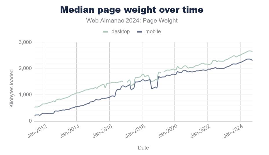
According to the 2024 Web Almanac, the average number of HTTP requests is around 70 per site, most of which is due to JavaScript with 23 requests. In 2024, JS overtook images as the dominant file type too. The median number of page requests for JS files is 23, up 8% since 2022.

And page size continues to grow year over year. The median page weight is around 2MB now, which is 1.8MB more than it was 10 years ago.

Sure, your internet connection speed has probably increased, too, but that’s not the case for everyone. And not everyone has the same device capabilities either.

Pulling in third-party code for things you can do with the platform, instead, most probably means you ship more code, and therefore reach fewer customers than you normally would. On the web, bad loading performance leads to large abandonment rates and hurts brand reputation.

Running Less Code On Devices

Furthermore, the code you do ship on your customers’ devices likely runs faster if it uses fewer JavaScript abstractions on top of the platform. It’s also probably more responsive and more accessible by default. All of this leads to more and happier customers.

Check my colleague Alex Russell’s yearly performance inequality gap blog, which shows that premium devices are largely absent from markets with billions of users due to wealth inequality. And this gap is only growing over time.

Built-in Masonry Layout

One web platform feature that’s coming soon and which I’m very excited about is CSS Masonry.

Let me start by explaining what Masonry is.

What Is Masonry

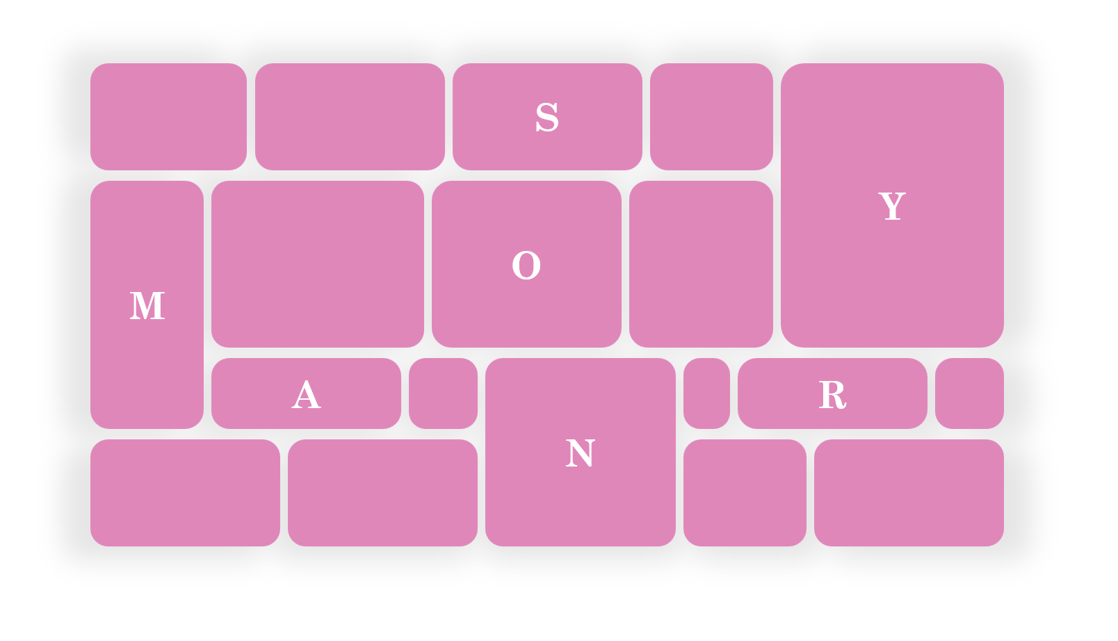
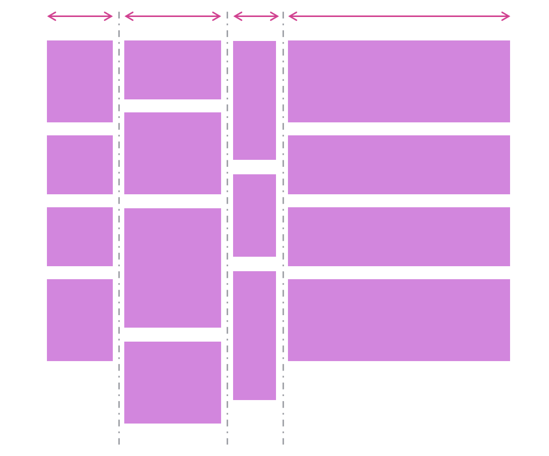
Masonry is a type of layout that was made popular by Pinterest years ago. It creates independent tracks of content within which items pack themselves up as close to the start of the track as they can.

Many people see Masonry as a great option for portfolios and photo galleries, which it certainly can do. But Masonry is more flexible than what you see on Pinterest, and it’s not limited to just waterfall-like layouts.

In a Masonry layout:

  • Tracks can be columns or rows:

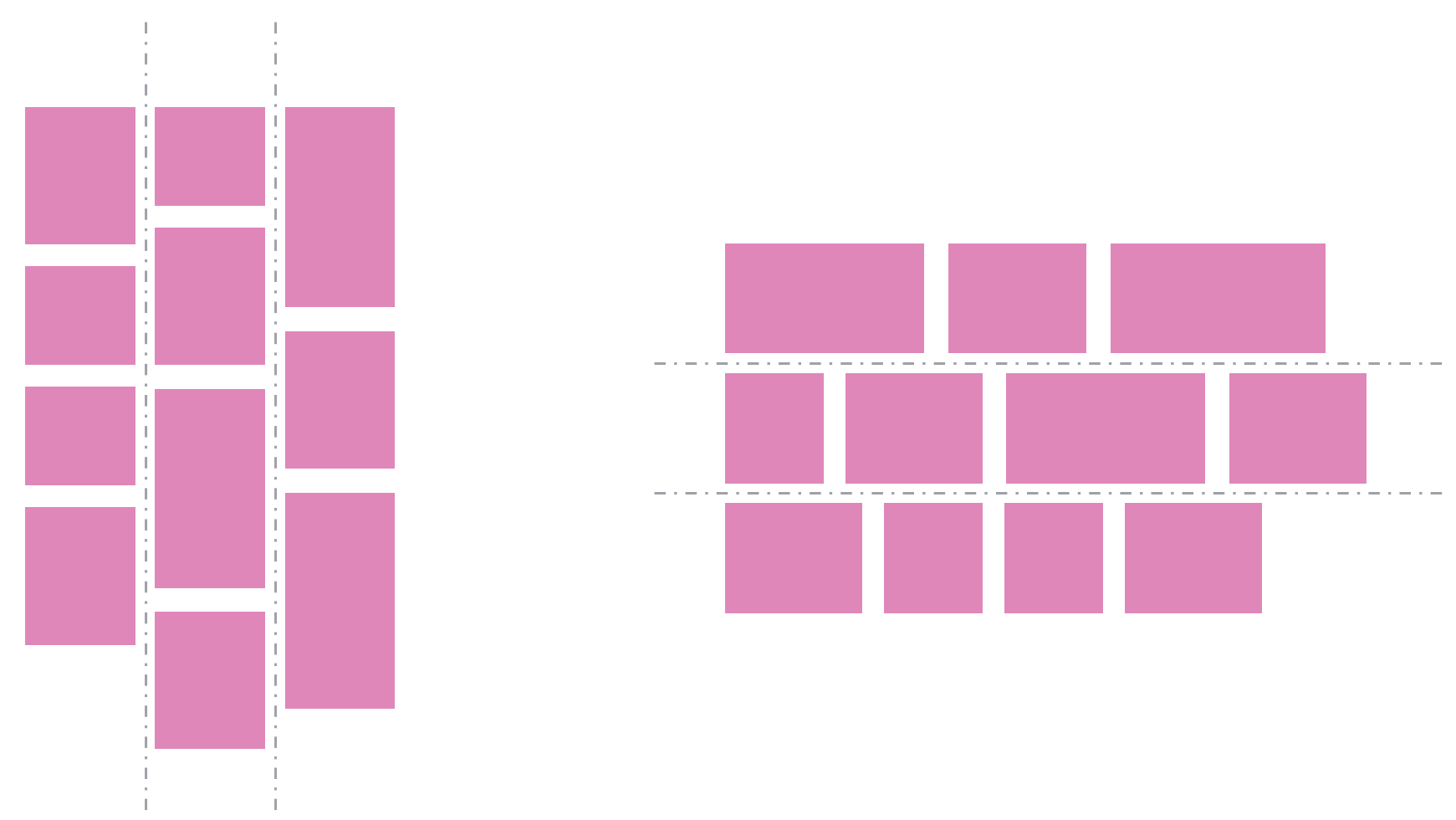
  • Tracks of content don’t all have to be the same size:

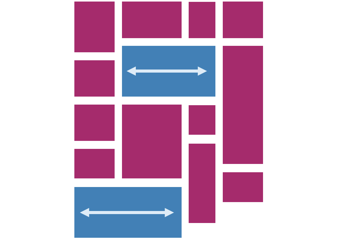
  • Items can span multiple tracks:

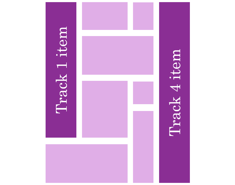
  • Items can be placed on specific tracks; they don’t have to always follow the automatic placement algorithm:

Demos

Here are a few simple demos I made by using the upcoming implementation of CSS Masonry in Chromium.

A photo gallery demo, showing how items (the title in this case) can span multiple tracks:

Another photo gallery showing tracks of different sizes:

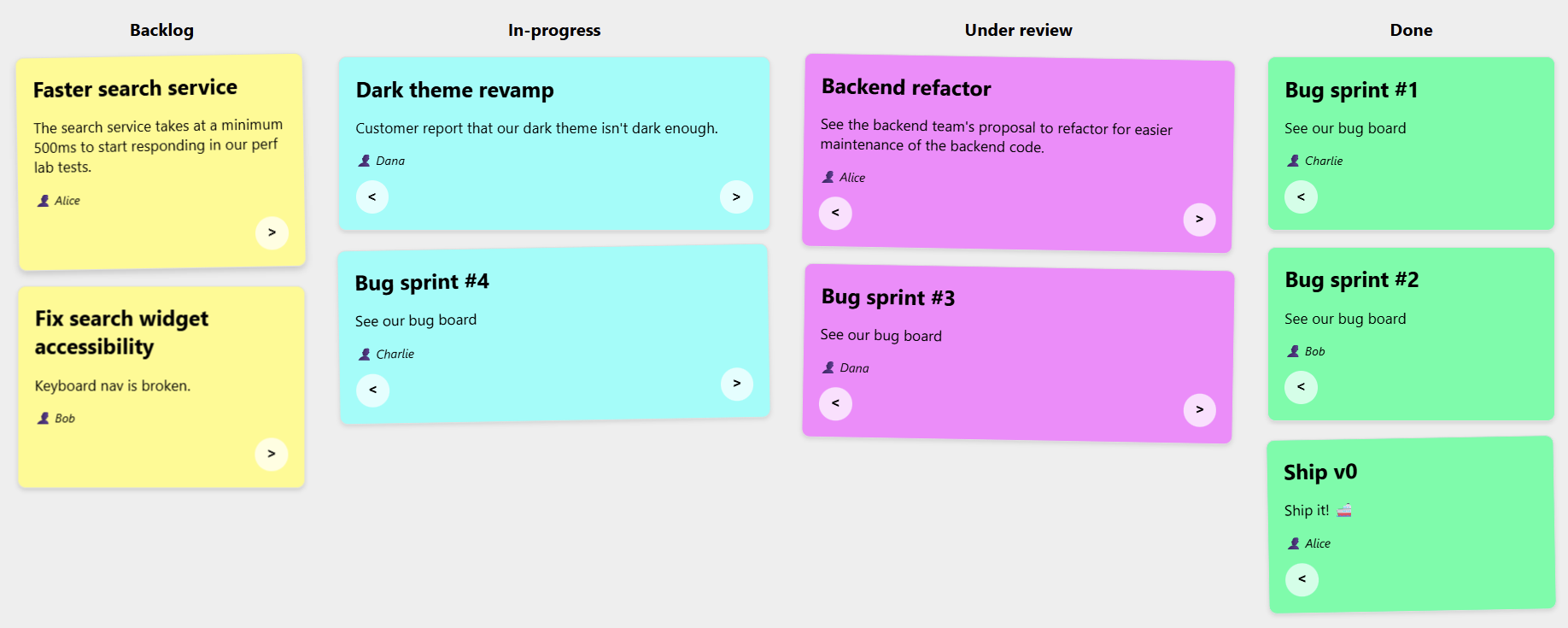
A news site layout with some tracks wider than others, and some items spanning the entire width of the layout:

A kanban board showing that items can be placed onto specific tracks:

Note: The previous demos were made with a version of Chromium that’s not yet available to most web users, because CSS Masonry is only just starting to be implemented in browsers.

However, web developers have been happily using libraries to create Masonry layouts for years already.

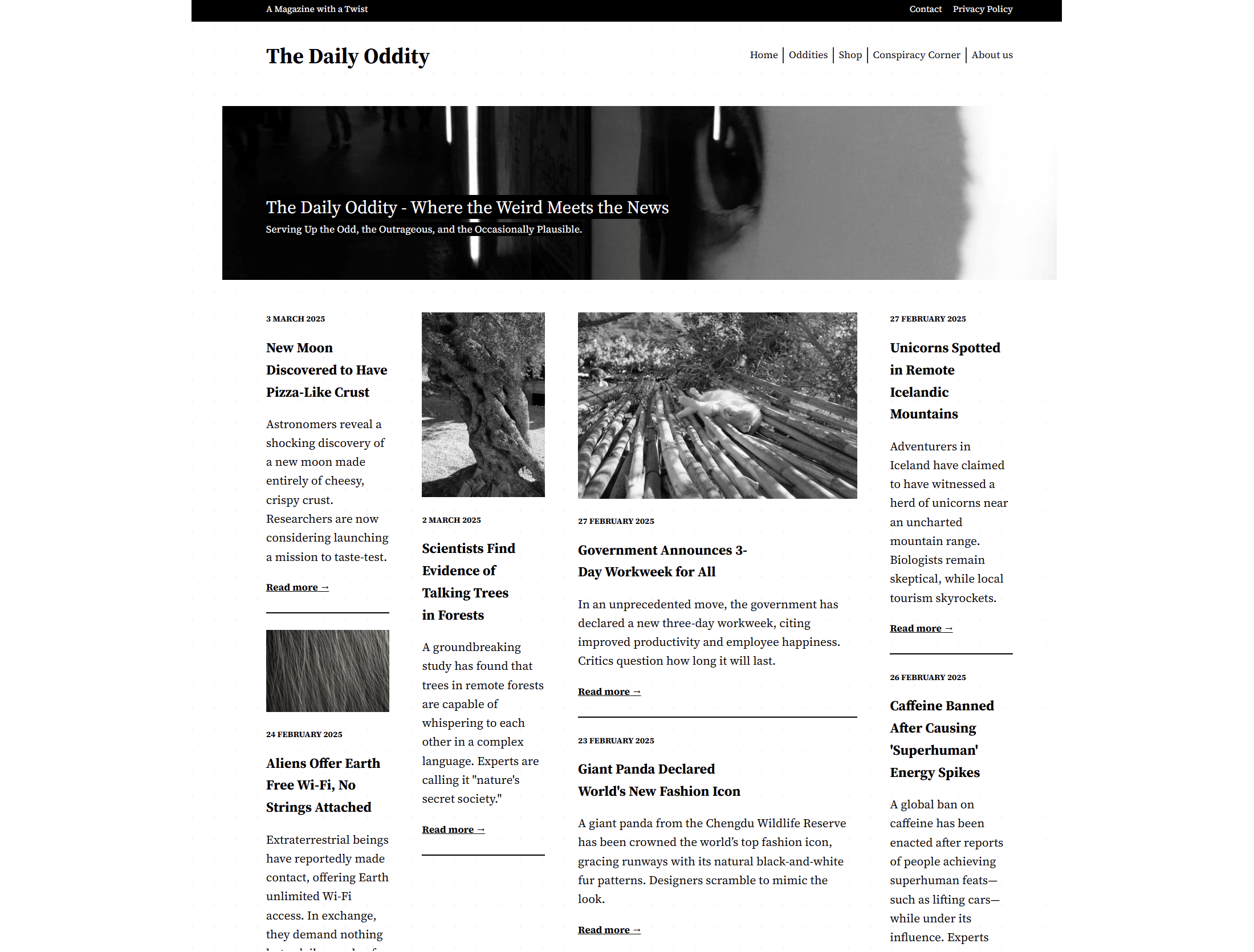
Sites Using Masonry Today

Indeed, Masonry is pretty common on the web today. Here are a few examples I found besides Pinterest:

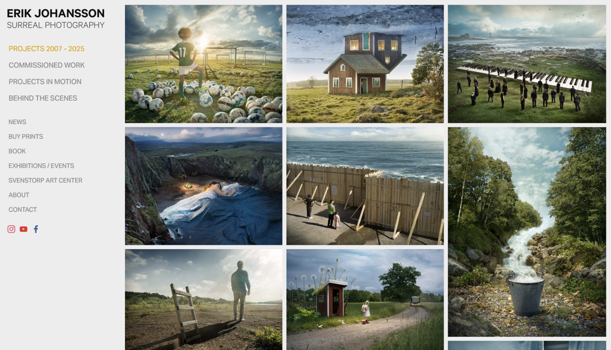
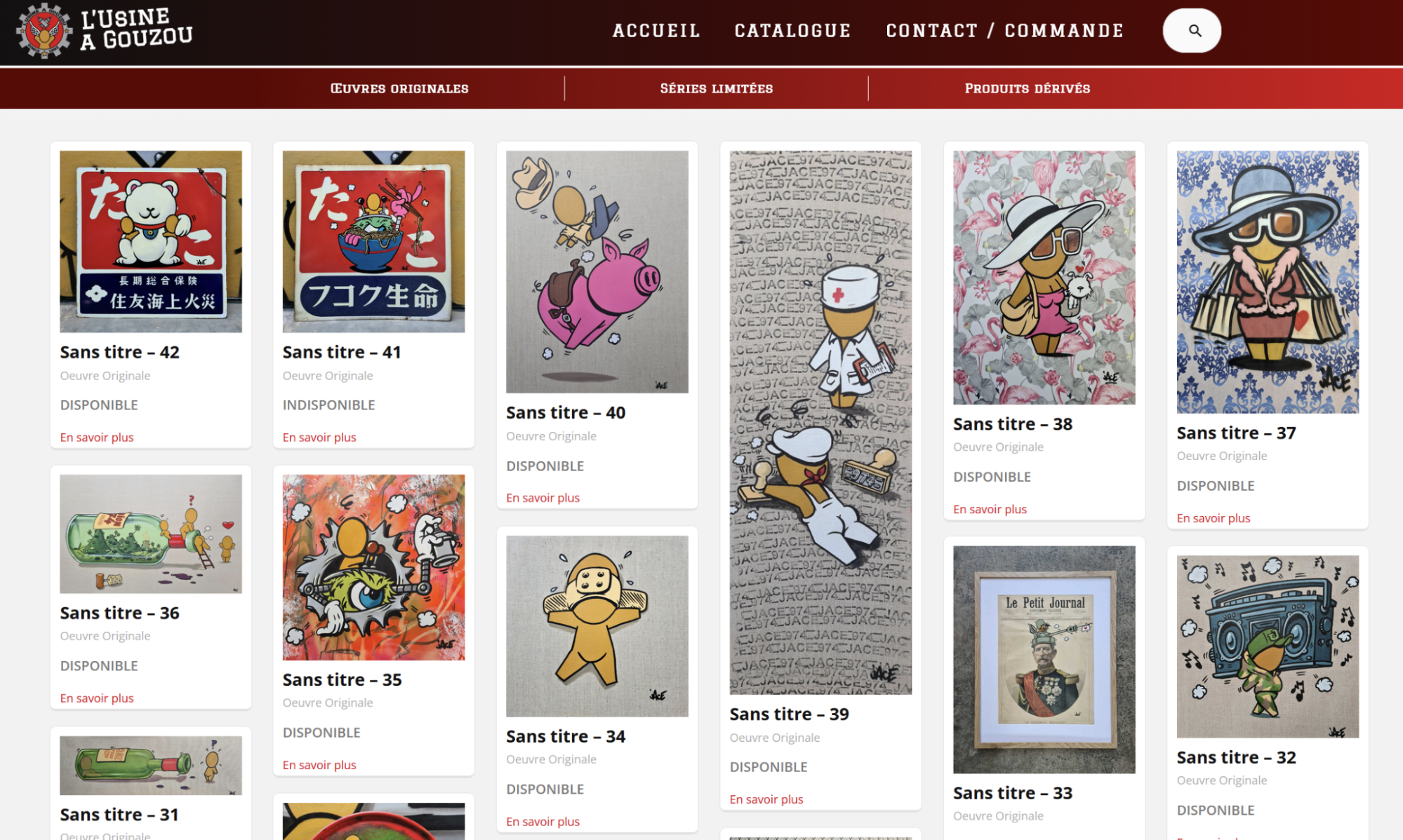
And a few more, less obvious, examples:

So, how were these layouts created?

Workarounds

One trick that I’ve seen used is using a Flexbox layout instead, changing its direction to column, and setting it to wrap.

This way, you can place items of different heights in multiple, independent columns, giving the impression of a Masonry layout:

There are, however, two limitations with this workaround:

  1. The order of items is different from what it would be with a real Masonry layout. With Flexbox, items fill the first column first and, when it’s full, then go to the next column. With Masonry, items would stack in whichever track (or column in this case) has more space available.
  2. But also, and perhaps more importantly, this workaround requires that you set a fixed height to the Flexbox container; otherwise, no wrapping would occur.

Third-party Masonry Libraries

For more advanced cases, developers have been using libraries.

The most well-known and popular library for this is simply called Masonry, and it gets downloaded about 200,000 times per week according to NPM.

Squarespace also provides a layout component that renders a Masonry layout, for a no-code alternative, and many sites use it.

Both of these options use JavaScript code to place items in the layout.

Built-in Masonry

I’m really excited that Masonry is now starting to appear in browsers as a built-in CSS feature. Over time, you will be able to use Masonry just like you do Grid or Flexbox, that is, without needing any workarounds or third-party code.

My team at Microsoft has been implementing built-in Masonry support in the Chromium open source project, which Edge, Chrome, and many other browsers are based on. Mozilla was actually the first browser vendor to propose an experimental implementation of Masonry back in 2020. And Apple has also been very interested in making this new web layout primitive happen.

The work to standardize the feature is also moving ahead, with agreement within the CSS working group about the general direction and even a new display type display: grid-lanes.

If you want to learn more about Masonry and track progress, check out my CSS Masonry resources page.

In time, when Masonry becomes a Baseline feature, just like Grid or Flexbox, we’ll be able to simply use it and benefit from:

  • Better performance,
  • Better responsiveness,
  • Ease of use and simpler code.

Let’s take a closer look at these.

Better Performance

Making your own Masonry-like layout system, or using a third-party library instead, means you’ll have to run JavaScript code to place items on the screen. This also means that this code will be render blocking. Indeed, either nothing will appear, or things won’t be in the right places or of the right sizes, until that JavaScript code has run.

Masonry layout is often used for the main part of a web page, which means the code would be making your main content appear later than it could otherwise have, degrading your LCP, or Largest Contentful Paint metric, which plays a big role in perceived performance and search engine optimization.

I tested the Masonry JS library with a simple layout and by simulating a slow 4G connection in DevTools. The library is not very big (24KB, 7.8KB gzipped), but it took 600ms to load under my test conditions.

Here is a performance recording showing that long 600ms load time for the Masonry library, and that no other rendering activity happened while that was happening:

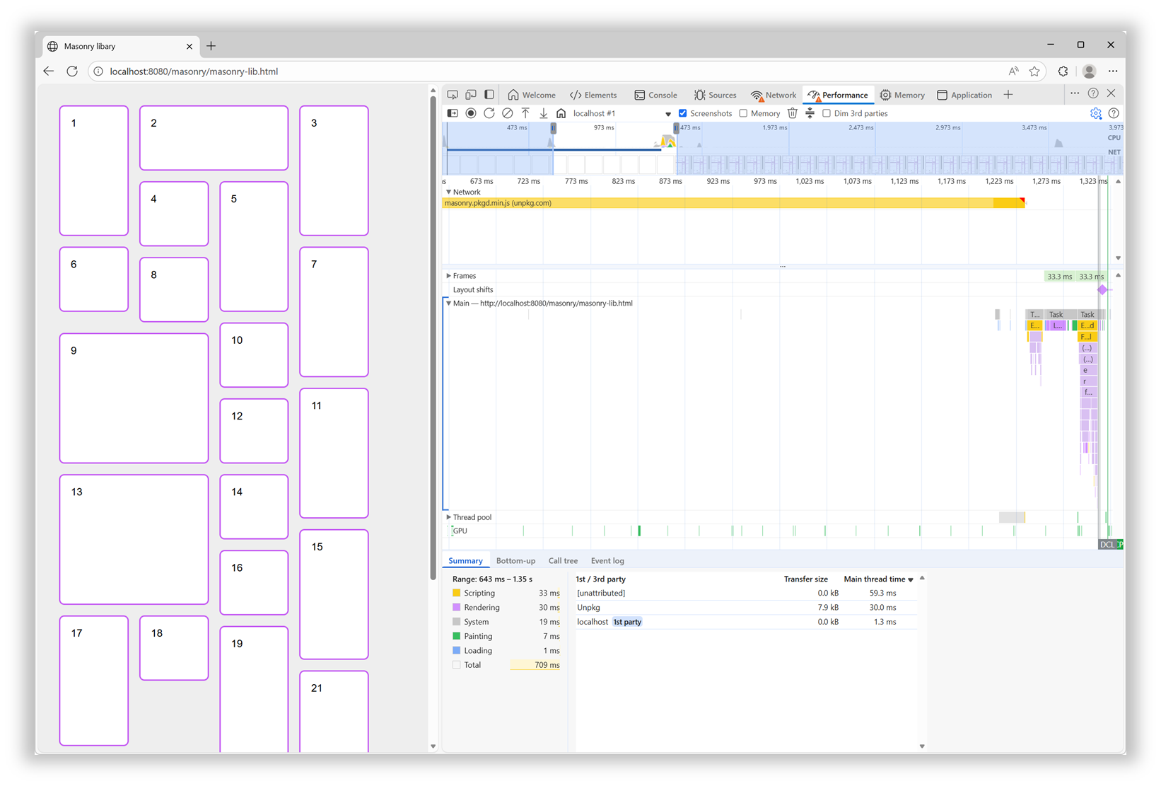
In addition, after the initial load time, the downloaded script then needed to be parsed, compiled, and then run. All of which, as mentioned before, was blocking the rendering of the page.

With a built-in Masonry implementation in the browser, we won’t have a script to load and run. The browser engine will just do its thing during the initial page rendering step.

Better Responsiveness

Similar to when a page first loads, resizing the browser window leads to rendering the layout in that page again. At this point, though, if the page is using the Masonry JS library, there’s no need to load the script again, because it’s already here. However, the code that moves items in the right places needs to run.

Now this particular library seems to be pretty fast at doing this when the page loads. However, it animates the items when they need to move to a different place on window resize, and this makes a big difference.

Of course, users don’t spend time resizing their browser windows as much as we developers do. But this animated resizing experience can be pretty jarring and adds to the perceived time it takes for the page to adapt to its new size.

Ease Of Use And Simpler Code

How easy it is to use a web feature and how simple the code looks are important factors that can make a big difference for your team. They can’t ever be as important as the final user experience, of course, but developer experience impacts maintainability. Using a built-in web feature comes with important benefits on that front:

  • Developers who already know HTML, CSS, and JS will most likely be able to use that feature easily because it’s been designed to integrate well and be consistent with the rest of the web platform.
  • There’s no risk of breaking changes being introduced in how the feature is used.
  • There’s almost zero risk of that feature becoming deprecated or unmaintained.

In the case of built-in Masonry, because it’s a layout primitive, you use it from CSS, just like Grid or Flexbox, no JS involved. Also, other layout-related CSS properties, such as gap, work as you’d expect them to. There are no tricks or workarounds to know about, and the things you do learn are documented on MDN.

For the Masonry JS lib, initialization is a bit complex: it requires a data attribute with a specific syntax, along with hidden HTML elements to set the column and gap sizes.

Plus, if you want to span columns, you need to include the gap size yourself to avoid problems:

<script src="https://unpkg.com/masonry-layout@4.2.2/dist/masonry.pkgd.min.js"></script>
<style>
  .track-sizer,
  .item {
    width: 20%;
  }
  .gutter-sizer {
    width: 1rem;
  }
  .item {
    height: 100px;
    margin-block-end: 1rem;
  }
  .item:nth-child(odd) {
    height: 200px;
  }
  .item--width2 {
    width: calc(40% + 1rem);
  }
</style>

<div class="container"
  data-masonry='{ "itemSelector": ".item", "columnWidth": ".track-sizer", "percentPosition": true, "gutter": ".gutter-sizer" }'>
  <div class="track-sizer"></div>
  <div class="gutter-sizer"></div>
  <div class="item"></div>
  <div class="item item--width2"></div>
  <div class="item"></div>
  ...
</div>

Let’s compare this to what a built-in Masonry implementation would look like:

<style>
  .container {
    display: grid-lanes;
    grid-lanes: repeat(4, 20%);
    gap: 1rem;
  }
  .item {
    height: 100px;
  }
  .item:nth-child(odd) {
    height: 200px;
  }
  .item--width2 {
    grid-column: span 2;
  }
</style>

<div class="container">
  <div class="item"></div>
  <div class="item item--width2"></div>
  <div class="item"></div>
  ...
</div>

Simpler, more compact code that can just use things like gap and where spanning tracks is done with span 2, just like in grid, and doesn’t require you to calculate the right width that includes the gap size.

How To Know What’s Available And When It’s Available?

Overall, the question isn’t really if you should use built-in Masonry over a JS library, but rather when. The Masonry JS library is amazing and has been filling a gap in the web platform for many years, and for many happy developers and users. It has a few drawbacks if you compare it to a built-in Masonry implementation, of course, but those are not important if that implementation isn’t ready.

It’s easy for me to list these cool new web platform features because I work at a browser vendor, and I therefore tend to know what’s coming. But developers often share, survey after survey, that keeping track of new things is hard. Staying informed is difficult, and companies don’t always prioritize learning anyway.

To help with this, here are a few resources that provide updates in simple and compact ways so you can get the information you need quickly:

If you have a bit more time, you might also be interested in browser vendors’ release notes:

For even more resources, check out my Navigating the Web Platform Cheatsheet.

My Thing Is Still Not Implemented

That’s the other side of the problem. Even if you do find the time, energy, and ways to keep track, there’s still frustration with getting your voice heard and your favorite features implemented.

Maybe you’ve been waiting for years for a specific bug to be resolved, or a specific feature to ship in a browser where it’s still missing.

What I’ll say is browser vendors do listen. I’m part of several cross-organization teams where we discuss developer signals and feedback all the time. We look at many different sources of feedback, both internal at each browser vendor and external/public on forums, open source projects, blogs, and surveys. And, we’re always trying to create better ways for developers to share their specific needs and use cases.

So, if you can, please demand more from browser vendors and pressure us to implement the features you need. I get that it takes time, and can also be intimidating (not to mention a high barrier to entry), but it also works.

Here are a few ways you can get your (or your company’s) voice heard: Take the annual State of JS, State of CSS, and State of HTML surveys. They play a big role in how browser vendors prioritize their work.

If you need a specific standard-based API to be implemented consistently across browsers, consider submitting a proposal at the next Interop project iteration. It requires more time, but consider how Shopify and RUMvision shared their wish lists for Interop 2026. Detailed information like this can be very useful for browser vendors to prioritize.

For more useful links to influence browser vendors, check out my Navigating the Web Platform Cheatsheet.

Conclusion

To close, I hope this article has left you with a few things to think about:

  • Excitement for Masonry and other upcoming web features.
  • A few web features you might want to start using.
  • A few pieces of custom or 3rd-party code you might be able to remove in favor of built-in features.
  • A few ways to keep track of what’s coming and influence browser vendors.

More importantly, I hope I’ve convinced you of the benefits of using the web platform to its full potential.

A Sparkle Of December Magic (2025 Wallpapers Edition)

As the year winds down, many of us are busy wrapping up projects, meeting deadlines, or getting ready for the holiday season. Why not take a moment amid the end-of-year hustle to set the mood for December with some wintery desktop wallpapers? They might just bring a sparkle of inspiration to your workspace in these busy weeks.

To provide you with unique and inspiring wallpaper designs each month anew, we started our monthly wallpapers series more than 14 years ago. It’s the perfect opportunity both to put your creative skills to the test and to find just the right wallpaper to accompany you through the new month. This December is no exception, of course, so following our cozy little tradition, we have a new collection of wallpapers waiting for you below. Each design has been created with love by artists and designers from across the globe and comes in a variety of screen resolutions.

A huge thank-you to everyone who tickled their creativity and shared their wallpapers with us this time around! This post wouldn’t exist without your kind support. ❤️ Happy December!

  • You can click on every image to see a larger preview.
  • We respect and carefully consider the ideas and motivation behind each and every artist’s work. This is why we give all artists the full freedom to explore their creativity and express emotions and experience through their works. This is also why the themes of the wallpapers weren’t anyhow influenced by us but rather designed from scratch by the artists themselves.
  • Submit your wallpaper design! 🎨
    We are always looking for creative talent and would love to feature your desktop wallpaper in one of our upcoming posts. Join in ↬

Zero-Gravity December

“Floating in space, decorating the Christmas tree, unbothered by the familiar weight of New Year’s resolutions waiting back on Earth every December.” — Designed by Ginger It Solutions from Serbia.

A Quiet December Walk

“In the stillness of a snowy forest, a man and his loyal dog share a peaceful winter walk. The world is hushed beneath a blanket of white, with only soft flakes falling and the crunch of footsteps breaking the silence. It’s a simple, serene moment that captures the calm beauty of December and the quiet joy of companionship in nature’s winter glow.” — Designed by PopArt Studio from Serbia.

Quoted Rudolph

Designed by Ricardo Gimenes from Spain.

Learning Is An Art

“The year is coming to an end. A year full of adventures, projects, unforgettable moments, and others that will fade into oblivion. And it’s this month that we start preparing for next year, organizing it and hoping it will be at least as good as the last, and that it will give us 365 days to savor from the first to the last. This month we share Katherine Johnson and some wise words that we shouldn’t forget: ‘I like to learn. It’s an art and a science.’” — Designed by Veronica Valenzuela Jimenez from Spain.

Chilly Dog, Warm Troubles

Designed by Ricardo Gimenes from Spain.

Modern Christmas Magic

“A fusion of modern Christmas aesthetics and a user-centric mobile app development company, crafting delightful holiday-inspired digital experiences.” — Designed by the Zco Corporation Design Team from the United States.

Dear Moon, Merry Christmas

Designed by Vlad Gerasimov from Georgia.

It’s In The Little Things

Designed by Thaïs Lenglez from Belgium.

The House On The River Drina

“Since we often yearn for a peaceful and quiet place to work, we have found inspiration in the famous house on the River Drina in Bajina Bašta, Serbia. Wouldn’t it be great being in nature, away from civilization, swaying in the wind and listening to the waves of the river smashing your house, having no neighbors to bother you? Not sure about the Internet, though…” — Designed by PopArt Studio from Serbia.

Christmas Cookies

“Christmas is coming and a great way to share our love is by baking cookies.” — Designed by Maria Keller from Mexico.

Sweet Snowy Tenderness

“You know that warm feeling when you get to spend cold winter days in a snug, homey, relaxed atmosphere? Oh, yes, we love it, too! It is the sentiment we set our hearts on for the holiday season, and this sweet snowy tenderness is for all of us who adore watching the snowfall from our windows. Isn’t it romantic?” — Designed by PopArt Studio from Serbia.

Anonymoose

Designed by Ricardo Gimenes from Spain.

Cardinals In Snowfall

“During Christmas season, in the cold, colorless days of winter, Cardinal birds are seen as symbols of faith and warmth. In the part of America I live in, there is snowfall every December. While the snow is falling, I can see gorgeous Cardinals flying in and out of my patio. The intriguing color palette of the bright red of the Cardinals, the white of the flurries, and the brown/black of dry twigs and fallen leaves on the snow-laden ground fascinates me a lot, and inspired me to create this quaint and sweet, hand-illustrated surface pattern design as I wait for the snowfall in my town!” — Designed by Gyaneshwari Dave from the United States.

Getting Hygge

“There’s no more special time for a fire than in the winter. Cozy blankets, warm beverages, and good company can make all the difference when the sun goes down. We’re all looking forward to generating some hygge this winter, so snuggle up and make some memories.” — Designed by The Hannon Group from Washington D.C.

Christmas Woodland

Designed by Mel Armstrong from Australia.

Joy To The World

“Joy to the world, all the boys and girls now, joy to the fishes in the deep blue sea, joy to you and me.” — Designed by Morgan Newnham from Boulder, Colorado.

Gifts Lover

Designed by Elise Vanoorbeek from Belgium.

King Of Pop

Designed by Ricardo Gimenes from Spain.

The Matterhorn

“Christmas is always such a magical time of year so we created this wallpaper to blend the majestry of the mountains with a little bit of magic.” — Designed by Dominic Leonard from the United Kingdom.

Ninja Santa

Designed by Elise Vanoorbeek from Belgium.

Ice Flowers

“I took some photos during a very frosty and cold week before Christmas.” Designed by Anca Varsandan from Romania.

Christmas Selfie

Designed by Emanuela Carta from Italy.

Winter Wonderland

“‘Winter is the time for comfort, for good food and warmth, for the touch of a friendly hand and for a talk beside the fire: it is the time for home.’ (Edith Sitwell) — Designed by Dipanjan Karmakar from India.

Winter Coziness At Home

“Winter coziness that we all feel when we come home after spending some time outside or when we come to our parental home to celebrate Christmas inspired our designers. Home is the place where we can feel safe and sound, so we couldn’t help ourselves but create this calendar.” — Designed by MasterBundles from Ukraine.

Enchanted Blizzard

“A seemingly forgotten world under the shade of winter glaze hides a moment where architecture meets fashion and change encounters steadiness.” — Designed by Ana Masnikosa from Belgrade, Serbia.

All That Belongs To The Past

“Sometimes new beginnings make us revisit our favorite places or people from the past. We don’t visit them often because they remind us of the past but enjoy the brief reunion. Cheers to new beginnings in the new year!” Designed by Dorvan Davoudi from Canada.

December Through Different Eyes

“As a Belgian, December reminds me of snow, coziness, winter, lights, and so on. However, in the Southern hemisphere, it is summer at this time. With my illustration I wanted to show the different perspectives on December. I wish you all a Merry Christmas and Happy New Year!” — Designed by Jo Smets from Belgium.

Silver Winter

Designed by Violeta Dabija from Moldova.

Cozy

“December is all about coziness and warmth. Days are getting darker, shorter, and colder. So a nice cup of hot cocoa just warms me up.” — Designed by Hazuki Sato from Belgium.

Tongue Stuck On Lamppost

Designed by Josh Cleland from the United States.

On To The Next One

“Endings intertwined with new beginnings, challenges we rose to and the ones we weren’t up to, dreams fulfilled and opportunities missed. The year we say goodbye to leaves a bitter-sweet taste, but we’re thankful for the lessons, friendships, and experiences it gave us. We look forward to seeing what the new year has in store, but, whatever comes, we will welcome it with a smile, vigor, and zeal.” — Designed by PopArt Studio from Serbia.

Christmas Owl

“Christmas waves a magic wand over this world, and behold, everything is softer and more beautiful.” — Designed by Suman Sil from India.

Catch Your Perfect Snowflake

“This time of year, people tend to dream big and expect miracles. Let your dreams come true!” Designed by Igor Izhik from Canada.

Winter Garphee

“Garphee’s flufiness glowing in the snow.” Designed by Razvan Garofeanu from Romania.

Trailer Santa

“A mid-century modern Christmas scene outside the norm of snowflakes and winter landscapes.” Designed by Houndstooth from the United States.

Winter Solstice

“In December there’s a winter solstice; which means that the longest night of the year falls in December. I wanted to create the feeling of solitude of the long night into this wallpaper.” — Designed by Alex Hermans from Belgium.

Christmas Time

Designed by Sofie Keirsmaekers from Belgium.

Happy Holidays

Designed by Ricardo Gimenes from Spain.

Get Featured Next Month

Feeling inspired? We’ll publish the January wallpapers on December 31, so if you’d like to be a part of the collection, please don’t hesitate to submit your design. We are already looking forward to it!

What if claude-code lived inside your browser?

I’ve built a browser extension that allows you to theme your visited websites just by prompting. It takes your request and uses openai’s codex-mini to generate the JS and CSS needed to apply the change.

It can do all sorts of things: stop autoplaying videos, replace links with archive.is on newspapers, dim sidebars, or add small QOL features like editing the responses in chatgpt so it’s easier to copy/paste.

Earlier today I asked it to add a “cost per 100 requests” column on OpenRouter’s activity page—decimals makes it hard for my ADHD brain to process.

Technically, you can do this with developer tools and user styles but i’ve been impressed with codex’ ability to take my vague requests and turn it into working styles with just 10% of the source page for context.

Building it i’ve alternated between codex and claude (opus) and I suspect that because I’ve decided to go with a very light stack: tailwind, alpinejs and basecoat (shadcn without react) the final code is maintainable and pretty performant.

I haven’t launched on an webstore yet but decided to release a BYOK open source version. Give it a try as I’m sure you’ll be able to replace at least 3 extensions you have with it.

Check the code here: https://github.com/alentodorov/clickremix-byok

Excel for Project Management: Tracking Timelines and Deliverables

The Project Manager’s Secret Weapon: An Introduction

We all know the scene: a new project kicks off, and suddenly you’re drowning in options.
Do you pay for that expensive, complicated project management software? Do you try to learn a dozen new features just to track a few tasks? For many independent developers, freelancers, and small teams especially those operating in high pressure, budget-conscious environments; the answer is a clear and resounding NO.

The most powerful, flexible, and affordable project management tool is already on your computer: Microsoft Excel. This post isn’t about the basics; it’s about transforming a simple spreadsheet into a highly effective, low-code system for tracking timelines and deliverables. We’ll explore why Excel often beats the high priced competition and how you can start managing complex projects today without spending a dime on new software.

Why Expensive Tools Drain Your Budget and Time

When a project gets big, the overhead of managing it often grows even faster. This is where most enterprise tools fail small teams, a problem that is amplified by our local economic realities.

Complex tools like Jira or Asana are excellent for large organizations with hundreds of tasks, but for a team of one to five people, they create unnecessary friction. The average learning curve for new project software can consume up to 10% of a small project’s total time budget.
Furthermore, subscription costs for these specialized tools quickly add up. A typical subscription for a team of five can easily cost ₦450,000 to ₦900,000 annually. For a startup, a solo developer, or a local agency, that money is better spent on essential infrastructure or talent.
Excel, on the other hand, is generally already available and requires no new subscription, offering an immediate 100% savings on specialized Project Management software fees.

Creating Dynamic Tracking and Visual Timelines

Excel solves the problem of cost and complexity by offering pure, unconstrained flexibility. You aren’t limited by pre-set dashboards or rigid fields; you design the tracker exactly the way your project needs it.

Data-Driven Visualization
The power of Excel lies in its core functions, which act as the “engine” of your project tracker.

  1. Building Your Gantt Chart: A key deliverable for any project manager is answering the question: “Are we on schedule?”
    In Excel, you can use Conditional Formatting to turn start and end dates into a visual timeline, known as a Gantt chart. This technique uses simple formulas to check dates and automatically color-code cells. This visual insight allows stakeholders to see the entire project duration at a glance.

  2. Automating Status Updates: By using simple IF statements, you can automate status updates. For example, if today’s date is past the deadline date listed in another column, a formula can automatically change the task status to “OVERDUE.” This instant data automation saves hours compared to manually updating dozens of task entries. This kind of logical automation is what developers already do, making Excel feel familiar and intuitive.

The Nigerian Edge: Trust and Transparency

In Nigeria’s dynamic business environment, stakeholders and clients often require immediate, clear evidence of progress, without wanting to navigate complex software. This is where the simplicity of an Excel tracker becomes a massive advantage.

Many Nigerian companies still operate primarily using documents and email for official communication, and they often lack the licensing or training for expensive cloud-based Project Management tools. A clean Excel sheet is a universally accepted deliverable. Instead of granting platform access or spending time exporting complicated reports, you can send a password-protected Excel snapshot that requires zero technical onboarding from the client.

This simplicity helps build trust and transparency. When you can quickly generate a professional, formatted sheet showing milestones, budgets, and deadlines, it minimizes communication overhead. Statistics show that projects with high visual accountability experience 25% fewer unexpected delays, simply because problems are spotted earlier. Excel helps you deliver that accountability quickly and professionally, meeting the local expectation for clear and direct reporting.

From Tasks to Completion: Ensuring Accountability

Tracking deliverables means more than just listing tasks; it means managing the entire lifecycle of a task and its outputs. Your Excel sheet should act as the Single Source of Truth for the entire project.

  1. Establishing Clear Ownership: Every task must have a clearly assigned owner and a defined deliverable (e.g., “completed code review,” “drafted documentation”). By having designated cells for Owner and Deliverable Description, you reduce ambiguity, a common cause of project delays.
  2. Measuring Overall Progress: Entering a Percentage Complete figure (0% to 100%) allows you to quickly calculate the overall progress of an entire project phase. If you have 10 tasks, and each is 50% complete, you know the phase is halfway done. This simple measurement provides immediate project health feedback.
  3. Mapping Dependencies: Use a dedicated column to note which task must be completed before the current task can start. This simple tracking prevents bottlenecks, ensuring Task B doesn’t start until Task A is officially marked as “Complete.”

Conclusion: Build Your Own Engine

Excel for project management isn’t a workaround; it’s a strategic choice for efficiency, cost savings, and maximum control, especially for developers navigating the competitive tech scene in Nigeria. By leveraging simple formulas, conditional formatting, and clear data structures, you move past the burden of overly complex software and put the focus back on shipping your product efficiently and affordably. You are, in effect, designing your own low-code project management engine, perfectly customized to track every timeline and deliverable your project demands.

Day 8 – Terraform Meta-Arguments

Whenever we create any resource using Terraform, whether it is an S3 bucket, an EC2 instance, or a security group, we have to pass certain arguments that are specific to the provider. For example, while creating an AWS S3 bucket, we must provide a bucket name, which is a provider-specific argument. Along with these arguments, Terraform also provides additional arguments that work across all resource types. These are known as meta-arguments. Meta-arguments allow us to add extra functionality on top of the normal provider arguments, such as creating multiple resources, controlling dependencies, or defining lifecycle rules.

Common Terraform Meta-Arguments

Some of the most commonly used meta-arguments are:

  • count – With the help of count we can create multiple instances of the same resource.
  • for_each – Allows you to create multiple resources based on a map or set, giving more flexibility than count.
  • depends_on – It is used to define explicit dependency between resources.
  • provider – Overrides which provider configuration to use for a particular resource.
  • lifecycle – It helps in controlling resource behavior, like preventing deletion or ignoring certain changes.

How Meta-Arguments Help in Real Projects

Let us consider a situation where we need to launch EC2 instances for testing, staging, and production environments. Instead of writing the same resource block multiple times, meta-arguments allow us to dynamically control how many EC2 instances to create.

Example Using count

variable "ec2_count" {
  default = 3
}

resource "aws_instance" "my_ec2" {
  count         = var.ec2_count
  ami           = "ami-0c55b159cbfafe1f0"
  instance_type = "t2.micro"

  tags = {
    Name = "EC2-${count.index}"
  }
}

What happens here?

  • If ec2_count = 3, Terraform creates 3 EC2 instances.
  • If tomorrow you want 5 instances, just change the variable. There is no need to modify the resource block.

This is very helpful in environments where:

  • The number of servers may change frequently
  • Teams want to scale infrastructure quickly
  • We need to replicate identical resources, for example security groups, IAM users, or EC2 instances

count Meta-Argument

Example Using for_each

Suppose we want to create EC2 instances with different names or configurations.

variable "servers" {
  default = {
    app  = "t2.micro"
    db   = "t2.small"
    cache = "t2.micro"
  }
}

resource "aws_instance" "server" {
  for_each      = var.servers
  ami           = "ami-0c55b159cbfafe1f0"
  instance_type = each.value

  tags = {
    Name = each.key
  }
}

This creates three EC2 instances with different roles and instance types without repeating any code.

for_each meta argument

Example Using depends_on

Sometimes Terraform automatically understands the order in which resources should be created based on references. However, there are situations where we need to manually define the dependency to ensure one resource is created before another.

Scenario

Suppose we want to create an EC2 instance, but only after a security group is fully created.

resource "aws_security_group" "ec2_sg" {
  name        = "ec2-security-group"
  description = "Allow SSH"

  ingress {
    from_port   = 22
    to_port     = 22
    protocol    = "tcp"
    cidr_blocks = ["0.0.0.0/0"]
  }
}

resource "aws_instance" "my_ec2" {
  ami           = "ami-0c55b159cbfafe1f0"
  instance_type = "t2.micro"

  depends_on = [
    aws_security_group.ec2_sg
  ]

  tags = {
    Name = "EC2-with-depends-on"
  }
}

depends_on Meta-Argument

Why is depends_on useful?

  • Ensures Terraform creates resources in the correct order
  • Helps avoid runtime failures, for example EC2 launching before its security group exists
  • Useful when resources do not have a direct reference but still require ordering
  • Makes execution predictable and safer

Why Meta-Arguments Are Important

In real projects, meta-arguments help:

  • Reduce code duplication
  • Improve scalability, making it easy to increase or decrease the number of resources
  • Keep infrastructure DRY (Do Not Repeat Yourself)
  • Provide flexible configurations
  • Control resource behavior more effectively

Meta-arguments are one of the most powerful features in Terraform and they help make infrastructure more modular, maintainable, and scalable.